This week sees the Colour Group on the Media and Methods Module look at what constituent parts of light are used in photography and then a chance to play in the colour darkroom.
LIGHT
First up, Jack talked to us about Light. The famous illustration of white light entering a prism and exiting the other side of it refracted into the components of the visible spectrum. It’s a famous illustration as it features on one of the worlds most highly recognised album covers.

The image shows a recreation of Isaac Newton’s famous demonstration that shows the white light beam entering into the triangular glass object, then refracting twice and exiting the prism “dispersed” into the colours of the visible electromagnetic spectrum.
The red light suffers least from refraction due to having a longer wavelength and going down the colours in the spectrum, the wavelengths get shorter, along with an inverse relationship with the frequency. The violet end of the spectrum has a higher frequency and thus a shorter wavelength.
This Electromagnetic spectrum contains Radio waves and Infra Red above the visible spectrum (lower freq, longer wavelength) and the opposite end contains such waves as Ultra Violet, X Rays and Gamma Rays.
Unlike a Black and White printing process in the darkroom where you can safely have the red light on to aid vision, colour films and papers are sensitive to all colours in the visible spectrum so it is essential that darkroom operations are fully dark and free of any light. Black and white Resin Coated Paper is not sensitive to red light at the top end of the spectrum so this is why it’s ok to have the safe light switched on when printing in B&W.
COLOUR PRINTS
Once the colour negatives are back from being developed at a lab, rather than in the university, we can begin the enlarging process. Light is projected from an enlarger head, through a series of colour filters, (Cyan, Magenta and Yellow) and then through the negative to produce a projected image on the easel (base) of the enlarger. The focus and composition is set up before projecting the light onto the RC paper before going and inserting the paper into the Colenta print machine where it’s passed through several chemical baths, washes, and dryers. Unlike the B&W dark room where the chemicals are kept around 20°C and can production of prints can be done in trays, the colour process needs the chemistry keeping at 58°C which is more challenging, hence the ease of using a self contained machine.
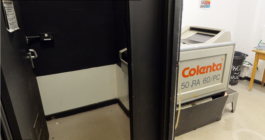
After 5 mins the print appears from the slot on the light side of the machine. The front end of this machine where you insert the exposed paper into the machine is in the small darkroom so you must retrieve the paper from a black bag, and remember to feed it into the input tray with the emulsion facing down.
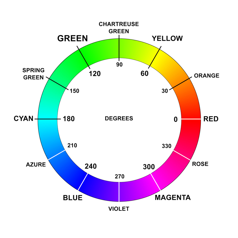
We were also shown the colour wheel and told that once we are able to remember it or refer to it, it will help us make the decisions on the adjustment of the light in the enlarger to help correct the colours in the printed image.
We also thought about the drawbacks of colour film printing over digital photography process.
- Film and Paper can be expensive
- Limit on number of images per film roll
- No ability to preview the images before printing
- Can fail easily by a small exposure to light.
We also discussed a list of prominent photographers that might warrant research, I noted two due to Jack pointing out they are local to the region.
Andrew Lacon and Stuart Whipps were artists in question.
DARKROOM DEMO
Then it was time to enter the Darkrooms for a demonstration and I had my own negatives to play with.
The Colour Darkroom Process
Set Composition and Focus
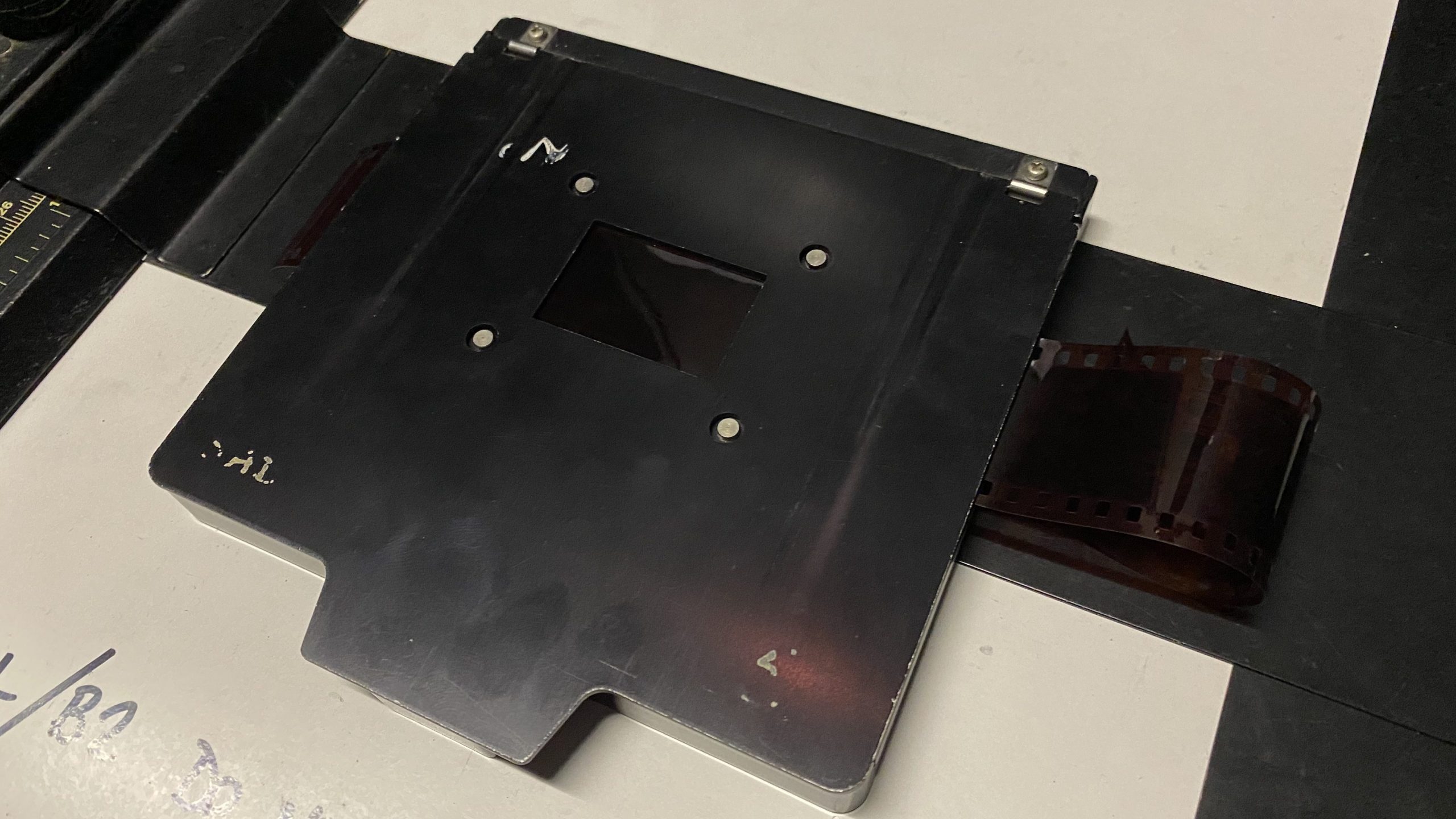
Place Negative in Enlarger carrier with glossy side facing up.
Set Filters on LPL C7700 Enlarger to Y 50, M 50, C 0 (Yellow, Magenta, Cyan) we don’t use the cyan filter unless absolutely necessary.
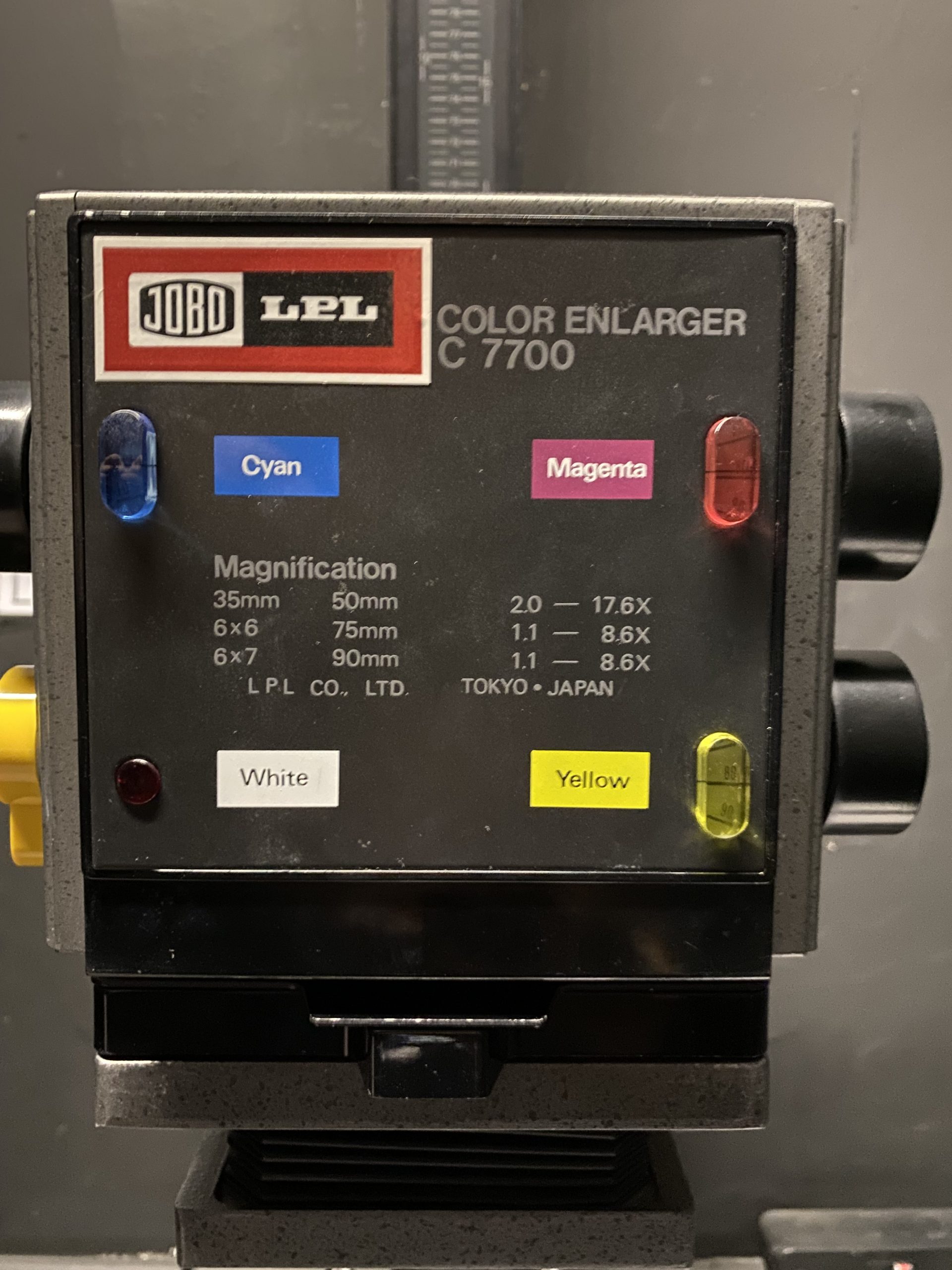
The filter numbers represent amount of effect the filter has on the light through the negative. 50 On Magenta allows more magenta light through than if the Magenta was set to 80. I think of it as a restrictor.
Underneath this head is a lens and we’re advised to use an aperture of f/8 but we can use f/2.8 to allow more light through so we can compose the image and check focus. As long as you return it back to f/8 before the exposing of the paper.
You can also see the negative carrier handle sticking out of the front at the bottom of the head.
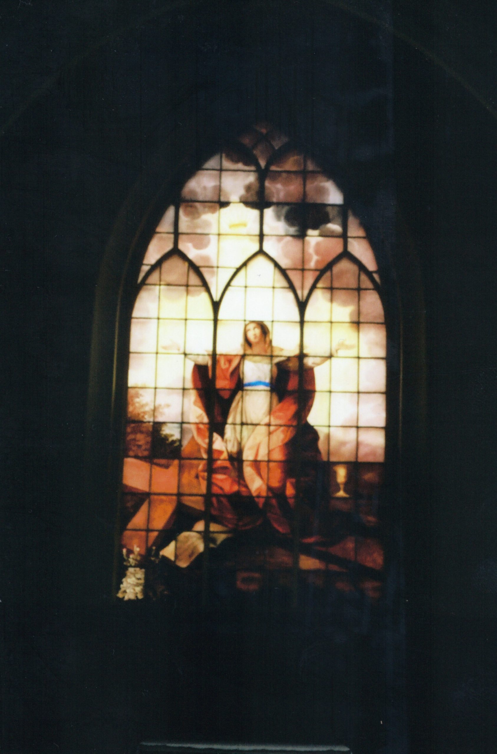
Turn on light using the timer box to project image onto easel as per the image to the right. Here you can see an image of a church window in negative. The Dark areas of this projection onto paper will receive less light from the enlarger so will be lighter and become a positive image.
A focus finder is also in this image and it’s a special type of magnifier that allows you to check the focus more accurately as you can see the grain of the negative precisely when correctly focussed.
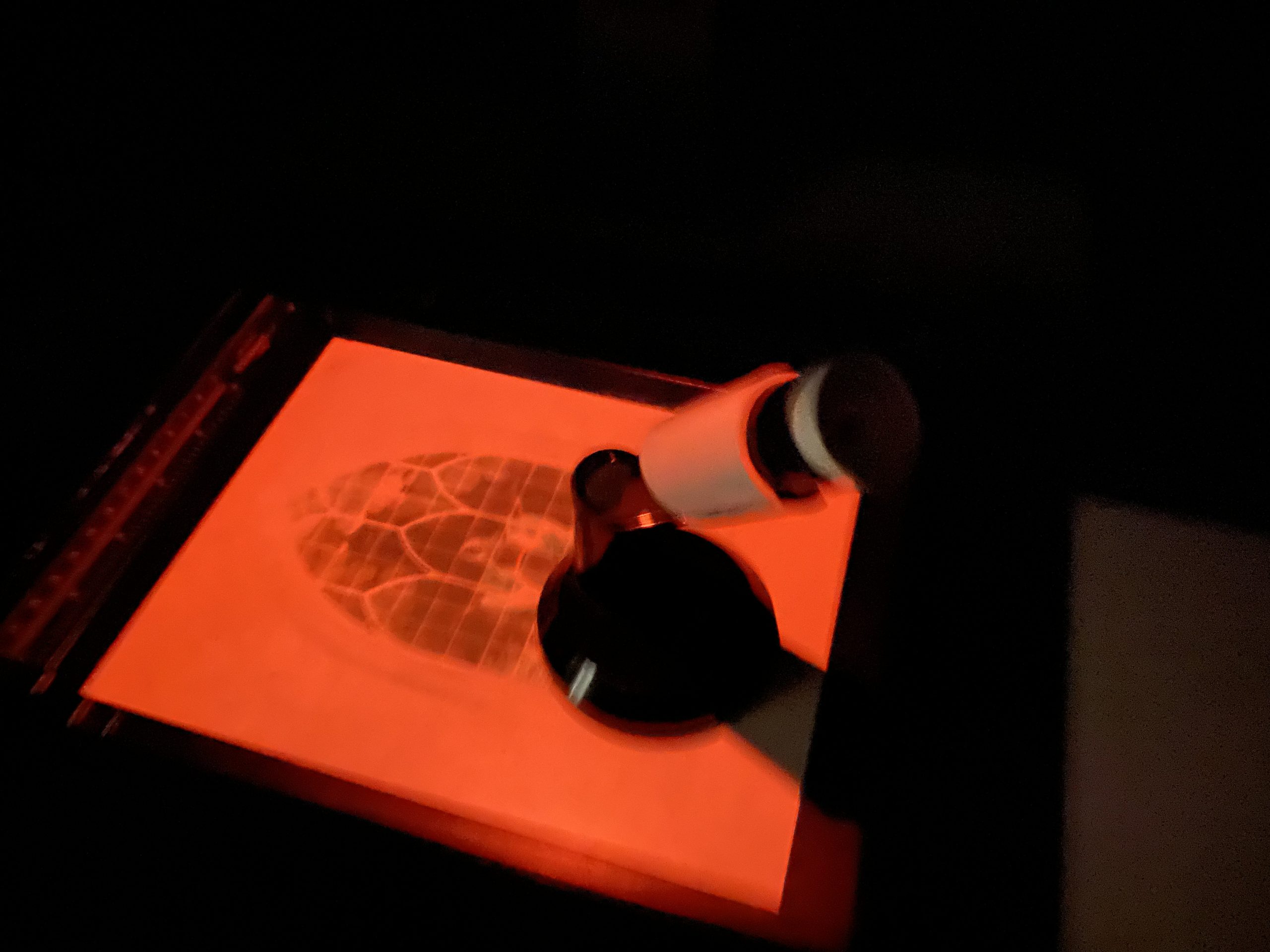
The focus finder uses a mirror to look upwards into the projection but the distance and angles mean it’s exactly the same distance to the eyepiece as it is to the paper/easel. I’ve got to be honest, I struggled to see anything through this focus finder so I hope to catch a bit more detail next time I use it.
LIGHTS OUT, DOOR LOCKED
Once the filters are set up to 50/50/0 and the image is focussed correctly, you must turn out all lights, even the red lights, lock the door and take your Resin Coated (RC) paper from it’s light tight black plastic bag, which is in the drawer under the easel for ease. It must be placed into the corner of the easel and held flat by the rulers.
Once happy that the paper is in place, emulsion side facing up you can operate the timer module to precisely expose the paper for the correct length of time for a good image. (We’ll discuss how we work this out when we come to my actual experience with this practical).
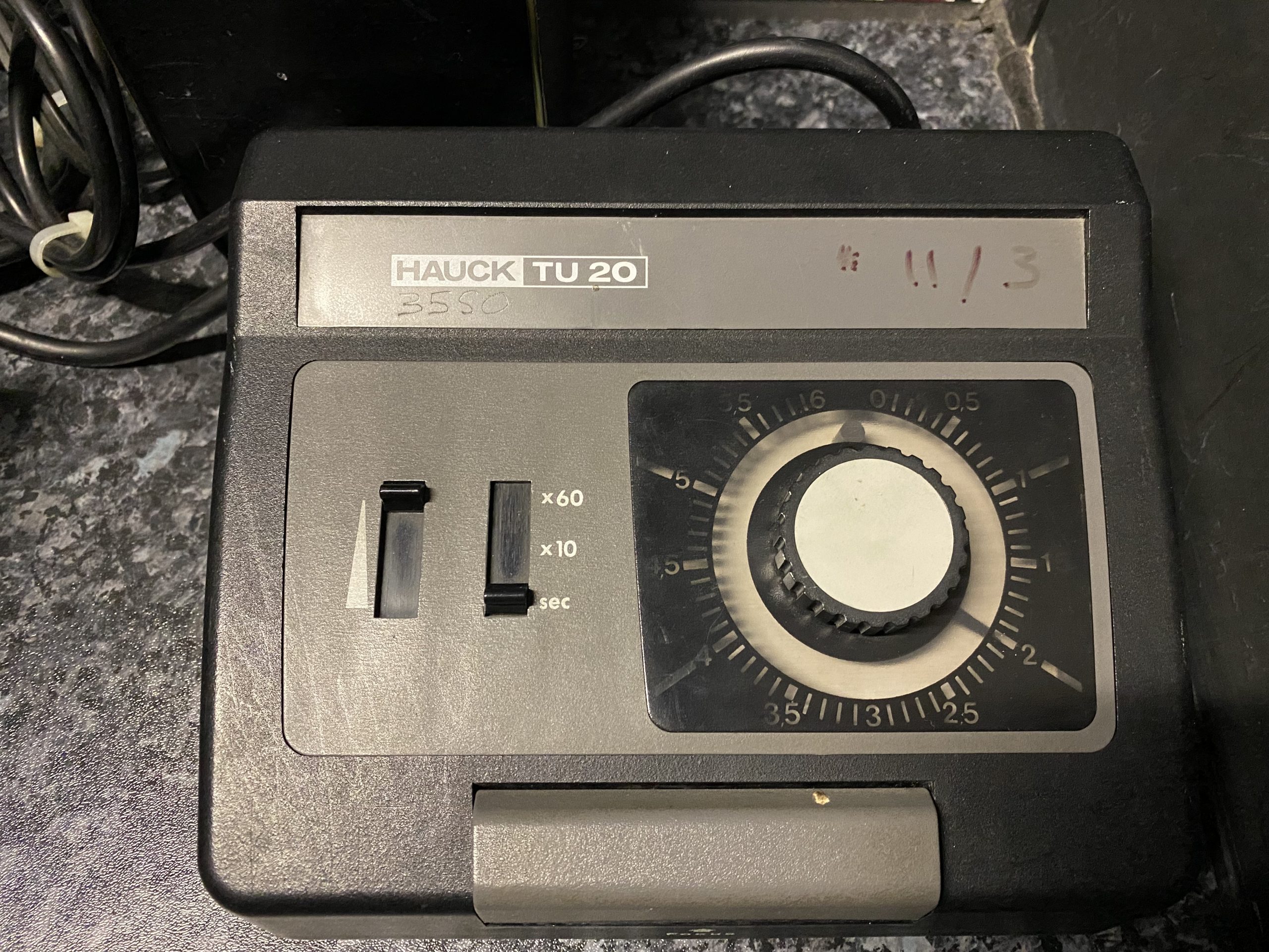
Here we can see the timer unit, the left most control enables a backlight for the timer gauge so it can be altered in the dark. the next slider is marked x60, x10 and sec.
Selecting 2 on the dial knob will time out after 2 seconds with the slider on “sec”, 20 seconds on “x10” and , yes, you guessed it 120 seconds (2 minutes) on the “x60” setting. For a 5 second time you can set it to 0.5 on the dial with a x10 or a 5 on the dial with sec selected.
The grey bar on the front of the timer is the big button you press to begin the timer, which turns on the light for the correct length of time. It can also be lifted up to keep the light on whilst composing and focussing the image.
When the paper is correctly exposed, put it back into the light tight bag, before turning the lights on, checking also that anyone else in the room is ok for this to happen.
ENTER COLENTA
Once you have the paper safe in the bag you can then carry it out to the Colenta Processing Darkroom where you lock the door with the lights extinguished, before taking it from the bag and feeding it into the front end of the machine, with the emulsion face down. Opening the door now or turning the light on might still cause some incorrect exposure to the paper so you must wait until the beep can be heard from the machine, after around 15 seconds. Then you can go around to the back end of the machine and wait for the print to traverse through all of the tanks of chemicals and dryers before it pops out of the top of the machine, fully dry and ready to hang on a gallery wall.
ASSESS PRINT
The next step is to assess the print in the light and check the colour balance is correct, if there is a colour cast on the image it will appear obviously and then after consulting the chart on the wall in the Colenta room you can select the adjustments required to improve the next print.
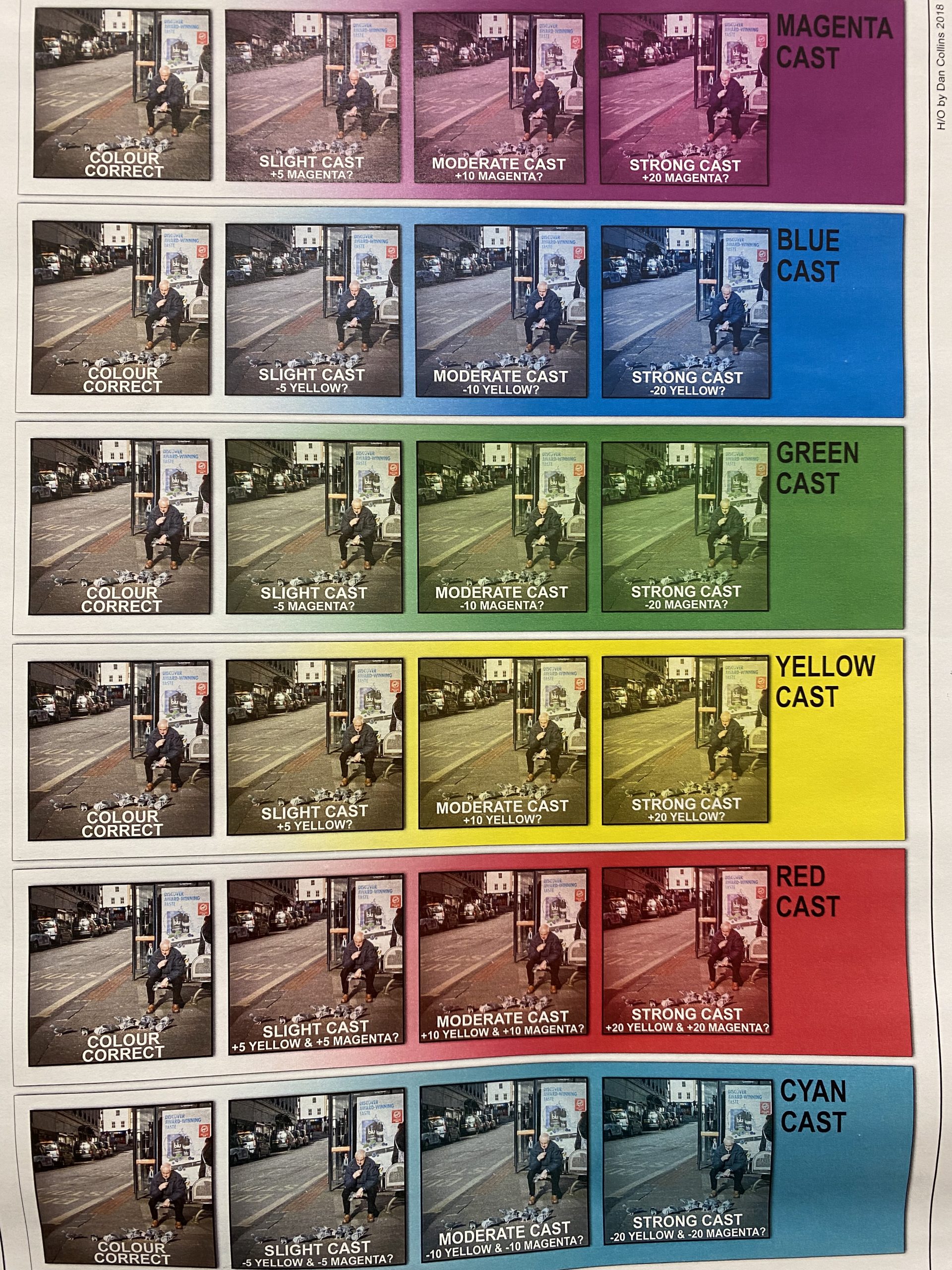
Here you can see that if there is a Strong Blue cast to your printed image, you should decrease the Yellow filter by 20 for the next attempt. Hence the settings for the enlarger would be Y 30, M 50, C 0.
This reduces the effect of the filter and allows more yellow light to hit the negative and paper.
If there is a Cyan cast to the image, rather counter-intuitively you do not adjust cyan, but the yellow and magenta should be subtracted by 20 each leaving the filters set at Y30, M30, C0 (if starting from 50,50,0)
Next it was time to try it for real ourselves, but we would be producing test strips so that we don’t waste an entire piece of 10×8 paper per exposure.
TEST STRIP PRODUCTION
Test Strips are exposed similarly to the full page as discussed above but we’re experimenting to try and figure out the correct length of time to expose and the filter settings for the combination of the enlarger, negative and paper. It might require different settings for every print you produce.
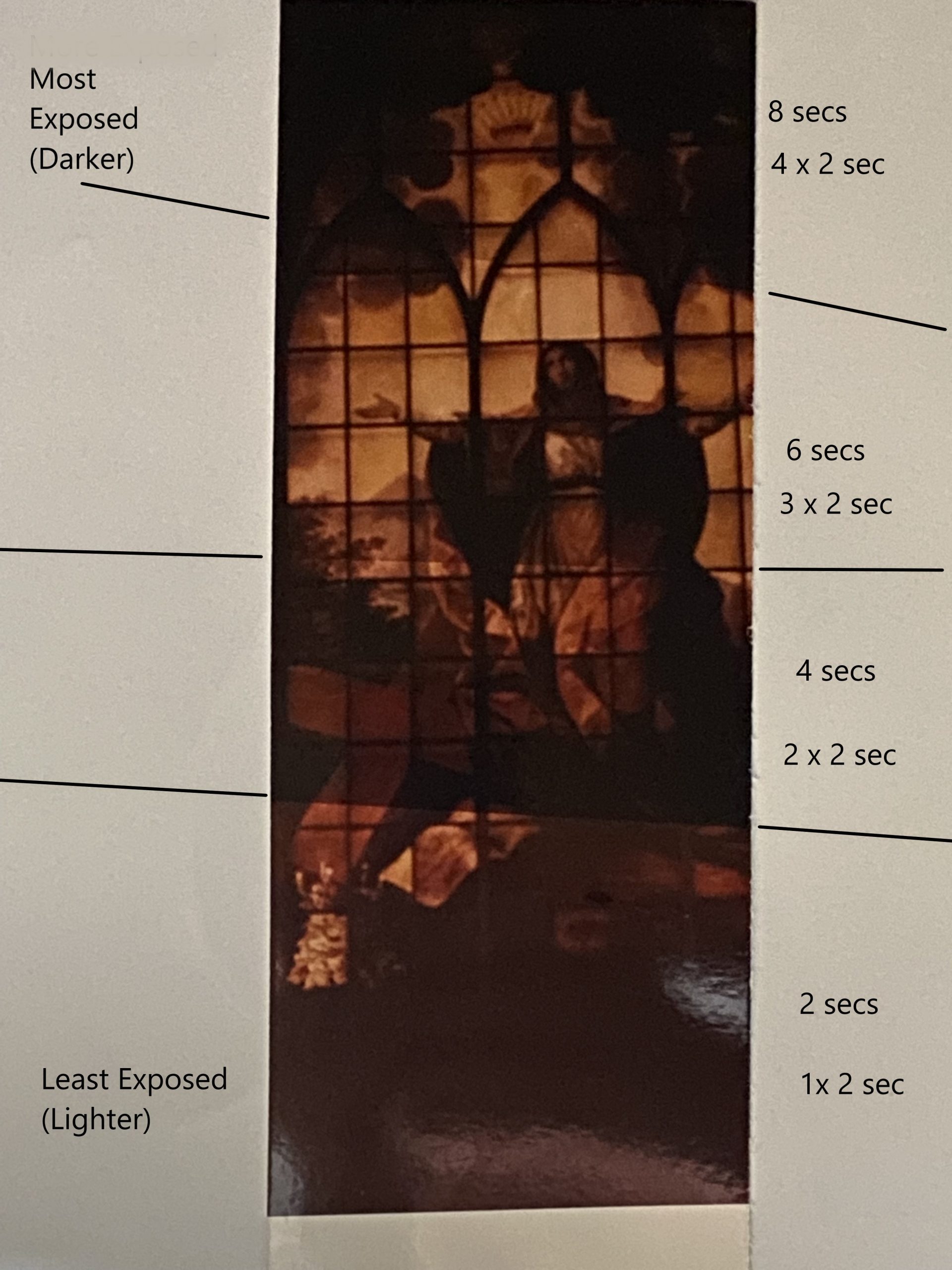
The way this is done is to cut the 10×8 into narrower strips and place it, emulsion side up, on the easel ready for exposing under the composed and focused image. Before, however, one presses the timer, a piece of card is utilised to cover three quarters of the strip and start the timer, once it’s completed it’s 2 seconds in this case, then you uncover another quarter, leaving a quarter already exposed and another about to be exposed, whilst the the other two quarters are covered. Another 2 seconds on the timer and then repeat the process of moving the card to allow only the final quarter to be covered. The three quarters that have been uncovered have now been exposed to 6, 4 and 2 seconds of light. Uncovering the final part of the strip allows that section to receive two seconds of exposure, whilst the other three quarters have now seen 8, 6 and 4 seconds respectively.
The iPhone photo of the test strip print created on my third time around shows the divisions and whilst they’re not truly square or quarters, it is possible to see the lines of difference. For ease I have illustrated with black lines the divisions. The reason behind them being unequal and not straight is that you must uncover with a card in complete darkness and do it all by feel and spacial awareness. It’s far from easy.
It seems that a lot of processing of films and prints is counter intuitive and it was tricky to get my head around the lighter part of the print being the least exposed part. It’s obvious really, as the paper is white, and it would be a similar result if you held a gas torch on the paper for longer, it would obviously be more burnt if held on for longer.. (Don’t try that at home or in the lab)
THE FIRST TEST
It was now time to create my test strips off my negative. I set the LPL Enlarger to Y50,M50,C0 and focussed an image of a series of traffic bollards upon the easel. I tried the focus finder but couldn’t see what I should have been seeing. I’ve since learnt that the black line in the viewfinder needs to be sharp, and you should then see the grain of the negative on the plane.
Lights went out, the door was locked, and I fished in my bag for a strip of paper then sealed the bag and shut the drawer. I placed my test strip, emulsion (shiny) side up, in between the rulers so it was held down at an angle across the image.
Jack, the lecturer, suggested a initial experiment of 5,10,15 and 20 seconds divisions so I used my pad of A4 to cover the first three quarters and set the timer off doing a five second exposure. I clumsily moved my pad to uncover the second quarter and repeated until I had done the operation four times.
The paper was lifted off the easel and put back into the bag, carefully placing it emulsion side opposite to the others in the bag, so I’d be able to distinguish it once in the other dark room. Locking the door in the dark room attached to the Colenta I reached into the bag and found the right strip ( I thought), then fed it in emulsion side down, into the rollers that start pulling it in automatically.
After 15 seconds a loud beep sounded and I was then able to exit the room and await the results. Whilst it was underwhelming, see below, it was practically a masterpiece compared to others who’d made some errors in the process. One had opened his bag in the light by mistake and others had selected the wrong test strip from their bags, and ended up with completely black or white strips.
Test Strip #1
You can see from the left most image that the top of it is very dark at 20 secs going down to the lowest section (which is tiny) that was exposed to five seconds of light. Whilst this 5 secs looks a good length of time to expose, there was a very heavy red cast to it, so Jack suggested I consult the sheet that Dan the Technician created, and it suggested that I add 20 to Magenta and Yellow filters. Jack advised that I should probably add 30 to each, so the filters for test strip #2 should be Y80,M80,C0.
Test Strip #2
After repeating the exercise with the increased filtering, reduced strength of magenta and yellow light, I took my paper into the Colenta Darkroom, waited for the beep and exited. Whilst I was being patient, others also inserted their prints into the machine in the dark and joined me waiting. Some prints came out but none of them were recognisable as the image that this test strip was based on. A blank white strip did come out and someone else picked it up thinking they’d made an error, I suspect now that this blank strip was mine. My logic is that I didn’t remember consciously placing it emulsion side up on the easel so it would have not been exposed and thus stayed white. Doh! Lesson learnt, check the emulsion direction….
Below, you can see a print of the road bollards, I had done at Jessops when getting colour film developed. I figured that it might come in handy, maybe it’s cheating like looking at the box lid when doing a jigsaw but I found it useful.
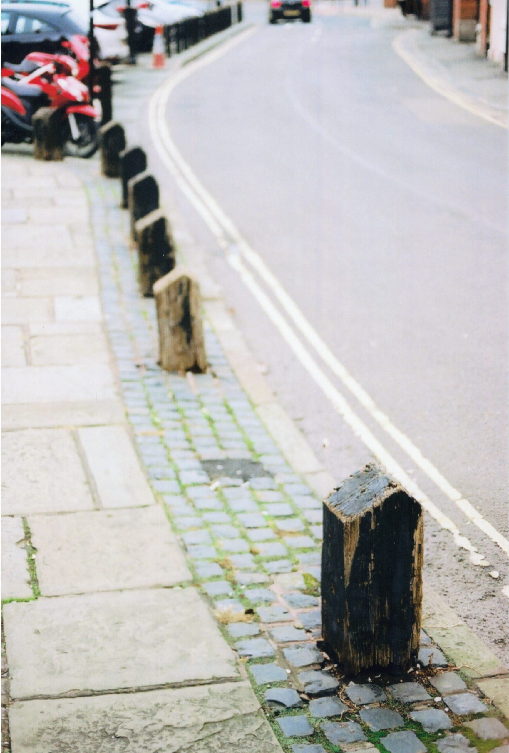
You can see the corresponding double yellows and cobblestones that appear in test strip #1 above.
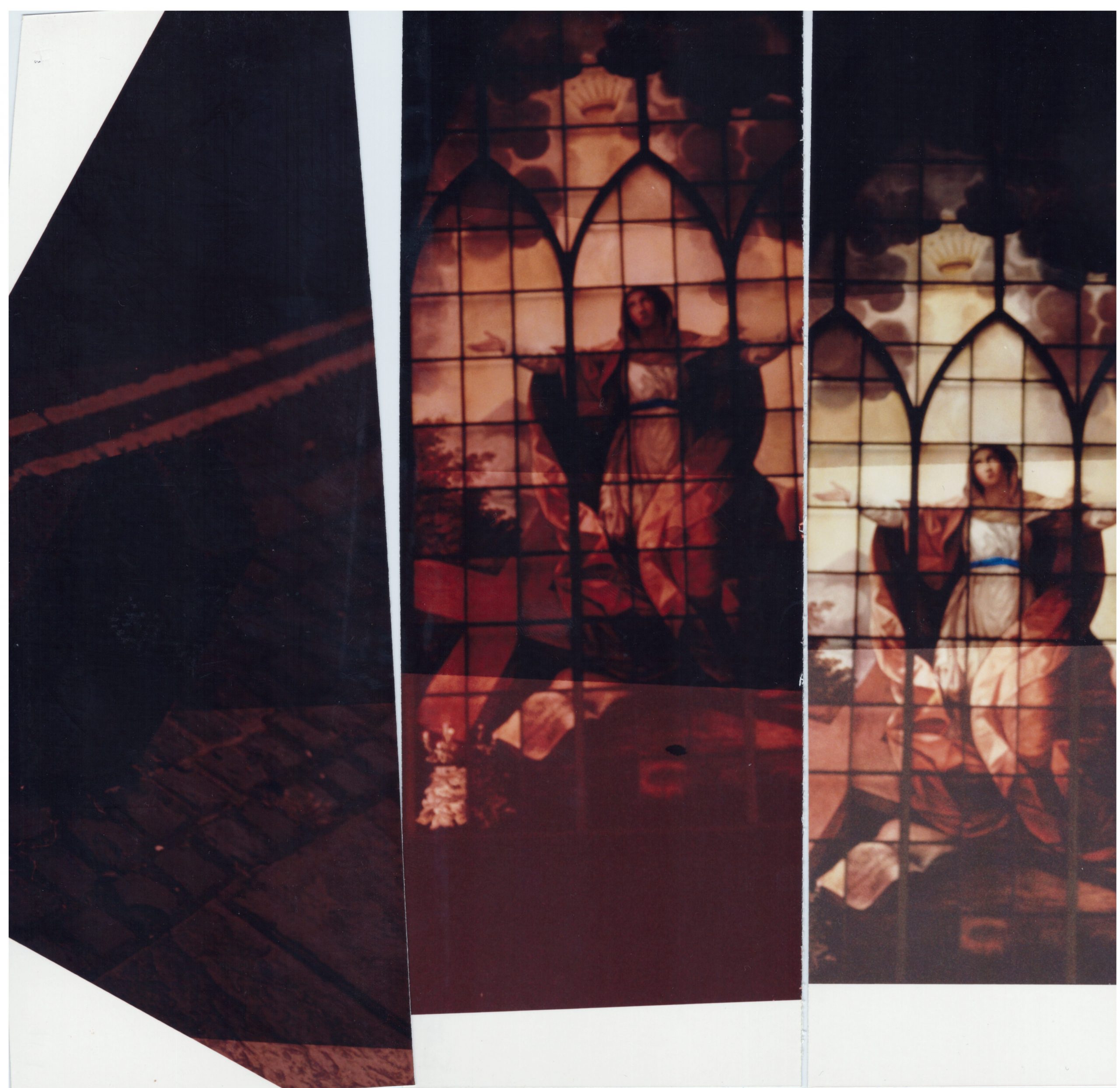
Test Strip #3
After the failure of #2 I figured I’d change things up and chose a negative depicting a stained glass window from St Alkmunds Church, Shrewsbury to work on next.
I composed the image on the easel, checked focus and tried the focus finder again, still no success at seeing the grain but it looked ok to my eye, with my glasses on.
Rather than putting the test strip on at an angle I figure out that I’d clamp the bottom of the strip under the ruler and move my book in as straight a line back over it with each exposure as I could. The filters were reset to 50,50,0 again as I was starting on a new negative, but looking at the heavy red cast produced after picking it up from the COlenta machine, I could have left it 80,80,0. It was suggested by the lecturer that test strip #1 was too dark so I should change the timer to 2 sec exposures on this third effort.
Test Strip #4
As you can see, I altered the filters to 80,80,0 and ran the 2 second timer again the third exposure down of 4 seconds seems to have been the best of the rest (2,4,6 and 8). The blue colour of the belt, the colour of the robes and window in the rear seem more natural. I think if I was to do a full print of this image this is the settings I’d use.
4 seconds exposure, f/8, Y80/M80/C0 for Portra 400 Film on Fujifilm Crystal Archive Paper On LPL Enlarger B2
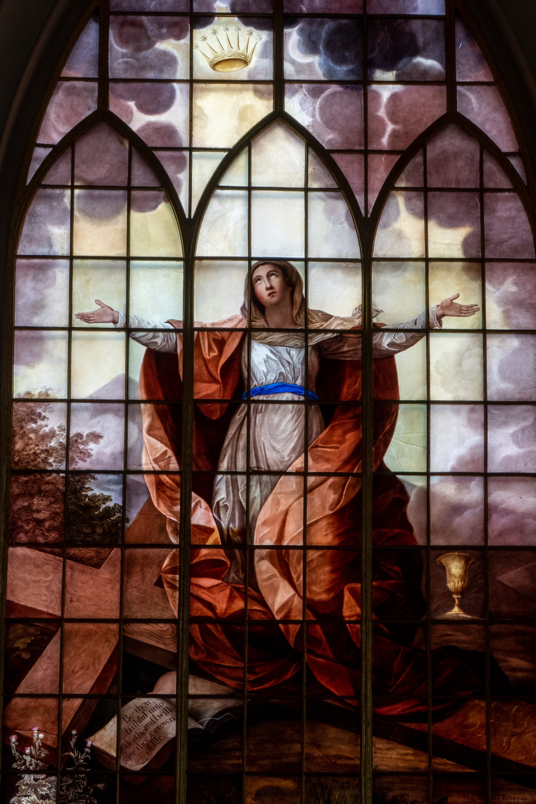
As you can see from the below image, another print from jessops, it is close to the 4 seconds under the 80/80/0 for test strip #4. It’s not a brilliant image here, as I scanned on a Xerox scanner at 600dpi from a glossy print so it’s a bit pants, but gives an idea of a “normal” print.
TECHNICAL SETTINGS
| Negative | Y | M | C | Times | Comment |
| #1 Bollards | 50 | 50 | 0 | 5,10,15,20 | Too Red, heavy cast. Diagram says to add 20 to M and Y but Jack said add 30 to each. Not equal sections and the best image was around 5 seconds |
| #2 Bollards | 80 | 80 | 0 | 5,10,15,20 | I think I exposed the paper test strip emulsion side down, hence blank strip. Someone else picked it up. |
| #3 Church Window | 50 | 50 | 0 | 2,4,6,8 | Very Heavy Red Cast again, next one to alter to 80/80/0 on Y and M |
| #4 Church Window | 80 | 80 | 0 | 2,4,6,8 | Much better and more accurate colour on six seconds |
SUMMARY
Overall then, this is a tricky process, using clever physics to balance out the colours correctly, and the fiddly nature of doing almost every important step in total darkness.
It was very rewarding to see the result of the 4 seconds exposure on test strip #4 but a digital camera photo taken at the same time, on a Canon G7X Mk II, was able to instantly give me this below image on it’s LCD screen and then on my larger monitor when imported into lightroom.
I’m fascinated to learn more about Colour film photography and processing, as I love to understand why processes work and how they can be altered to provide varied results and what can go wrong.
Next week we’ll be doing some more prints in the darkroom, but I’ll hopefully have a few more negatives to work from too.
Thanks for reading parts of this super-long entry. You deserve a medal..
Be First to Comment