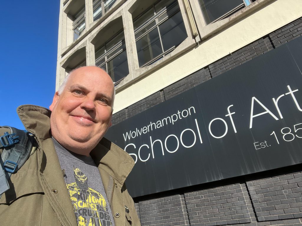
Friday of welcome week meant a trip over to Wolverhampton and on my journey up the M54 I missed the junction and then ended up on the M6. I was listening to Chris Mason on the radio talking about the mini budget and wasn’t focused on getting to where I needed to be.
After a diversion off the M6 into the city centre I found a parking spot and walked into the School Of Art Building’s reception and had a chat with a couple of students on my course before heading down to the basement for the morning’s session.
The Basement
Alice was there and asked us to talk in small groups about the feelings and emotions that we’d experienced in this welcome week. I sat talking to Emma, Brian, Shellie and Kyle about some of the words that we felt over the last four days.
After the 10 minutes of chat Alice brought us together to discuss the words that we chose and then set another task to think about colours that these emotions bring to mind. This is a follow up to the colour task we did on Tuesday, which can be seen in my previous post, so we had another chat and only managed to get two of the words in and also no real apparent single answer on which colour should represent each word.
We discussed the word Apprehension and one member of the group felt like it could be represented by a grey colour, another thinking of. asickly green whilst my thought of apprehension bought an Amber to mind. The Amber of a traffic light which means to me that the situation is changing and the next light that pops on is either a Red for stop or a Green for Go.
Nervous was the second word we managed to fit in and this was a weird mix of colours. Green, Bluey Green, Bluey Purple, Orange and Machine Gun Grey were all mentioned as an indicator of the word content.
It strikes me as a purely logical thing to happen, everyone’s perception of events and emotions is different, their history, past experiences and impressions shaping each and every micro-decision that goes into judging how something makes you feel. It’s the reason why art is a very subjective thing to everyone, some love an artwork, some think it’s pointless whilst others see both sides of the argument and all of the spectrum of perceptions in the middle.
Using Colour To Direct The Viewer
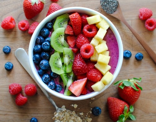
We were shown photos by artists and the first one was of a fruit bowl image with a very fruity breakfast pictured. Obviously by an Instagram photographer or advertising photographer to sell the fruit, or make people consider their 5-a-day requirements. The colours were complementary of each other and the layout was very designed, which I found to be quite uncomfortable to look at. A usual photo of a bowl of breakfast cereal has everything mixed up but this was set out with kiwi fruit in a straight line, blueberries in a straight line next to them etc. Kyle pointed out that this may have been done to catch the eye and make you pause for a second glance on the subject, exactly what an advert is supposed to do. Great point.
Alice showed us some images to discuss and then finally showed us an image called “The Bogeyman” by Duane Michals. It’s a single frame from a sequence and it showed a little girl reading a book and then looking at a spooky coat and hat on a stand. The darkness and mood of the shot was very eerie and the fact that it was monochrome meant that colours could only have been shades of black and white. `the composition was also important and I felt that this was a super creepy image. Looking at the whole sequence now is even worse. It means that Colour don’t have be the thing that makes an image but can be left out completely to provide another type of mood.
Colour Photo Challenge
What we’d been working to this morning had all led up to the next challenge.
Create a self portrait using a strong emphasis on colour that shows one of the emotions that were experienced in the Welcome Week. A self portrait, it was pointed out, does not need to have your face in it, it can be a representation of you or characteristics of your self.
We had 10 mins to to plan the shoot, using sketches, diagrams, notes, lists etc. Work out Location, Facial Expressions, Body language and how to introduce the colour into the shot, then get it uploaded to Padlet by 1pm.
I began making notes in my book and the emotion I considered was Change, or embracing change that comes with switching from my introductory year into the second year of six. Changing into a group of people I’ve never met before and just getting on with it, driving forward at full speed.
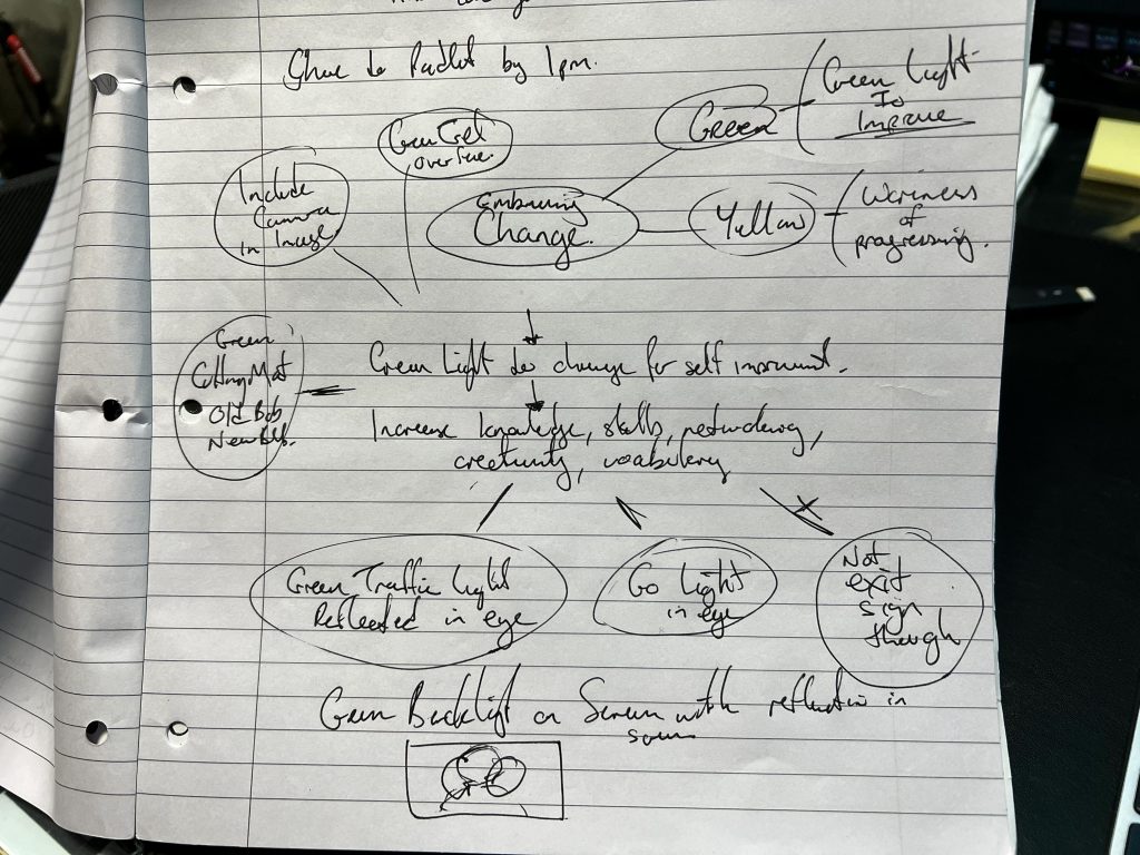
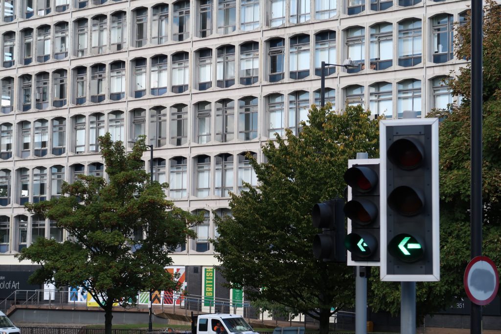
My initial thought on the colour of change, wow I just realised that was the title of a brief from last year., was the colour green. The green colour of a light meant GO whether it’s on a pedestrian crossing or traffic light, and emergency exit sign is green but I felt that would have a different connotation, like “Let’s get the hell outta here” type of vibe.
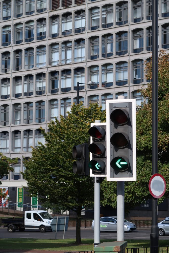
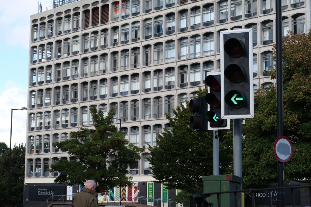
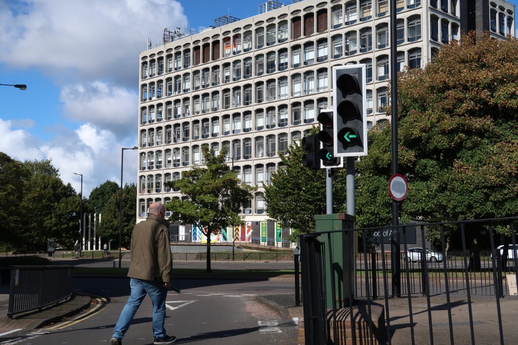
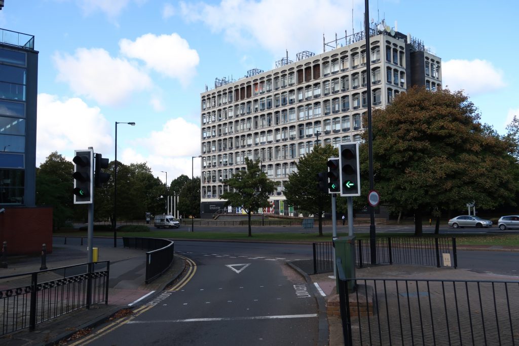
Little Green Man
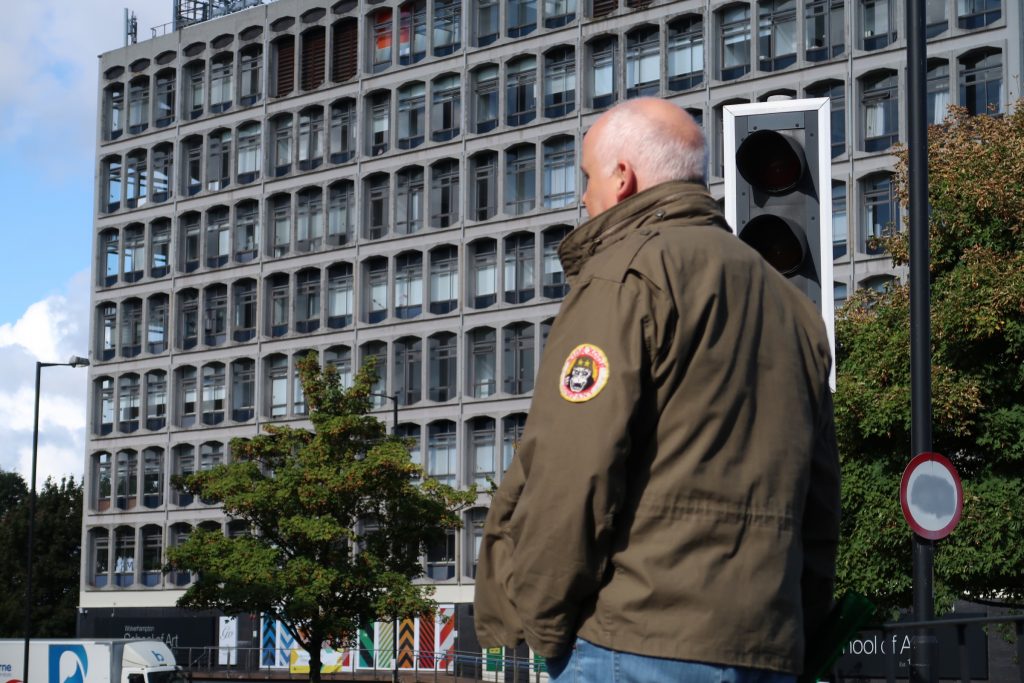
I headed off out to the traffic lights outside the Art Building and set up my little Canon G7X II up on a bollard and started taking pictures of the traffic lights. One of my ideas was to have a green light reflecting in a close up of my eye but this wasn’t possible without fetching a step ladder out to the traffic lights. I tried a few different shots, from straight into traffic lights, to walking down the slip road on a green light towards the Art Building but none of them seemed right. I even missed a few shots as the 10 second self timer meant by the time the shot was taken I’d had to jump out of the road to avoid a car…
The photo I chose to upload to Padlet can be seen below but I’m disappointed that, now I can see it on a screen larger than my phone, that it’s blurred. The focus was locked on the lamp post in the centre of the frame but I was trying to focus purely on the green man walking symbol.
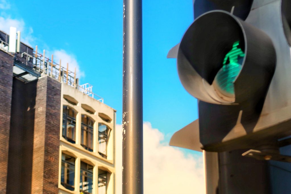
I edited it only a small amount in Snapseed on my phone as I could only transfer it from my camera to my phone to play with. The SD Card I had in the camera wasn’t recognised in the Mac in the basement or I would have spotted the issue.
We discussed each other’s photos and Alice and my coursemates read my image pretty spot on.
It’s about giving myself the green light to go and get on with the course in the distinctive Art Building of the university. The green man is me, it’s got permission to be more selfish and spending time on pursuing the course that I’m interested in. The pole in the centre of the shot could be seen as a barrier that I need to overcome and get past in order to get on with the course. The green is kind of on the junction of thirds in the top right of the shot and the blue sky helped with the overall mood that people picked up on of being happy that I’m going to continue my journey across this road.
The others on the course had also taken some fantastic images:
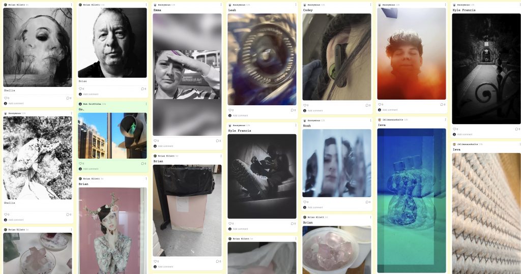
I loved them all but the one that got to me the most was Noah’s photo of himself from the inside of a glass jar. The cold blue colour of it and the fractured appearance was quite an arresting image. All done whilst he was still in the same room.
Tour De Farce
Once we had discussed the images we were sent off for our lunch to return to the Art Building Reception at 2pm when we would then be sent around the other art departments in the MK Building and find out what they’d been up to during this induction week.
We went up to the sixth floor and found a room with some fine art students in with their lecturer Gavin and a little yellow dog.
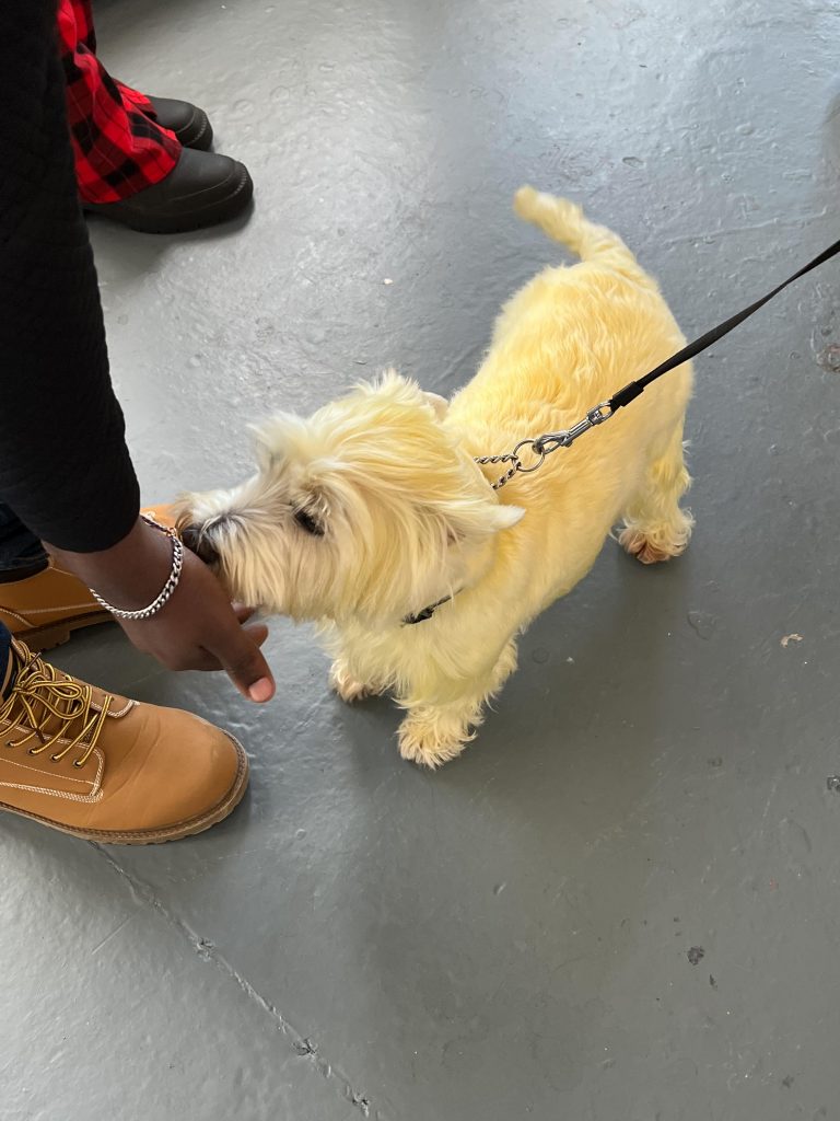
We listened as they were discussing their output from the week and the yellow dog was once white but had been coloured differently to alter perception of it. Another couple of students had used the colour cues given to them and made a lot of great work from redesigned Kaleidoscopes, OHP movable films and a mobile of photos of flowers and ink drips. It was great to see how this idea had evolved organically over the week.
Another couple showed us their work which was a tree branch dressed up with bits of old broken CDs as their rain along with the other elements in the work. These element were based on their grey and green tones that they’d been working with. They also employed some sonic art in the form of a rain sound playing from the phone.
Illustrators Anonymous
Once we photographers had left the artists to it we wandered to the 3rd floor and the Illustration and Design dept where they gave us short shrift and told us they were doing presentations and to leave them alone.
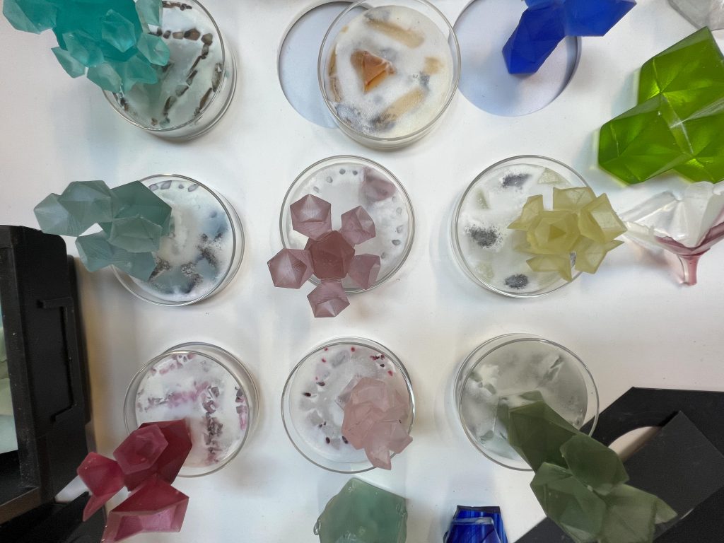
Glass & Ceramics
Down then to the ground floor and the ceramics and glass area there were some great pieces of work that had been produced so we all had a look at these, but there were no students or staff around to discuss it with.
After a group chat in this area we watched a shortened version of 4’33” by John Cage which is a silent musical composition. Emma showed us it on Youtube and we discussed how it appears to be making a mockery of art and music but at the same time it was saying that without silence the music would not be so special. We had a chat about this for ten minutes before we headed out the door and home or accomodation for the weekend and a return to the building on Tuesday for the groups first workshops session and then my first Tutorial and discussion on the afternoon. I don’t need to be there for the workshops as I did these last year as part of the Media and Methods module.
Next Week
I am looking forward to going back on Tuesday to find out exactly what my year will consist of and can hardly wait. I’ll be heading over in the morning with my work laptop too so that I can do work work in the library and then Uni work in the afternoon. Then on Friday it’ll be the first seminar/lecture where we find out about the contextual work that we’ll be needing to complete this year.
With the cohort of fellow students this year, there appear to be no students looking for an easy way through to a degree, as far as I can tell. Most of them seem to be taking it super seriously and getting involved as much as they can, sure there might be a couple of shy students but this is ok too. That’s the good thing about the art community at Wolves, they understand and help everyone to be comfortable.
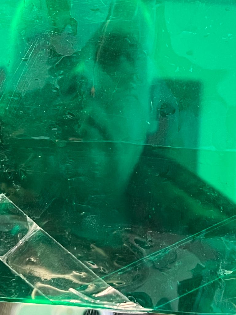
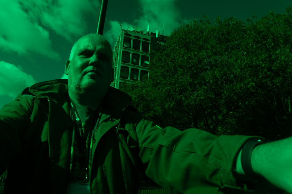
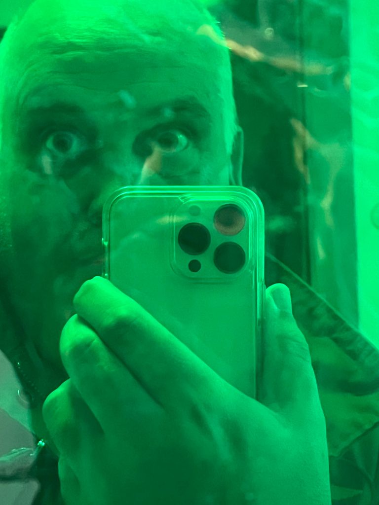
Here are some of the other photos I took today for the Self Portrait with the colour green playing. a prominent role to represent Change and accepting nay embracing change.
Be First to Comment