7th October 2022
Padlet Review
Review of the images that we’d submitted for the selection of a Szarkowski Approach. Mine were uploaded to Padlet for the “Time” approach which saw me walking around town on a wet Saturday evening. This can be read about here on another post.
As we shared our images with the group and discussed each other’s photos as to whether we thought the photographer had been aiming for a Time, Vantage Point approach etc.
It turns out that the interpretation of the photograph is incredibly subjective, with some images being thought of as up to four different approaches. Not a real surprise as we are all aware of how subjective photographs and art in general can be. Some people like a piece of art and some dislike it.
Alice explained how Szarkowski was criticised for his views on the five approaches documented in The Photographers Eye. He was particularly mocked for Time because all photographs consist of time, each image takes a finite time to capture whether it’s 1/1000th of a second or 20 hours, they’re still time constrained. Frame was also criticised as every photograph ever produced has a frame, what’s in or out of the image. Sometimes it’s by design and sometimes it’s purely limited to location and conditions etc but it still counts as a frame.
We also discussed that often what we bring to a photograph as a viewer colours our perception of the contents of the image. What the viewer has experienced in their life up until the point of viewing this image will have an effect. I find it to be the same with movies and when you have a personal experience of a subject documented in a film it often hits home more and can create some pre-judgement of what is happening.
Semiotic Seminar
We were shown a PowerPoint slide set about Semiotics and how they are classed as signs and symbols used to add meaning in a picture, be it a painting or photograph.
Daniel Chandler wrote in The Basics, “Anything can be a sign as long as someone interprets it as signifying something” There are classically three types of sign that can be used in Semiotics.
ICON
Relating to or having the characteristics of something or someone. A photograph of a dog looks like a dog but it is not a dog.
INDEX
This is something in an image that shows evidence of something being represented. Smoke in a photo signifies a previous fire, a puddle likewise signifies it’s rained prior.
SYMBOL
Symbols in images have no inherent meaning, a Red Traffic light means Stop to anyone whose had driving tuition. But a red light wouldn’t mean stop to someone who has never seen driving or traffic control. Numbers and letters are similar, a number 8 in Chinese culture is a lucky number, 13 an unlucky number in the West but this is learnt meaning and not something that is universally known or a thing that people are born with.
We watched a video by The Media Insider channel on YouTube called “Semiotics Theory In Under 1 Minute Semiotics theory in under 1 minute! Media studies revision #shorts
In the video it’s mentioned that Roland Barthes was interested in the study of signs and believes that signs can “Denote” and “Connote“
If you include an apple in an image, it Denotes that it is an apple, it’s a description of an apple. But it connotes other things, like health, doctors, Adam & Eve, Temptation, Newton etc.
This is where Connotations is rooted from, i.e. if I said something vague in a work meeting the connotations could be something different for different people in the meeting.
Connotes are indeed different for people with different backgrounds, cultures, educations etc they can be interpreted differently.
Looking For Clues
Analysing Images relies on thinking of the following questions when faced with a photo/painting etc.
WHAT? What is in the picture, items, clothing, weather, facial expressions, body posture, positions
WHO? Who is in the image, what is it about the subject that’s worth noting?
WHY? Why has this image been made, photo taken? Is there an obvious message that the photographer is trying to get across?
HOW? How was the image made? Is it film, digital, alternative process etc? Could be that the process used means something also.
WHEN? When was the image made? Was there something happening in that area at that time that is relevant, a social movement, war, unrest, party?
WHERE? The location of the image is important too, if it can be discerned. It helps with tying down any relevance to dates and also if there are any rules/laws/customs specific to the location. Inside/Outside, studio, house etc?
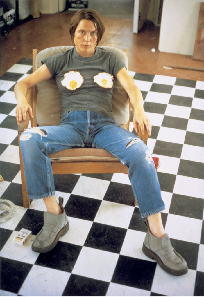
First Practice
Alice showed us an image and asked us to analyse it using the methods we’d just learned. The image was of an androgynous person sitting on a chair with fried eggs on their chest.
WHAT?
- Androgynous person sat in chair
- Lounge style chair, relaxing.
- Ripped jeans, plain top, heavy looking shoes.
- Fried Eggs where breasts are to be found usually.
- B&W Chequered floor
- Body posture is relaxed manspreading
- Face looks confrontational
- Pack of cigarettes and ashtray on floor
WHO?
- Androgynous person
- Looks like a female to me
- Looks like a friend of photographer
- Owner of apartment space or visitor
- Posture looks relaxed and masculine
- Facial attitude looks confrontational.
- Hair could be masculine or feminine hairstyle.
WHY?
- Fashion Shoot For Jeans?
- Feminist statement on how breasts are regarded?
- To blur the gender of the subject?
HOW?
- Shot on film by look of the image
- Looks hand held, at waist height like a WVF was used
- Natural Lighting
WHEN?
- Daytime
- 70s – 90s
- Maybe feminist movement growing at time
WHERE?
- Looks like an apartment
- Not a studio
- Flooring looks like kitchen area of apartment
Group Discussion
We looked at it as a group and had input into how we interpreted the image and the semiotics involved.
- It was a planned and staged image.
- Flooring is important statement, kitchen, woman’s place etc.
- The attitude of the subject is confrontational and looking to start a fight.
- It’s a very androgynous subject sitting in a masculine fashion on a chair.
- The cigarettes represent recklessness apparently too.
- The fried eggs are a statement about the objectification of women and their sexuality.
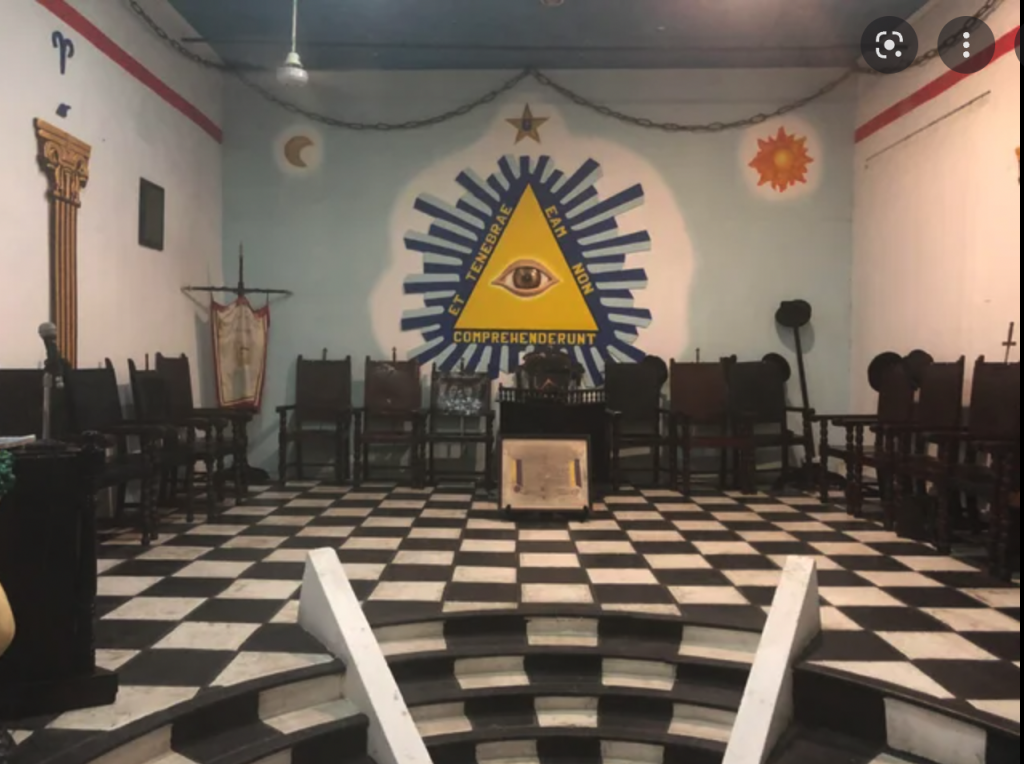
For me, the black and white chequered floor is representative of a Masonic Lodge Temple Floor so it could be an anti-patriarchy message too.
(I’m not in the Freemasons, I’ve just seen inside a temple once, a few years ago)
The image of the person in the chair was Self Portrait with Fried Eggs by Sarah Lucas 1996
Paint Splashes
The next image we were shown was a photo of a road leading to a town in a hilly bit of British countryside. There were paint splashes on the road in the colours of Red, White and Blue.
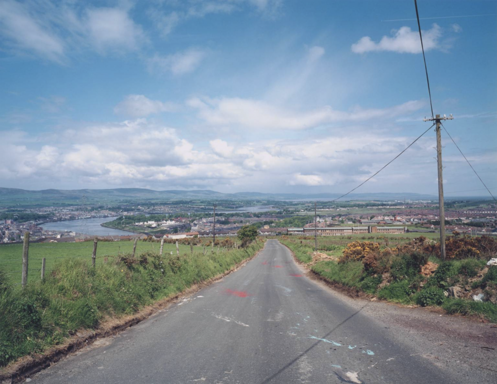
WHAT?
- Red, white and blue paint spilt on road in splashes
- Road downhill towards town and river
- Small power lines at side of road so looks like a rural environment
- Layby at side of road
WHERE?
- Rural Countryside
- In the middle of a road
- Above a town like a military observation
- A school or military building in the town below.
- From seeing this image before I know it’s Northern Ireland
WHO?
- A town of people but nobody in the image.
- Is it purposely an empty scene?
WHY?
- Photographer was pointing out paint on road above this town
- Political statement about the troubles and Unionist & Republican politics.
HOW?
- Looks like a film image but could equally be a digital or phone image, depending on the year taken
WHEN?
- With the paint on the road it looks like it was during the troubles in Ireland and Northern Ireland.
- Alice told us that it was a picture called Paint on Road, Gobnascale Estate, Derry by Paul Graham taken in 1985 as part of his Troubled Lands book.
- Graham was criticised at the time for his use of Colour photography when almost everyone else was using black and white.
- Without the colour in these images though it would make less sense to people who didn’t immediately grasp the meaning.
- The Red White and Blue, as well as Orange, White and Green painted onto the kerbstones in Unionist and Republican areas respectively might look the same through a black and white product but could lead to big mistakes in reality.
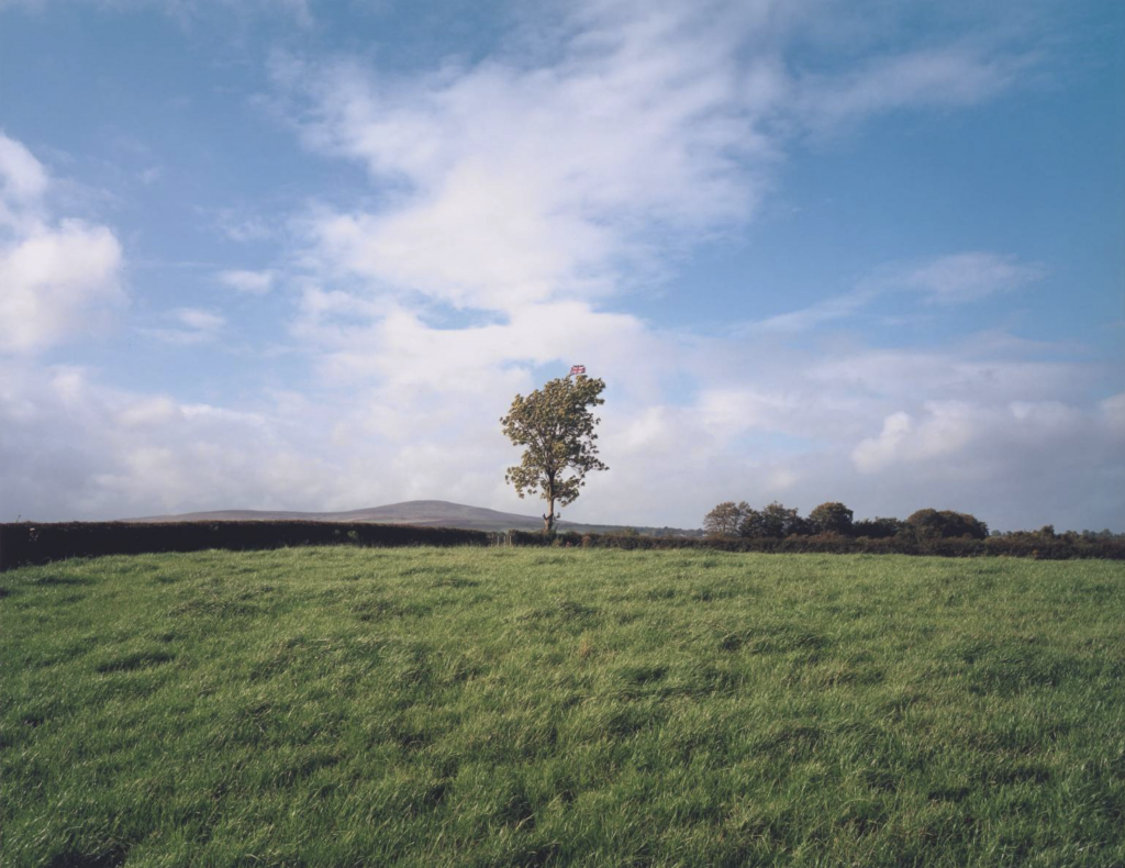
Further Work
Alice then showed us Graham’s Union Jack Flag in Tree, County Tyrone from 1985 which shows us a seemingly simple landscape of one tree against a sky background with some usual fields and hills making it into a typical landscape photo. The detail you might miss is the Union Jack flag at the top of the tree, meaning that this is a territorial statement. It means that if you are a republican you should think twice about coming into this area. Paul Graham is English so was putting his life in danger to take some of these photos.
Bad Boy
Alice then showed us an image like a classic James Dean style portrait.
WHAT?
- Man in leather jacket
- Posed for photo
- Smoking cigarette might be recklessness
- Leather jacket
- Open pockets on coat
- Coiffed hair like a rocker
WHERE?
- Studio or room
- No other information to identify location.
WHO?
- Young man
- Shirt open to show Adam’s apple
- Confused expression.
WHY?
- Looks like a portrait of someone wanting to look like a rocker
- Might be a statement on the person wanting to be someone else
- Could be a headshot for an actor or musician
- Could be an author’s image for a book.
HOW?
- Could be film or digital
- Looks like a film camera
- Studio set up with dark background
- Catchlights look like a flash was used off camera
WHEN?
- Looks like 70s or 80s
- Filter on cigarette means it’s after 50s
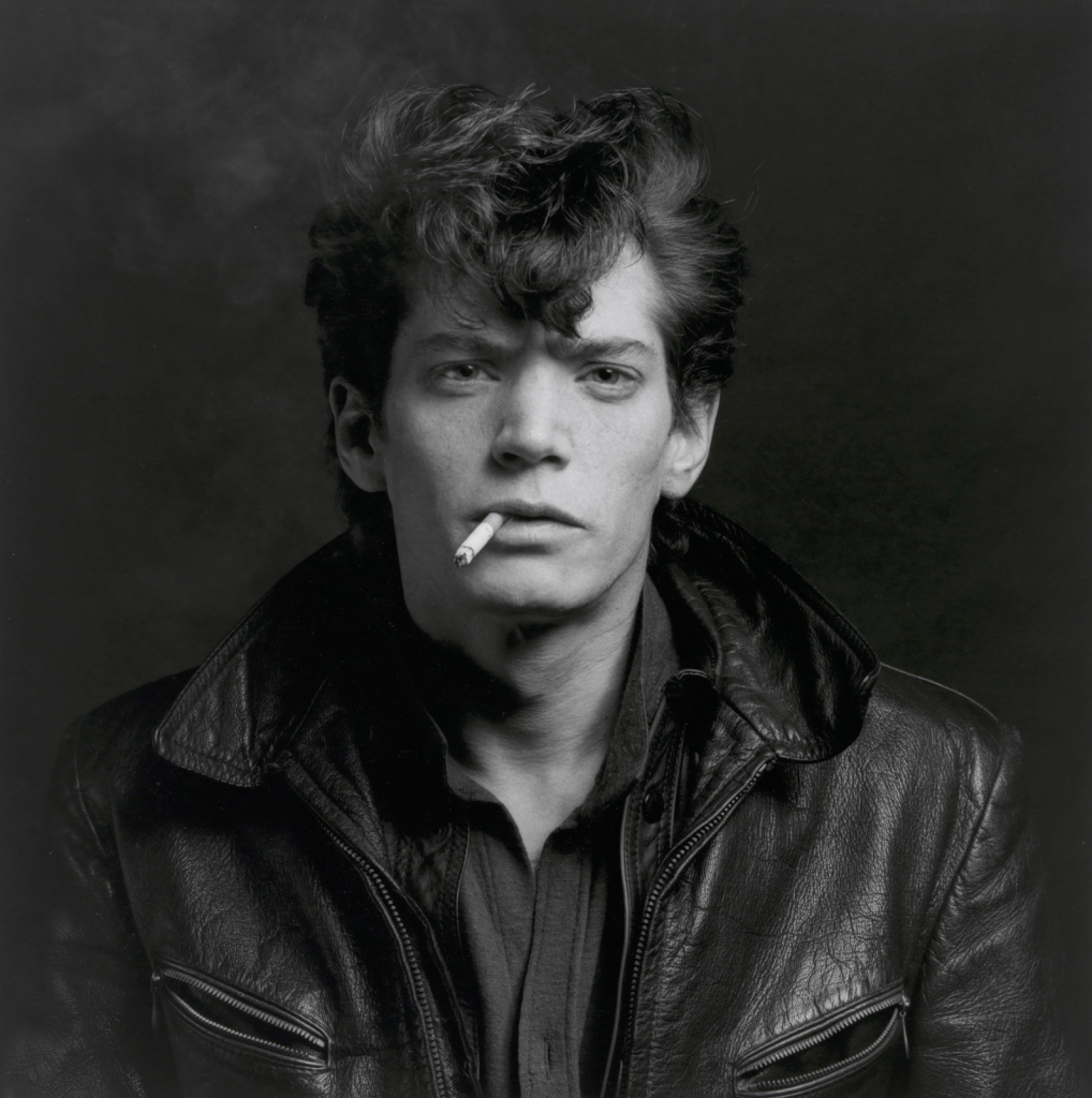
Alice introduced us to the details behind the photo and it is a Self Portrait by Robert Mapplethorpe from 1980
Mapplethorpe wanted to make a picture of himself as an “archetypal bad boy” similar to how James Dean is thought of.
Alice then showed us another Mapplethorpe self portrait from 1980 in which he takes on a different appearance.
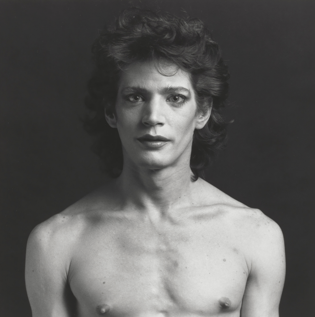
In this image we see him with no shirt exposing his chest and shoulders. He has a very feminine hairstyle and some well applied make up.
With this image if the chest was cropped out it might be tricky to ascertain whether it was a male or female but the juxtaposition of the masculine chest and the feminine face and hair blurs the line between gender identity.
The pair of self portraits invite the viewer to question what attributes are used to decide what makes a person more masculine or feminine.
Library Time
After a short break we popped over to the Harrison Library on the main city campus to be introduced to Tom Hicks who is a librarian with a strong involvement in the arts.
He explained where the books were and how they were laid out on the shelves into Art History, Artists biographies and all of the other books that were there. We went upstairs to the floor above to look a the magazines that were available too.
Tom mentioned that Aperture and British Journal Of Photography are particularly great magazines to read to see other contemporary photographers work to wither inspire or help with direction of projects.
Alice asked us to select a “Monograph” or a book of photos by one photographer to look through and choose a single image to study for semiotics.
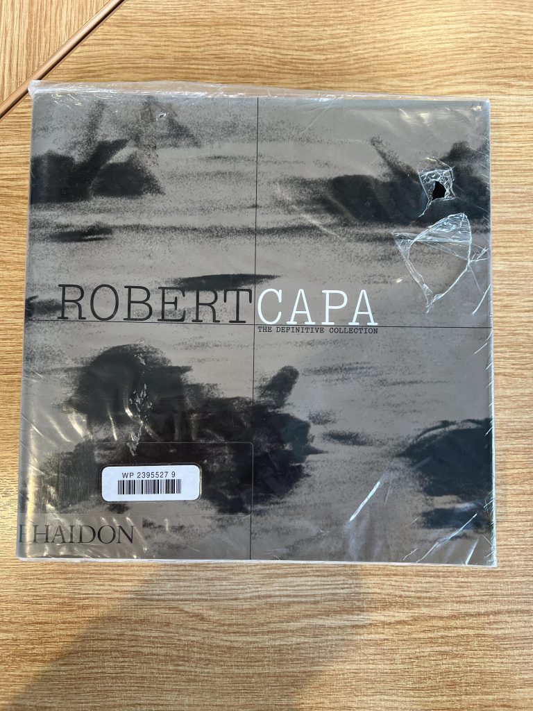
I picked up two books, one was Robert Capa’s monograph The Definitive Edition published by Phaidon and there are some extraordinary images in the book but I felt like it was more difficult to spot semiotics in his images. The problem with Capa’s images that I flicked through, all appeared to be “The Thing Itself” like and not much room for carefully selected semiotics. There were some images where the background contained purposefully placed or framed objects but I wasn’t feeling it.
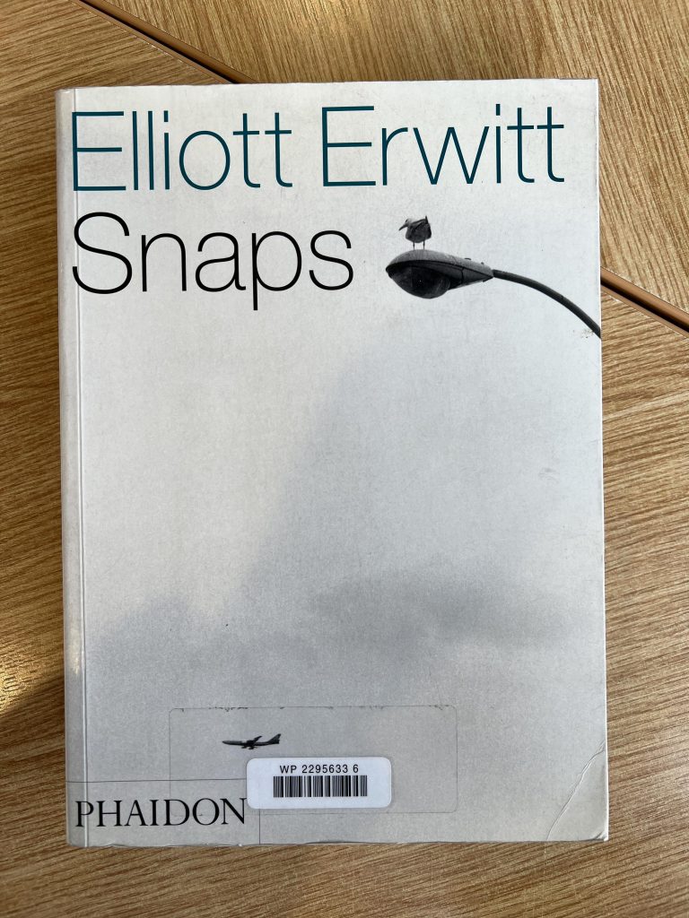
The second book that I was drawn too was Elliott Erwitt Snaps. Erwitt is one of my favourites street photographers and the humour in some of his photos make me smile enormously.
Image Analysis
The image I picked to analyse was Museo Del Prado, By Erwitt in 1995

WHAT?
- Two similar paintings by Francisco De Goya on a wall
- A group of men in front of the nude
- A solo woman in front of the clothed image
- Fence stopping access to the paintings
- Men wearing long coats
- Woman wearing professional close
- Woman standing close to painting
- Men standing further away
- The negative space under the woman viewer creates a lonely figure.
WHERE?
- Museo Del Prado in Madrid, Spain
- Large gallery where both paintings can be seen from anywhere
- Light background and dark floor
- Diamond pattern on floor
WHO?
- Two distinct parties of people
- One solo woman
- Group of men
- Mixture of men
HOW?
- Film camera seems to have been used
- Hand held as you wouldn’t be allowed to use tripod
- Black and white film
WHEN?
- The photo states 1995 so it’s after the third wave of feminism in Spain but before fourth.
- Could be any time of day or evening.
WHY?
- I think this is a humorous capture of the juxtaposition of a large group of men in front of the nude painting making them look like they’re only interested in the naked form of this model.
- The woman standing alone appears to be studying the image of the clothed subject intently and seemingly without sexuality being a component.
- The guys at eh rear of the group have long macks on, similar to that a “Flasher” might stereotypically be portrayed in.
- I don’t think Erwitt is making a politically charged statement about men’s objectification of the woman’s body and that it was just a fortuitous timing that led to this imbalance in viewers. He probably saw it as a funny scene but it could easily be used in a political manner.
Summary
From today’s session in the seminar and library, I learned that although there are some “rules” and “guidelines” on how you can read an image, different people will still interpret the photo using their own experiences, cultural background or education.
To read a photograph and try to calculate what the artist was intending is tricky but for some images it can be immediately obvious, whilst for others it can be almost imperceptible.
With this new found knowledge I will look at images in the newspapers or news articles with a more critical eye to see if there is indeed some nudging as to the direction of what they want you to believe.
I will use the categories to list out the characteristics of the image and then try and work out what the original intention was.
We also know how to use the library correctly and I didn’t know about the magazines upstairs so I’ll definitely have a sit up there when I have a spare 30 mins between lectures or workshops in the future.
Be First to Comment