This week, (Week 11) saw the course leader of Graphic Design head up to talk to us photography students about Typography, as my classmates who are on the Media and Methods module will need to be finishing off their Album Cover project soon. It was noticed that some of them could do with a brief chat with someone in graphics about how to place and select text on their work.
I am not doing the module that this is covered in but I wanted to hang around and see what was covered so I asked if I could and Alice agreed it might be helpful so I stayed.
Typography is the selection of and using of already existing typefaces not designing them, which is something I was not aware of.
Denotation and connotation is part of selecting a typeface, what do we want to tell the viewer of the work and what do we want them to take from it themselves based on their previous experiences.
Subjective in what is understood, objective in what we want to portray.
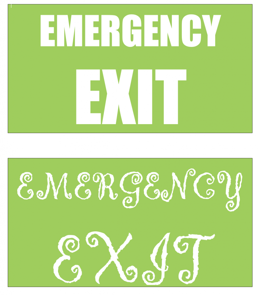
Marc explained the relevance of typeface selection with an example of two signs for an emergency exit, one with a cursive hard to read typeface and the other in big blocky and strong characters. It’s not hard to tell which one is the correct one for the job.
Marc explained the terms size,weight,width and spacing in reference to typefaces and what each of them meant and how their alteration can be done in software to make them more suitable for the task at hand.
“Colour theory doesn’t work”
Marc Austin
Marc explained that Colours have multiple different meanings and it’s the context that is important, he stated that the colours used on a piece of work might mean something totally different to many people, dependant on culture and formative experiences. When Red means luck or love, to someone else it might mean blood and death so three’s no fixed meanings.
He then displayed on screen the following two lines in the typefaces shown.
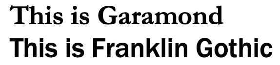
He asked us to ascertain which might be used by the tech companies Microsoft and Apple, as the Garamond typeface is an old classic and more formal looking style, whilst the Franklin style appears sans serif and looks like a young and confident style. In actual fact Apple used the Garamond whilst MS used the Franklin typeface . Apple now use San Francisco Pro whilst MS uses Segoe.
The next piece of advice was to not be too literal and overdo the message. If an album contains a song called Dog or the Band name contains Dog then you don’t need to have a photograph of a dog and the word Dog displayed. It’s redundant to do this, and makes the viewer or potential purchaser feel like you’re dumbing it down for them.
Album Covers
Marc then shared with us some album (and EP) covers for music that he had on his playlist and explained a little about each of the pertinent points as to why the picture/image was selected along with the text displayed on the sleeve.
Suede album picture of lesbian women kissing, cropped from full length picture.
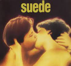
Ambiguity is important to the album, as is Brett Anderson the lead singer of the band. They play with ambiguity all the time and it’s important that the cropped image removes identifying body parts which would clarify this. It’s their eponymous first album so the album title is the same as their band name and appears just once in large lower case characters on the top of the cover.
This next image was on the screen alongside the Suede album
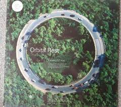
Orbital:rest EP showing picture of ring road that goes nowhere, the band were originally named after the M25 London Orbital motorway. The designers have used the Swiss modern principles of modernism style and the text is carefully laid out on a grid structure that is mostly empty.
Nick Cave & The Bad Seeds, Push the sky away
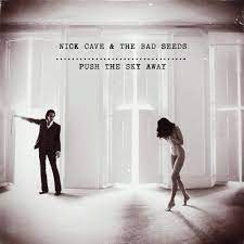
Handmade feel, lo-fi use of the uneven typewriter, the image shows Cave and his then partner seemingly having a row of some sort.
Savages, silence yourself
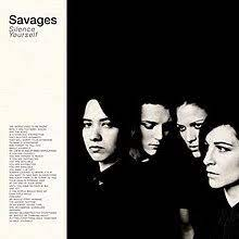
More low key, lack of harmony and eyeline in line with start of song lyrics. Same typeface used across the cover but different families help it to sit together. Not very often that lyrics appear on the front cover of an album either so a bit of a break from the norm.
White stripes de Stijl
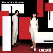
Controlled and formal design style. Jack Black is a student of design and art and chose De Stijl as it is an art movement consisting of Piet Mondrian, Theo van Doesburg among others. De Stijl is Dutch for “The Style” and Marc explained how the image was very carefully designed with on location props and stickers on the album artwork after printing giving a sense of dimensionality to it all.
Chemical brothers, block rockin beats
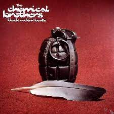
Feather and grenade designed by the “negative space” agency who used found images from images that didn’t make it through to stock websites or unused marketing shots.
We also looked at lots more that I’ll not delve into in this post but needless to say it was very interesting to hear how the decisions might have been made in the design of the covers and I’ll bet it has a big impact on improving some of the work that I’ve seen so far amongst my classmates. Some of the others are listed here in case I want to refer back to them in the future.
- Nirvana, Nevermind
- Nirvana, Bleach
- Yo la tengo, Inside out who used Gregory Crewdson’s image of an Alien Abduction.
- Spiritualized, stop your crying
- Therapy, teethgrinder
- Don’t let him waste your time, Jarvis Cocker
- Sonic youth, dirty boots
- Nick cave, abattoir blues,
- U2, the fly
- Marilyn Manson , Antichrist superstar
- Jam , News of the world
Joan Armatrading, Back to the night album cover was interesting as it shows a backlit photo taken by Clive Arrowsmith of Armatrading.
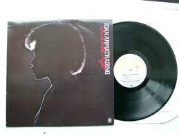
The production of the album was apparently a nightmare to all involved and it was apparent that Armatrading didn’t want to be associated with the album, she was so dissatisfied. The album title and name is featured behind her head as if she has turned her back on it, whilst her name is in a very non-emotive typeface and the name of the album is in red cursive script on a black background to make it tricky to read.
Marc then showed us how the Industry Workflow is set up to produce a cover of an album or book etc.
- Creative direction
- Art direction
- Graphic design and typography
- Photography and illustration
The process means information flows down the hierarchy from top to bottom and is used in book covers and movie posters as well as music covers. It will be more difficult for my classmates who are to produce this as they are working from the bottom up, with no clear guidance on where to start. The band or music genre should provide some guidance as to the direction they should be heading, after all you wouldn’t use a bubble writing font for a death metal band or a script-like typeface for an electronic band unless it was matched to the title of the album.
Fonts
Marc explained about an app for Mac and Windows called Font base that is used to manage fonts on systems. It prevents all fonts being installed all of the time and some can be deactivated to save memory resources on the computer. It also access Google fonts too and provides over 5000 fonts for use.
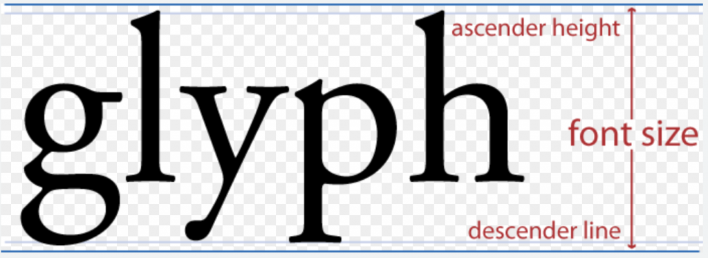
Explanations of the dimensions of a typeface were also very helpfully explained.
Marc explained that there are roughly 3 points to a mm when text is measured in points, i.e. 12 pt
Type is measured from top of block to bottom, ie top of b stroke (Ascender) to bottom of p leg (descender)
Altering the Kerning removes spaces between individual letters. Marc showed us the word LAVENDER and then used the Kerning function in Illustrator to reduce the gap in between the A and the V as well as the other letters. It leads it to looking more stylised and suitable for an album cover or some such application.
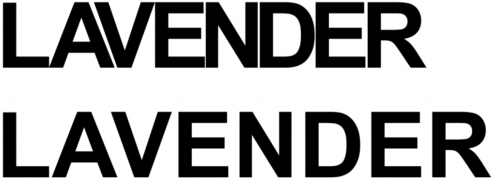
Normal Kerning is ok but can look strange so you can use Auto or even Optical which is supposed to make it more pleasing to the eye. The typeface designers will have originally designed each letter with appropriate kerning depending on what letter it was adjacent to, this is a large amoutn of work and one of the reasons I don’t feel I’d like to go into design of typefaces..
Marc got a bit animated and showed off his pedantry skills at one point when discussing the humble dash.
He explained that people usually use the minus sign or hyphen instead of a proper dash. He then told us that the correct length for a dash is the same width as a lower case m, hence its name EM DASH, the next shortest dash is called the EN DASH as it is the same width as the lowercase n.
EM DASH = —
EN DASH = –
HYPHEN = ‑
After this short interlude I asked him if he was also a fan of the Interrobang which consists of an exclamation mark merged with a question mark to end the sentence asking an exclamatory question. Do you like it? Well, do you ‽
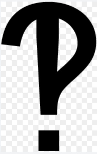
Marc appreciated this question and then explained what an interobang was to the rest of the class. He mentioned afterwards that not many people bring up the interobang to him. I know of it primarily from listening to science and movie related podcasts whilst driving to and from different places. The minutiae and details like this really appeal to my own pedantry.
Conclusion
In conclusion then. for a lecture/seminar I didn’t need to attend I got an awful lot out of it. I’d spoken with Marc earlier in the day and had a brief chat about glitching images and he’d told me he used audio editors and text editors to open up a picture file, move some stuff around and then re-save them. This is definitely something I’ll be looking into further.
His use of typefaces and the reasoning behind some of the decisions made in album covers was logical and it sank in for me so I think I’d refer back to this again as well as know more clearly how to search for related info on the web.
Networking is a term that I usually dislike but just knowing who Marc is and ask him questions in the future should help me if I have issues with any project work that needs graphic design input.
Comments are closed.