This Tuesday saw me spending some time in the colour darkroom, trying to finish off the contact sheets that I started last week and maybe pull a print or two out of the negs available.
I picked up the 120 and 35mm contact printers and B2 Medium Format Colour Enlarger kit so I could use the LPL Enlarger with the 645 Negatives once I’d done the contact sheets.
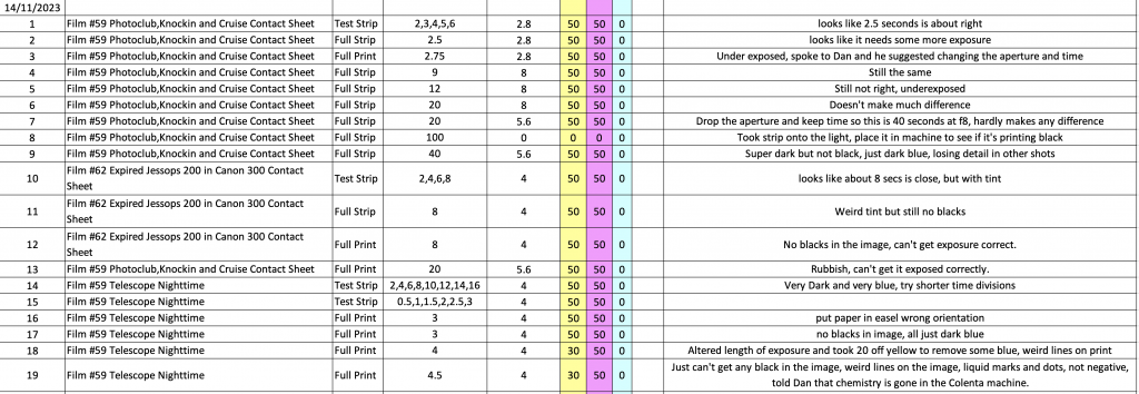
Below you can see my excel spreadsheet for the printing session detailing the film number, the frame number, the aperture setting, the colour filter settings, the time of exposure and some comments on each exposure made.
First Contact
Starting up I put the Film #59 in the 120 contact printer under the enlarger set to f/2.8 and tried a Test strip with 1 second intervals. After the exposure I popped into the dark room that holds the front entrance of the Colenta colour processing machine After it came out it looked like 2.5 was the right sort of exposure so I tried a Full Strip on the same exposure and it was not dark enough so I upped exposure a quarter of a second before trying it next time.
I thought this was ok so I banged in the easel a full sheet of 10×8 Fuji Crystal Archive, Lustre ready to print the whole contact sheet.
As you can see from this contact sheet, the blacks in the image weren’t black enough so I went into the other dark room with the paper cutter to create some test strips from full sheets.
After I’d cut these strips I spoke to Dan and showed him the issues I was seeing and he suggested that I change aperture from 2.8 to 8 and this would allow me to fine tune the exposure without having to operate the enlarger timer by a tiny difference each time. With the aperture set to f/8 it meant that the exposure length changed. 3 seconds at f2.8 becomes 6 seconds at 1 stop down f/4, then 12 seconds at f/5.6 and finally 24 seconds at f/8. I popped in a few full Strips but I hadn’t worked it out correctly so I was underexposing. I change the exposure to be 20 secs at f/5.6 and it hardly made a difference to the exposure of the blacks.
Dan had said earlier that he’d put a full sheet through to see if the black was being processed correctly so I thought I’d take a full strip out into the light then pop it in the colenta to see if it was a solid black. When it came out it looked better than I’d got on my prints but it was still a little bit blue/black instead of full black.
I popped the lower of the two above strips in to the enlarger for 40 seconds at f/5.6 and as you can see it did make it a little darker and more detail and colour were lost, but the blacks were a bit bluey black. At this point I thought I may as well try another film as I was struggling with this one. It was Portra 800 so thought it might be related to that but I jsut couldn’t seem to get anywhere with it.
Cat and Contractors
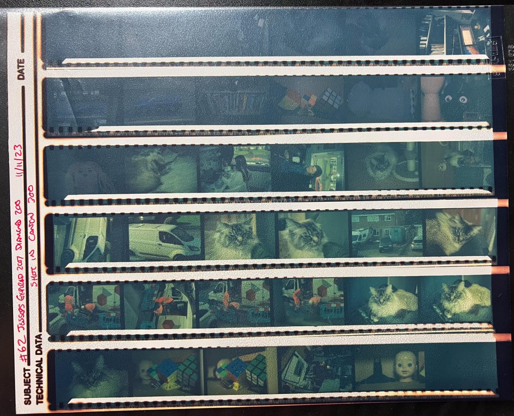
The next film I tried to get a contact sheet for was film #62 a very expired (2007) Jessops Diamond 200 ISO colour film. I’d shot this in an old Canon 300D a friend had gifted me. I wasn’t expecting much but wanted to see what it was like as I have another 4 rolls of it.
I had this camera in my house, on the office shelf so never took it out anywhere, as a result the pictures are of a rather constricted space and out of the window. I put the test strip in and then selected 8 seconds at f/4 for the full strip and full print of the contact sheet.
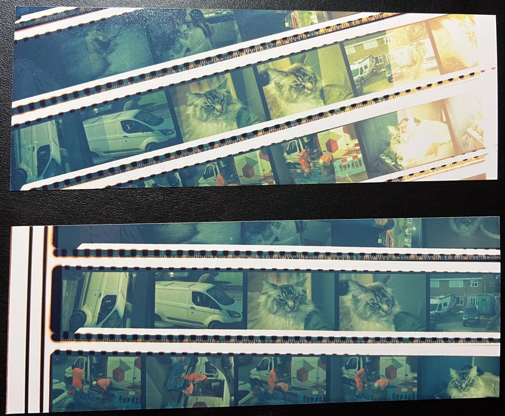
You can see the contact sheet test strip and full strip are a bit greeny looking but the blacks were just not there at all, I started confirming that there was an issue with the colenta or the chemistry within. It could have also been the paper, I’d bought it earlier this year so it should still be ok with no ill effects. I don’t keep it on the windowsill in direct sunlight or anything so I figured it’s probably likely to be the Colenta/Chemistry.
The full print I got out of it wasn’t any better either. I moved on again to see if I could at least get one print out of this lot, after all I’d been in the dark for 4 hours already.
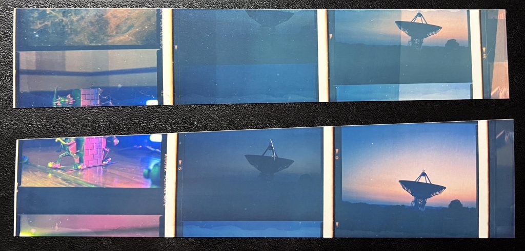
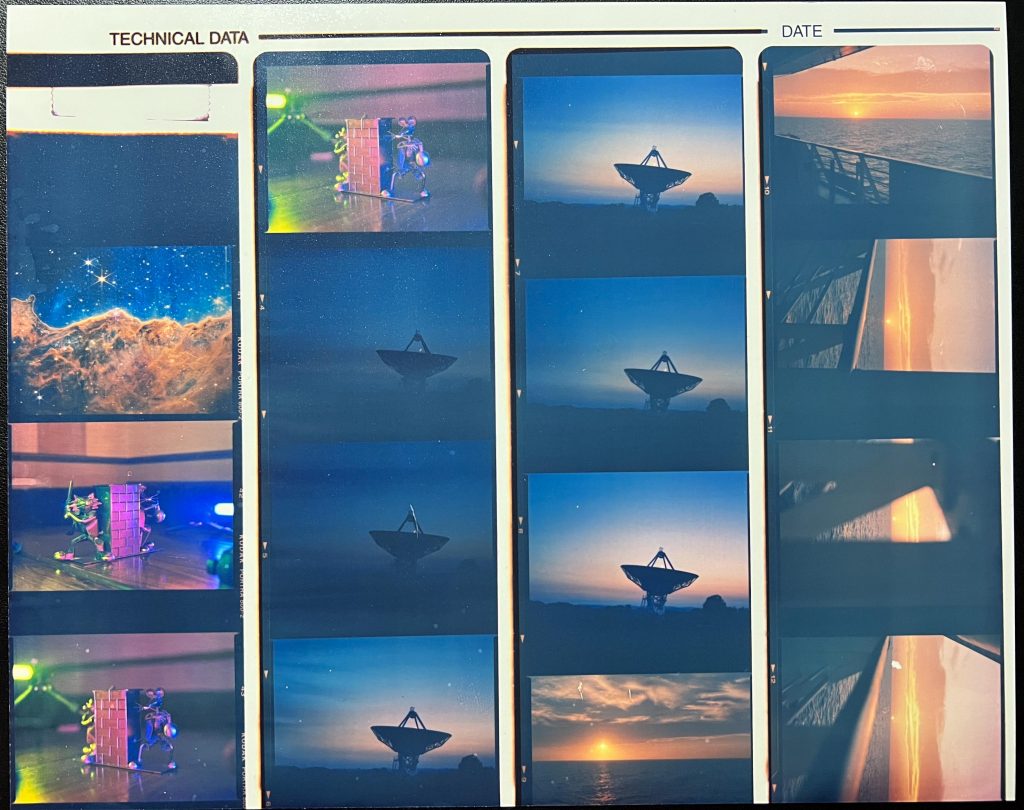
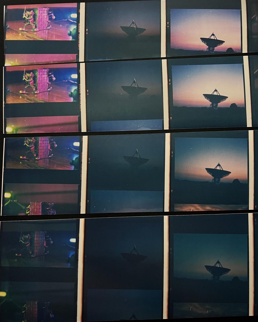
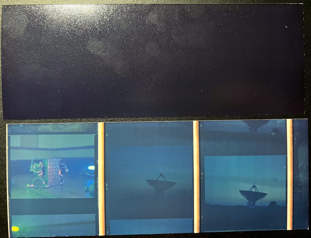
Pulling a negative from film #59 of the Knockin Osbaston Radio Telescope I created a test strip then changed the time intervals for something smaller, it looked like three seconds might give me the best chance at pulling out a print so I banged a full sheet of 10×8 into the easel. Only when I pressed the timer I noticed that some of the image on the easel was much brighter, why ? Oh no, I’ve put the paper in oriented incorrectly. Doh.
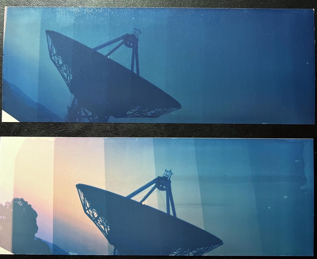
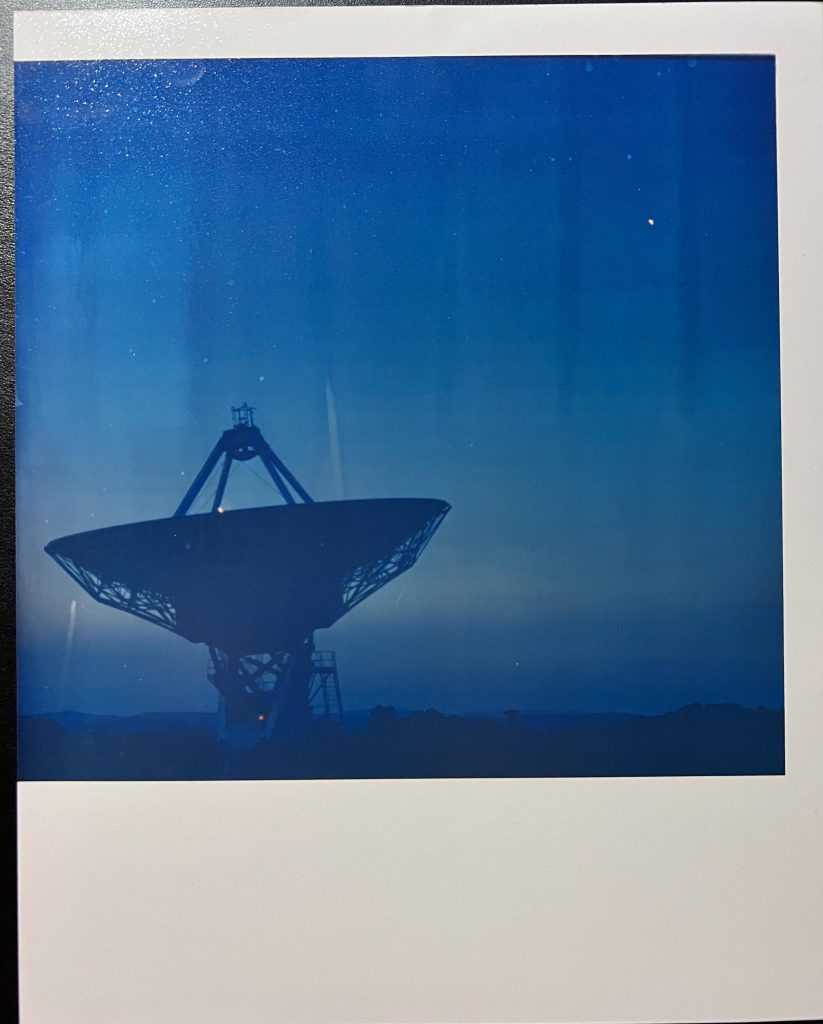
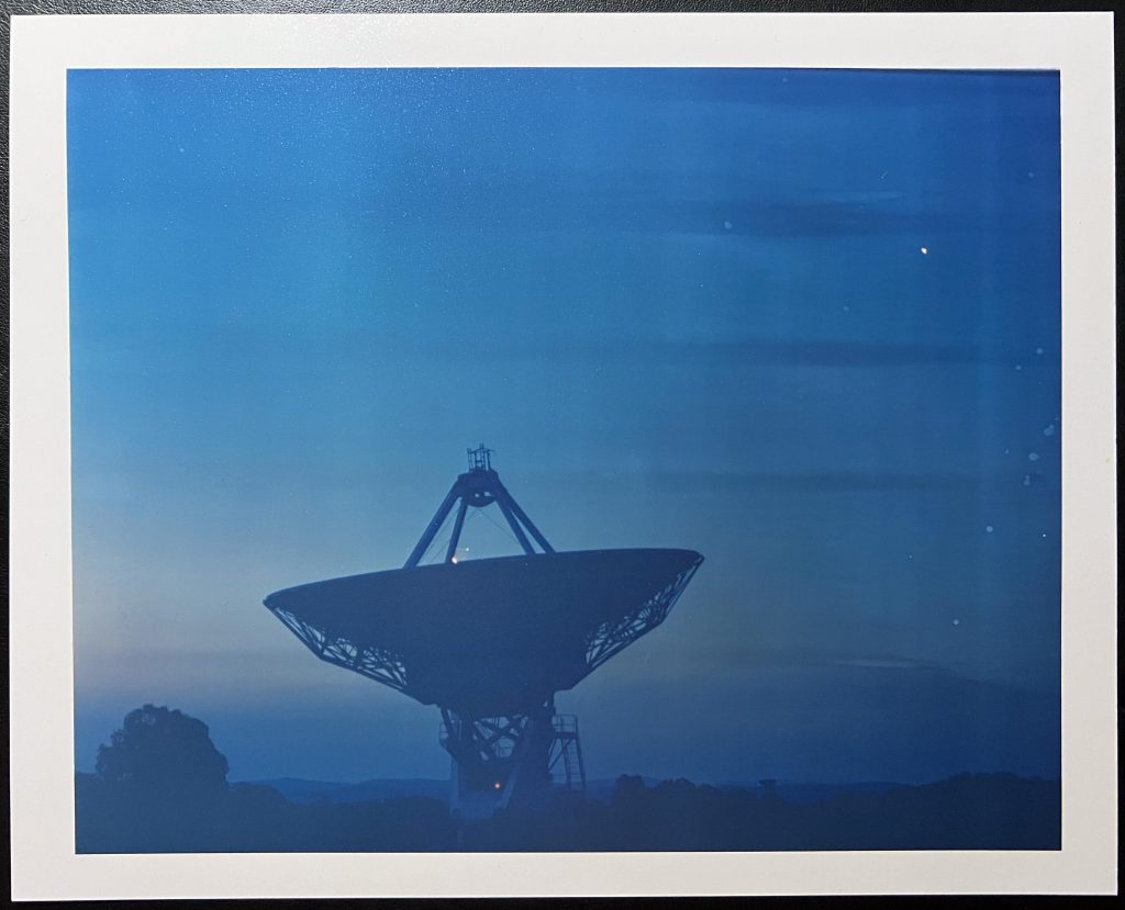
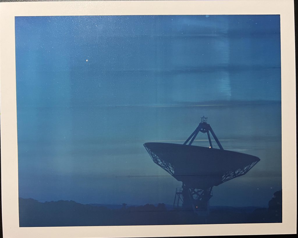
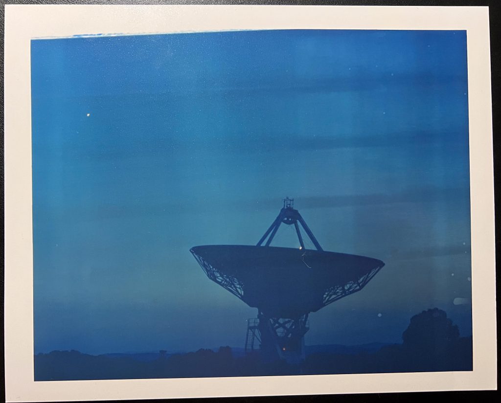
A new sheet of paper in the easel correctly was all just dark blue so I played around with the colour filters and exposure time but got nowhere near what I thought the image should look like. The contact sheet although still poor, showed some lovely sunset colours in the sky but this print gave us none of this at all. I also noticed that there were some liwuid marks on each print, all going the same direction and a few drips and splodges. I was so disappointed that I decided to quit ahead of going up to the foyer to meet up with the rest of the class and take a walk to Eagle Works. First though I had to remove the lens and negative holder for the 645 films, and replace them with the 50mm lens and 35mm film holder. This then went to Dan in the media store and whilst I was there I mentioned the problem, showed him these last couple of shots and he said it looked like the chemistry needs changing.
Dan will take a look at the chems in the Colenta and let me know when it is back up and running.
Making an exhibition of myself
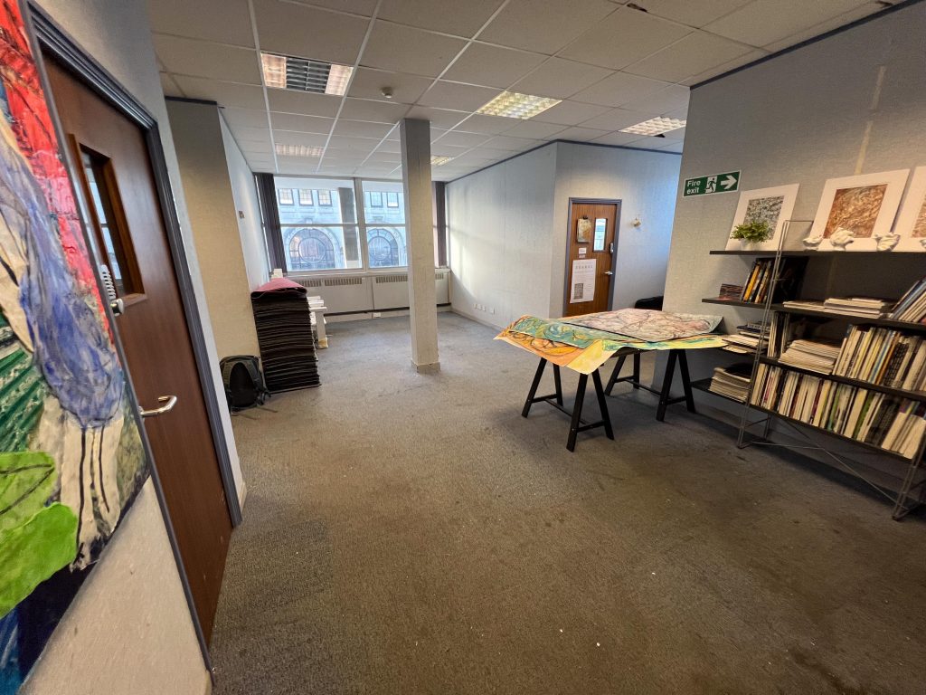
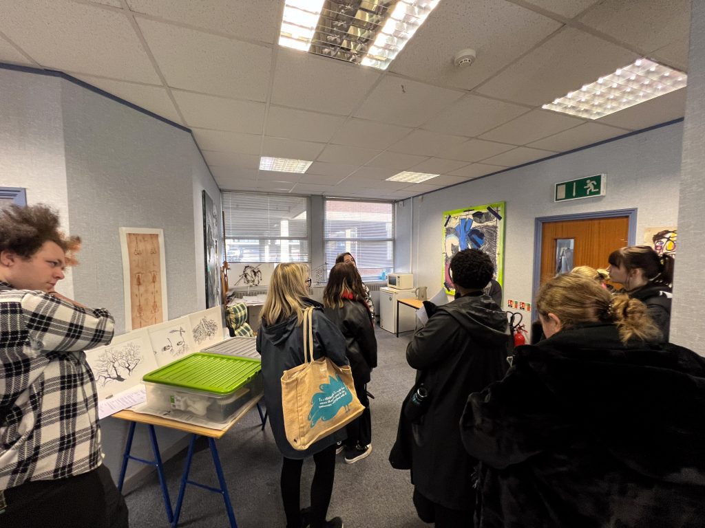
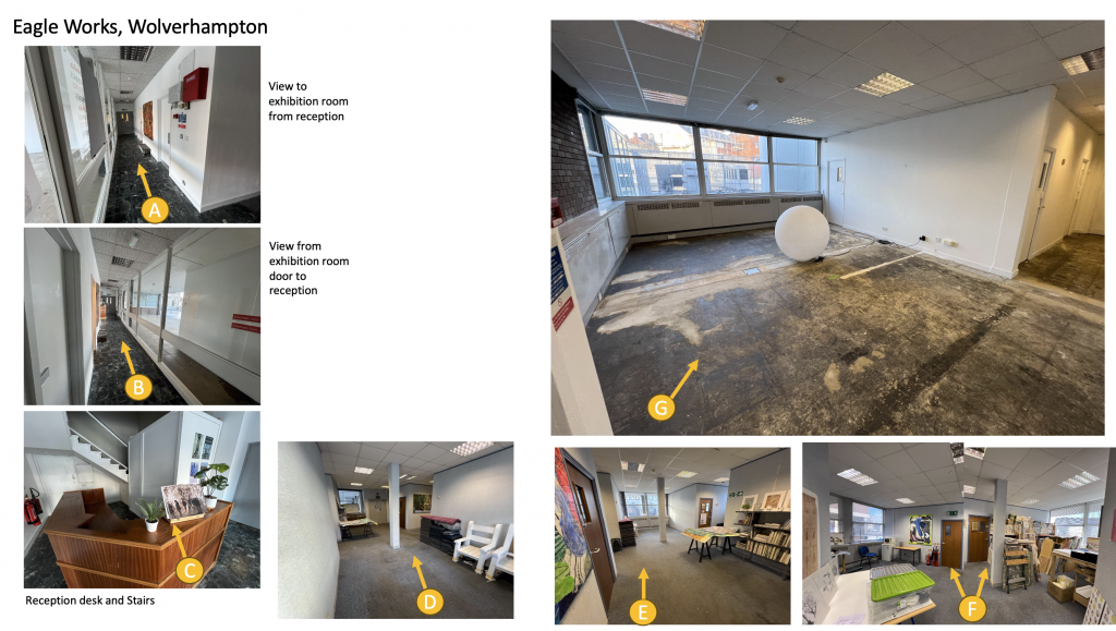
Next we were off to the Eagle Works with Sylvia and Laura. We were going to scope out the space for our easter exhibition and maybe make a few notes and ask Laura questions. There were also a bunch of Fine Art students with us and my class thought it might be a tight squeeze to get all of our work in one exhibition, but it turns out they are Level 6 and contemplating looking into setting up a studio themselves so were interested in the reasonable prices for having a studio in the Eagle Works.
Eagle Works was the name of the building were an art community had grown together in an old building previously used for metal work and manufacture of components. They’d moved into the empty Victoria House on the top of the Mander Centre, and it looks like the set of Ricky Gervais and Stephen Merchant’s The Office with more stuff cluttering up the space.
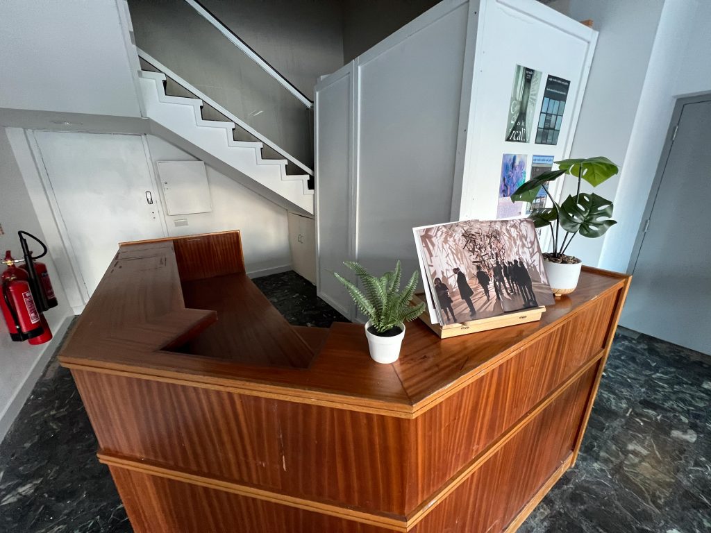
We had a little tour around with Laura, showing us some of the spaces and studios before I whipped out my laser tape measure device and started making some notes on sizes of the rooms we might get to use. I figured I’d draw a simple diagram when we got back and this might help us design our exhibition.
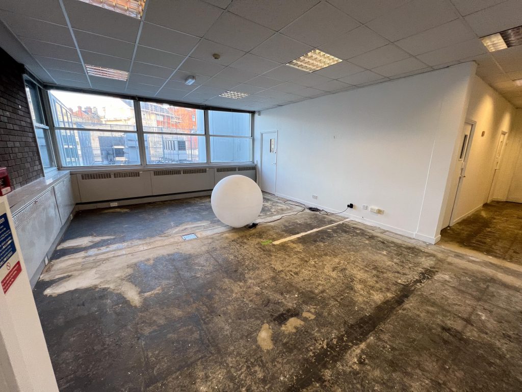
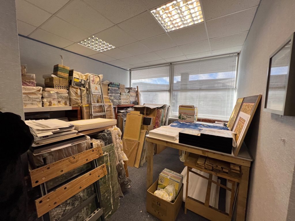
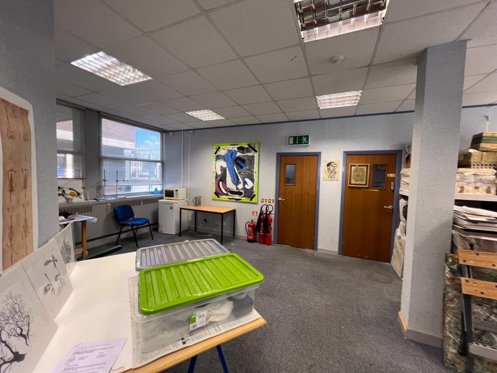
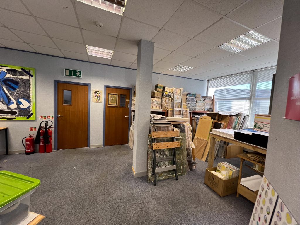
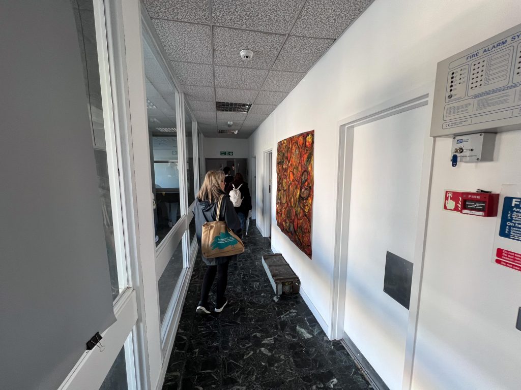
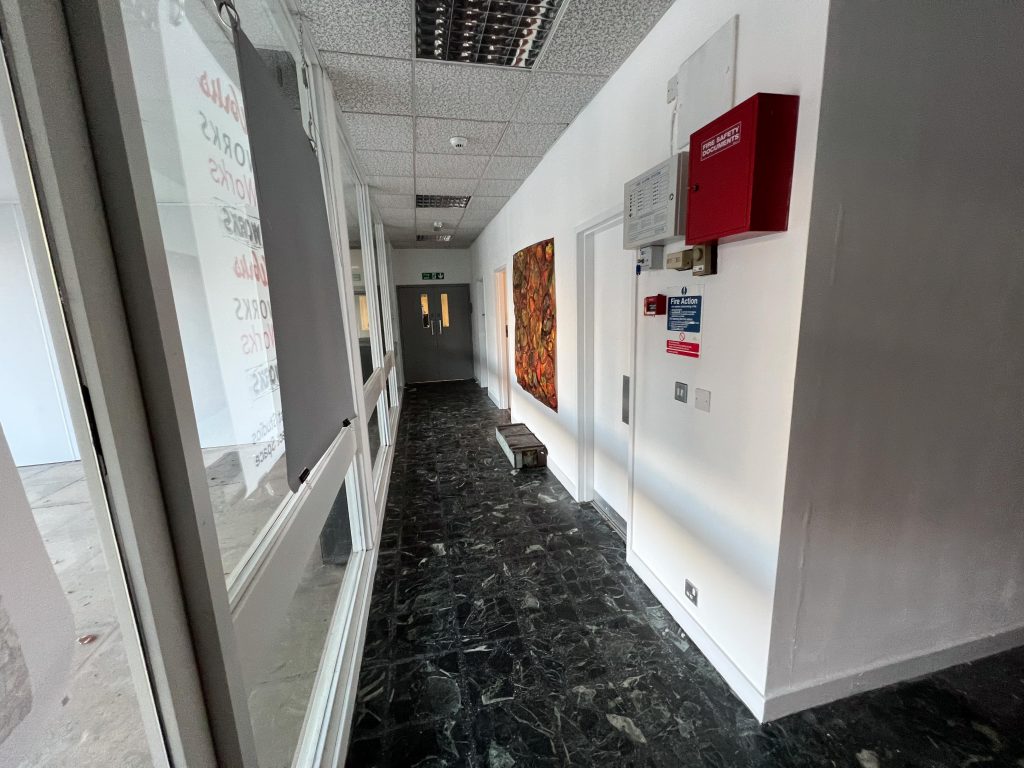
The space was cold with no carpet or floor covering on the main space we were looking at, except a large Orb in the middle of the floor. The walls were painted nicely in a white colour and I think it will do a good job. There are many windows which might be something we can use to present our work or struggle with them, but we can always board them up if need be. We could also paint the walls too, providing that we repainted them to their original colour.
Below is the map of the space and the dimensions, I shared this with the rest of the group so that we’re all on the same page, after all this is a joint exhibition so it’s all about collaboration and teamwork.
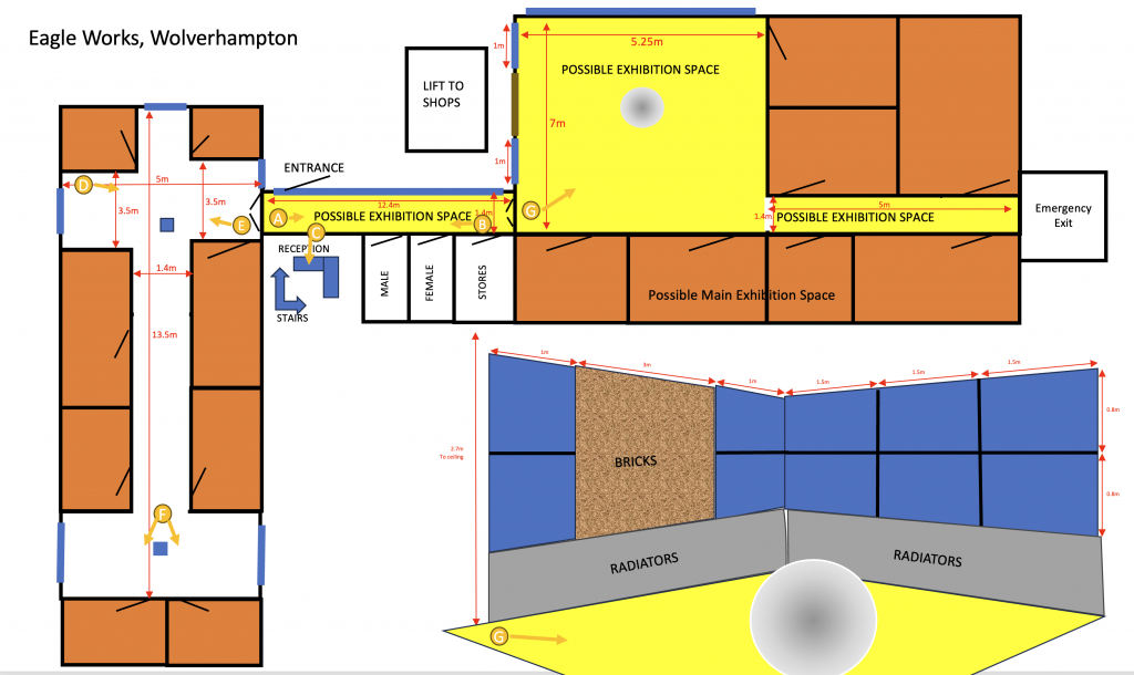
I drew some circles with arrows, and a letter in the centre so that I could reference the views in the pictures above, but in a more logical way.
After we’d finished in the Eagle Works, we walked back to the uni, sat in the lecture theatre and discussed what we’d thought of the space.
We all agreed that it was easier to use this space than find somewhere else, that it was the right size for the small group of seven that we are and that anything bigger would be too large. It’s also being offered to us for free which is a bonus.
We’d have to invigilate the exhibition for the time it was open which just means working out a rota of people to be there.
We discussed the number of days it might be open too, it was suggested that we could open on the thursday night with a private viewing and then run it Fri, Sat, and Sun before dismantling Sunday evening. I asked the question of if the Fine art students have their exhibition on too, will it cause any clashes in staff supporting either exhibition? Sylvia will go and check this and then we’ll organise to avoid a clash.
I asked about footfall too, and Laura had said that there is some footfall from the car park at the Mander Centre and that usually the lift works making it easier to get guests up there.
Thinking Time
Sylvia gave us a short list of things to consider for the visit:
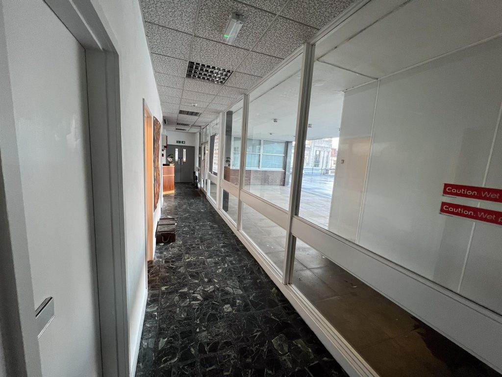
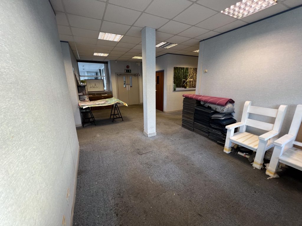
Space Available. Should be plenty for the limited number of us. There is the one main room and then two corridors coming off this room.
Size of Space. Again it’s small enough to be cosy and not too big to let our work be swallowed up by the vastnesss.
Lighting. There were some adequate fluorescent tube lights and also daylight in through the main windows.
Wall Space and Quality. There are a few walls, mostly thin plaster board, but there is an interesting brick wall between two windows. The main wall in the room on the outside edge is a big window made of three units so not straightforward to hang something there.
Layout. Was considered and it was decided to use the main room and the two corridors as there is room for this.
The Location. Being on top of the Mander Centre has benefits and disadvantages. It’s central to the city but there is no way locals will see the exhibition without knowing it’s up there. Could lead to smaller footfall.
Accessibility. There is a lift available that brings people up from the Mander Centre to the level of the Eagle Works and from there it’s plain sailing. laura said that often the lift is out of action though so it would need consideration as to how we inform guests on this. There is also a pair of bathrooms, male and female as well as a reception area where we could set up a stall selling prints, postcards etc.
How can your work be displayed in this space? For me I thinkk that hanging it on a wall perhaps in the corridor might suit my work but if I was to print it in large scale, it would need to be in the main room, owing to the fact that the corridor is only 1.4 meters wide and it’s difficult to step back far enough to see a large image, unless you want to make people feel enclosed by the image of course.
Any other general considerations? Painting walls? Carpeting? Hanging work from suspended ceiling, hanging on windows or even printing to clear vinyl for display on the glass.
It was a worthwhile trip, way more worthwhile than My last tow weeks of colour printing anyway. It was good to see hwo artists studios look, adn how we can use space, working together to find the right place for our work.
Be First to Comment