Reviewing our selections of paintings and playing with the lighting equipment for the first time.
The group sat around in the studio to look at the screen whilst Dan and Euripides helped us to understand what our selected images of paintings might mean and symbols that may be included.
To reiterate, we have a brief to take a portrait painting and recreate it with some changes in the studio. Whether the changes are Appropriation or Detournement depends on us too, see last post about Portraiture lecture.
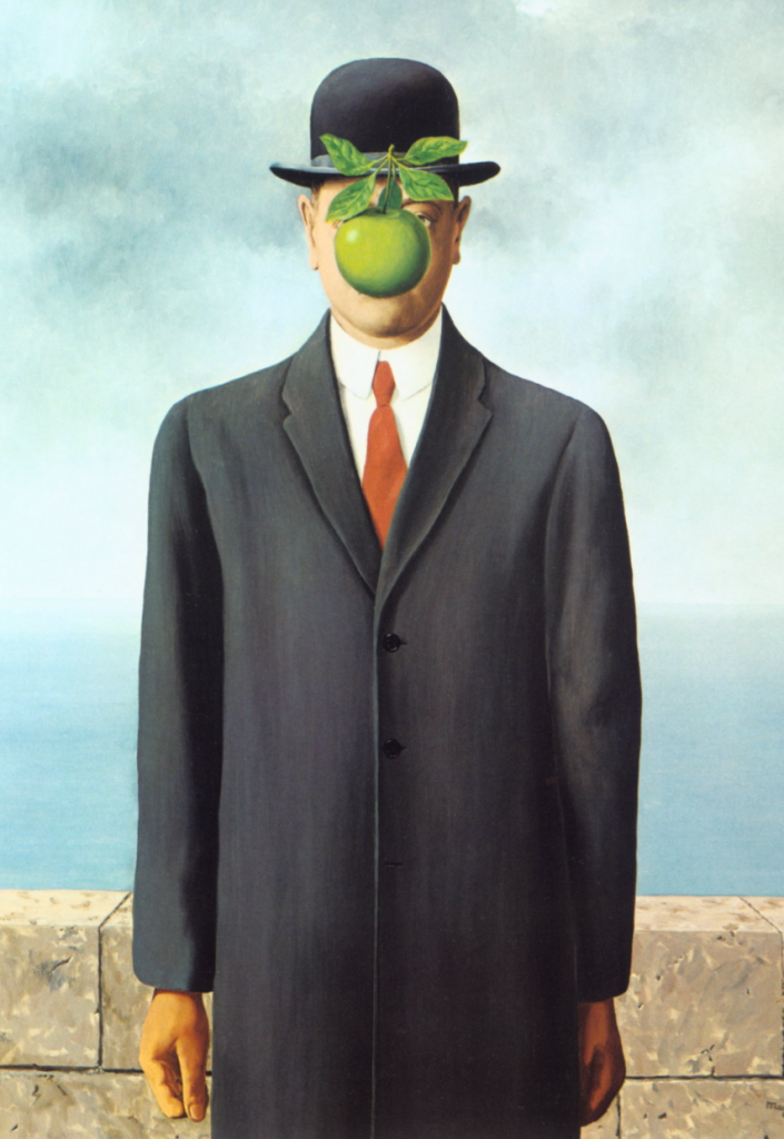
Euripides asked to see the paintings that I’d chosen to work with. I’ve actually got six of them in my shortlist but I didn’t want to bore everyone so I explained about the first being Rene Magritte’s famous self portrait “The Son Of Man” which he painted in 1964. It’s a well known image so I was nervous about choosing it but figured that the subject is a man standing straight upright in a long coat and bowler hat, with an apple in front of his face so I should be able to do something with it to make it my own image interpretation. I explained how I was planning on having an Apple iPhone fixed to a tongue depressor and holding it in my mouth to make it appear as though it was floating. The apple logo on the rear of the phone would be in a similar location too.
The clothes at the time were typical business attire in Belgium so I could wear my corporate workwear which could be a shirt and tie, (too similar), or a logoed polo shirt with a pair of overalls that I sometimes wear when carrying out my job on the shopfloor.
Euripides and Dan asked what I would do with the background and I suggested that the brick wall could be made up of amazon boxes stacked upon each other as whilst I’ve been working from home there have been many of these styles of boxes arriving with goods from eBay, amazon, etsy, and many other places.
For the hat I could wear my baseball cap, or even the safety bump-cap from my work when I have to go into a dangerous area.
Euripides mentioned that there is a great book by Roland Barthes called Mythologies about semiotics in paintings/photos and what each represent to the trained eye. I ordered a copy later that same day and now await delivery of it.. It was explained that there are levels of meaning, a cup being held might be the level 1, level two could be the tea that is inside the cup, and level three , going further into it could represent a national identity . Quite deep but I’d not really thought about this before like that.
Returning to Magritte’s work, it was said by Euripides that “the Apple was a word in a sentence made up of the rest of the painting.”
The lighting on this painting was explained to be split lighting with the flash on the left side of the picture with maybe a little reflection from the right hand side.
Once we’d discussed that painting we moved on to my next choice, a self-portrait by Sir Joshua Reynolds which sees the young artist shading his eye from a bright light in order to see something across the room.
He is seen holding a palette and a mahl stick used to rest the arm on to steady when painting. Signwriters also use these aids to ensure there is no wobbling. Euripides called it “the painter’s tripod”
We discussed the attire seen in the image, and that it appears to not be the clothes of a working artist and when I mentioned this I was told that he is seen dressed in these clothes to appear more affluent or in the same class as those who might pay him for a portrait. By dressing similarly to the clients he appears as their equal. The clothes were usually completed by assistants or apprentices with Reynolds coming in to do the face and limbs to finish off with the tricky and most important parts.
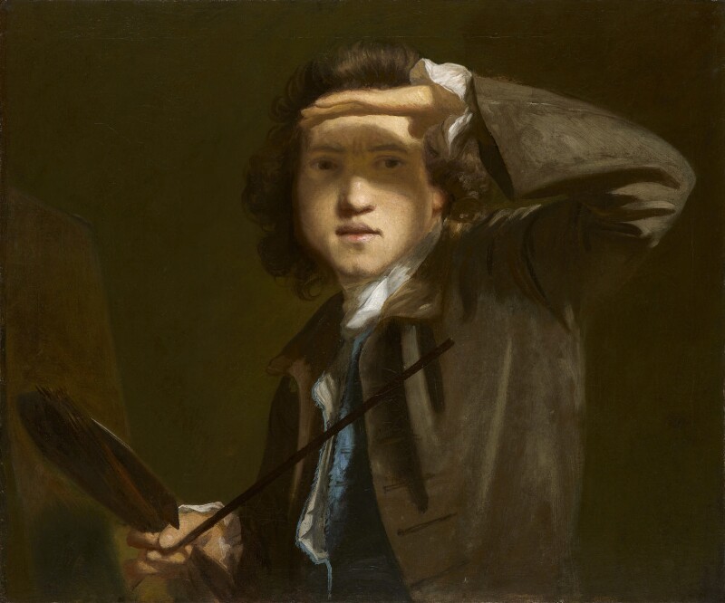
I liked this image because of the technical challenge of getting the lighting correct and also including the shadow across the eyes.
Dan also noted too that this image is tight on the subject and that in the previous studio group there were some who didn’t go tight enough to their subjects as per their paintings. It’s an interesting thing to point out with this image as Henry himself shortened the image from being a taller image be reducing the top and bottom of the canvas.
Looking at the shadows on the nose and the hands it appears as though the flash would need to be above and to the right of the subject but not enough to be full Rembrandt lighting.
The Others
Liberty chose a painting called “a boy with a lesson book” by Jean-Baptiste Greuze
Angel chose the Fernand Pelez, “Homeless” (1883) and was thought to be a big challenge due to the number of children in it and props.
Paris chose Frida Kahlo, “Me and My Parrots” and it was thought to be a difficult exercise to replace the parrots with anything that damages Kahlo’s feminist message and life’s work. The lighting in the image was explained as “Badger” and meant there was a big shadow style strip from centre of forehead and down the face to the chin.
Chan chose a few paintings to look at and these included “Emma, Lady Hamilton”1782, by George Romney and “Dido Elizabeth Belle” by David Martin (1779). It was thought that the hat on the Emma painting would prove to be a challenge to replace and still keep the shadow from the brow across the forehead.
Meg chose “Young Sick Bacchus” by Caravaggio (1593) and it was discussed about how it was mocking the Greek gods and would have been a controversial thing to do at the time. The conversation from the lecturers indicated that the grapes might represent wealth as it was a luxury food item then and his robes indicate something about his getting undressed quickly for sexual relations possibly with other men which would have also raised eyebrows at the time.
Veronica chose the “Mona Lisa” to work with and it was discussed that the background of the painting would be a huge challenge as it’s an Italian valley.
It was a great discussion about each painting and was interesting to hear about the lighting setups required for a photograph of similar look.
My Short List
My other paintings that I have on my short list are Jonathan Miller, by Stephen Conroy (1999) which shows a very educated and erudite tv presenter, actor, comedian, director and doctor sitting looking like Rodin’s “The Thinker”. I like the pose in this image as I’ve not seen many from a side elevation and the art is very gritty and dour.
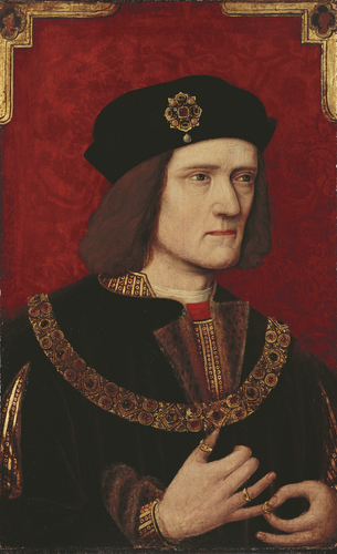
Another was a well-known painting of Richard III by an unknown artist in the British School (16th century) and it’s a close in portrait in which the king is putting a ring onto his pinkie finger whilst wearing some very ornate gowns and hat, in front of an embellished background. This was on the list as a standard portrait in case the others were laughed at and not portraity enough.
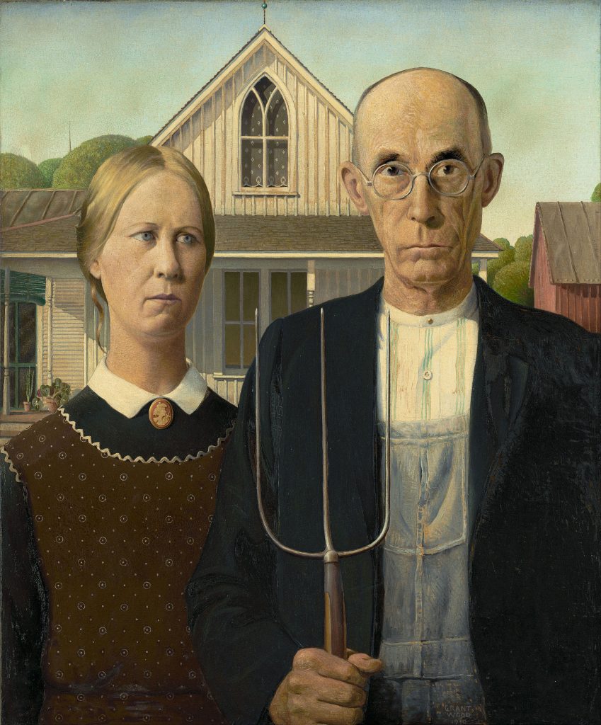
American Gothic (1930) by Grant Wood is the penultimate image I selected and is a very famous image that I knew very little about, only the name in fact. The name comes from the “Carpenter’s Gothic” style house in the background and I’d always thought that the woman in the image was the man’s wife but Wood explained that it is his daughter. It’s an interesting story about Wood and that his father died when he was only young , leaving him alone with his mother and it’s considered that he may have had Oedipal style thoughts about his mother, whether consciously or sub consciously, it may be who this woman represents.
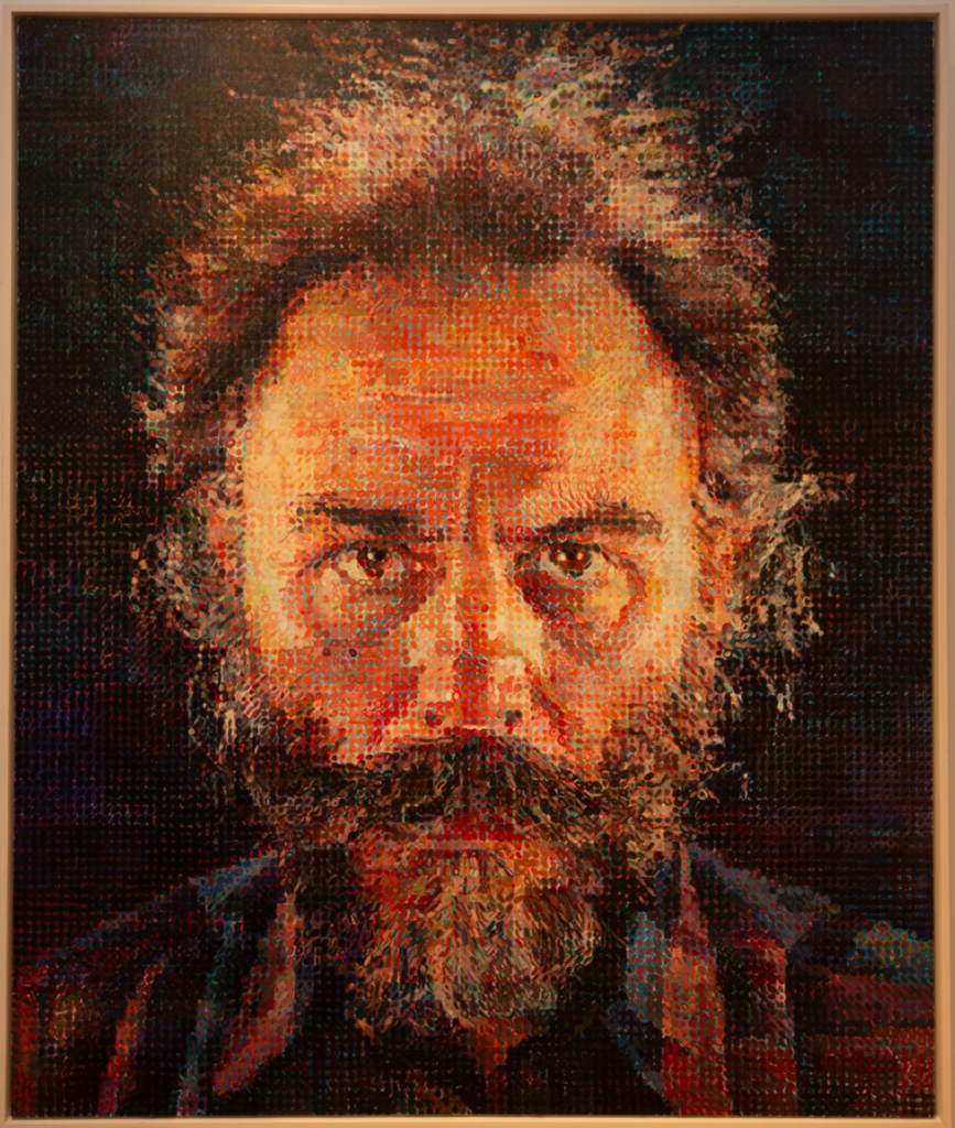
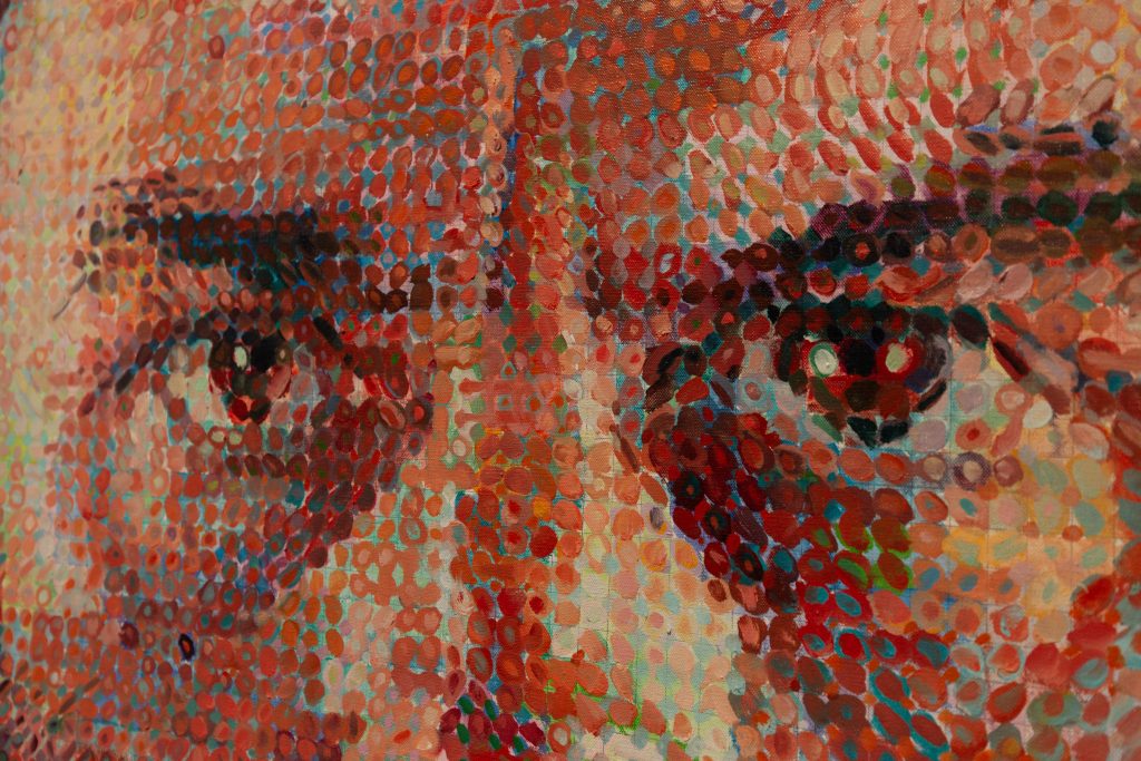
The last painting I’d selected on my list was from Chuck Close a painting called Lucas (1986-1987) in which he has drawn a grid on the canvas and then used a dab of paint in each and every grid to give the illusion of a painting from distance but close up you can see the details in the work. I saw this in the Metropolitan Museum Of Art in New York city in 2019 and it is a huge piece that grabbed my attention from across the gallery due to the solid stare from the subject out towards the viewer. Intense.
I thought that I could make a photo portrait of this image perhaps by using a high ISO film and shooting it and developing it, or even use a digital medium format camera on crazy high ISO settings to ramp up the noise in the image..
Studio Line
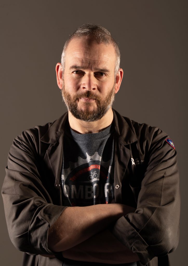
From talking about images we went into the white scoop to learn about how to use the lighting heads to create a particular style. We started off with the Badger and as a group we helped move the stands and heads, changing the power on the heads and also using a light meter to measure the lighting.
First up we were told that with the Pentax 645Z Medium Format camera we had, that the Depth Of Field is shallower than a 35mm so an aperture of f/16 would be more likely to produce in focus shots, if we drop to a low f number a slight movement in the model/subject would be more likely to produce an out of focus image.
Badger Lighting
To get the Badger effect a light must be placed on each side of the subject just behind them so that the light from the left side stops before the bridge of the nose and centre of chin/forehead, and the same on the opposite side also. We set up a Bowens head each side with a small dish modifier on each and then tried a firing of the flash. To fire the flash the sync cable can be connected to the sync port of the Sekonic light meter so that when the measurement button is pressed, the lights trigger and the reading taken.
With the light meter almost touching Dan’s nose and the dome facing toward the camera, Chan triggered the flash and it showed f/32 so we had to take the power of the lights down two stops. The common full stops are f/1.4, 2, 2.8, 4, 5.6, 8, 11, 16, 22, 32 so we need to reduce from 32, down through 22 to 16. We reduced the power on the flash heads until the reading on the nose was f/16 so were happy to take a picture when we were reminded that we hadn’t finished just yet…
We now needed to check the light reading on each side of the face with the meter pointing at the light whilst almost resting on the cheek. The readings from each cheek were f/22.9 and f/16.9 (the readout has some decimals, so 16.9 is nearly 22 in terms of full stops) we turned the power down on the lights to get these to both read f/22. To achieve the difference between the shadow on the nose and the light on the cheek which makes a badger style, the difference needs to be one stop. So nose at f/22 and cheeks at f/16.
The sync cable was then removed from the light meter and plugged into the sync port on the Pentax 645, the camera set at ISO 200 and the mode selector changed to the X position (in red). Without this setting it will likely not trigger the flash, and telling it that it needs to use flash prevents it from going auto and changing loads of the settings you’d like to keep.
The shutter speed was set at 1/125 sec for this camera but can go to 1/60th usually on other cameras. The Hasselblad can go to any speed of shutter and still sync due to the shutter being in the lens rather than in the camera. The shutter in my Bronica ETRS is also in the lens so that camera is capable of syncing up to 1/500th of a second which is also good to know.
Flash Thoughts
I asked Euripides about why we don’t alter shutter speeds when using the flash in the studio and he explained the obvious that I hadn’t twigged to. Simply put, how I understand it is that the room is seen as dark by the camera with no lights or flashes firing. Imagine the camera taking a picture at f/16 with a 1/125 sec shutter speed on a slow ISO of 200. If there is not much ambient light in the studio then the image would likely come out black. When the flash is triggered it emits the light for something around 1/1000th to 1/8000th of a second so that is the only time the light coming back off the subject ends up on the film or sensor. If I have the shutter speed set to 1/30 secs then it would be the same result as there’s only a thousandth of a sec of light, for the remainder of the time the shutter is open, only the ambient light will be captured. With the f/16 aperture and ISO 200, there should be little to no ambient light in the studio so the photo is only affected for the duration of the flash lighting up the subject.
That probably sounds way more mixed up than I understand it to be. It’s the same as when I do light painting in the darkness of a countryside night, I can have the shutter open for 30 secs and the only time any light makes onto the sensor is when I turn on the torch/flash/laser pointer etc. Whether it’s open for 5 secs or 30 secs is neither here nor there, if I set off a flash, that’s the only time an image is committed to the CCD sensor. Makes sense now..
This question came about as I was confused as to why they were only bothered about f stops of light and aperture of the camera aligning, my initial thought would be that you can change the shutter too but that is pointless thinking about it now.. Every day is a school day!!
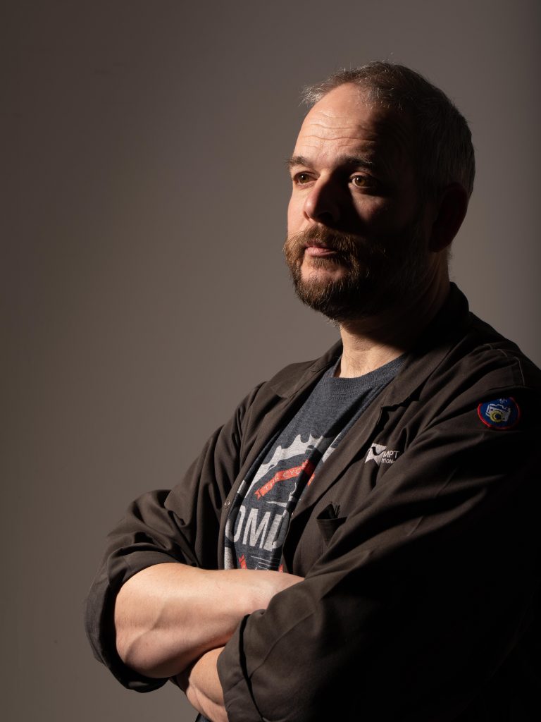
Rembrandt Lighting
Once we’d finished the Badger photo, we tried our arm at a Rembrandt set up, so one of the heads was turned off and moved aside. The flash head on the left side was lifted up in the air to provide the shadow from the nose in the Rembrandt style that is so prevalent. Again, we had to meter for the light to be f/16 on the nose of the subject so adjusted the power of the flash accordingly until the reading was correct, took one photograph and it turned out ok.
A big challenge we had here was directing the model to turn to an angle just so, that the light made the tell tale triangle on the cheek opposite the light. It was suggested that we stand in front of the model, ask them to move their head when following my movements. By moving left and right accordingly the model moves their pose, without having to say, left a bit, right a bit, bit more, too much, back again…. It’s a more professional method and one that removes confusing language from the process, thus helping the model stay at ease and the photographer less stressed.
I’ve now also found the Digital Camera magazine’s Lighting guide so can use this as a reference to plan a shoot before getting there. There are also tools such as the online lighting diagram creator where you can document the setups you’ve done or even plan for the next shoot. I believe there are other apps on mobile devices that can also be used to document what you have done but I’m researching into those before splashing the cash.
Post Studio Problems
Upon finishing the session I tried to get the images off the memory card but the Macs in the studio don’t have SD slots so Paul very kindly lent me his USB SD Card reader, and I’ve now bought one myself… Once on the computer I can save it to OneDrive or a USB Stick and then get the images home to play with.
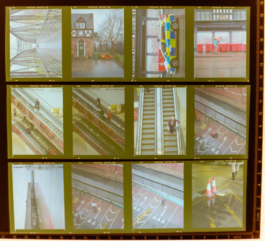
The afternoon from 13:30 was to be occupied with producing colour contact sheets from 120 and 35 mm films I’ve had processed recently. I P{picked up the contact printers and medium format kit for the enlargers in the colour darkrooms to find that the colour processing machine was out of action due to some maintenance, so I returned home to get on with some day-job work and then digitised the negatives using my DSLR and a lightbox, then adjusted the curves in Lightroom. Job done, time to pick out which ones will complete my colour set of images.
Anyway, I’m looking forward to doing this now and having a good bit of a giggle too.
Be First to Comment