Alice gave us a task to go away and think about how best to present photographs, look at examples of exhibitions we’ve been to in the past and maybe visit a photography exhibition to take a look .
Some of the questions Alice posed are:
- How is work presented?
- Think about materials, scale etc. What impact does this have on the viewer?
- How does the display connect with the concept?
All In All
In January I visited the “Another Brick In The Wall” exhibition at the University Of Leeds as documented in this post.
It was an exhibition regarding the brutalist architecture used to redevelop Universities of East Anglia, East Sussex and Leeds in the latter half of the 20th century.
The brutalist architecture on show in the form of photographs was joined by multiple other artefacts from the day. You can see in the image below that there is one large photo on the rear wall within a white frame, on a white wall surrounded by vitrines containing contemporaneous documents such as music records, magazines, newspapers, posters, design documents, quotations, engineering and architects drawings etc. In this section of the gallery the photo appears to be just another document to act as an historical record of the building depicted.
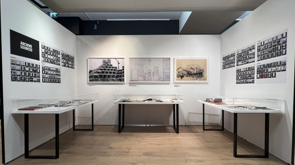
The contents of the vitrines and the other walls all go to make this a documentary almost as if it’s a magazine article laid out in physical form for the viewer to see.
If I turn 180 degrees in this spot you’ll see the black painted wall and the photos and other contents.
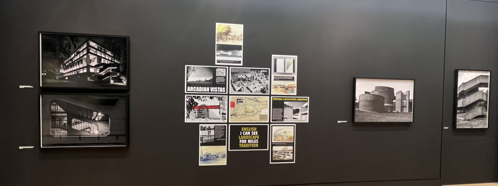
You can see that the photographs on the black painted walls are all in black frames with the prints to the edges of the frames and no mounts inside. The pictures within appear to be at the rear of the frame with a gap to the front, rather than the images being on the front of the structure. It’s similar to an insect specimen display case in looks with the structure of the frame being an important part of the whole piece. Each photograph is in one of these sturdy, functional frames as the buildings displayed in them are designed to be form following function. The supporting evidence is made up of printed out documents pasted to the wall like bill posters, there is no fluff or presenation style to speak of, it’s deliberate and simple. Maybe the poster style images reflect the signs that are posted on building sites, or in the university campuses bars and noticeboards.
The difference between the photos in the frames and the bill poster style documents is stark but works together to tell the story. The posters, made up of scans of other documents, represent the context that existed when the buildings were being designed, built and beginning their lives.
The documents scanned in to become the posters are what is on display in the glass cases around the gallery and rather than having a mis-mash of different sized articles on the walls they’ve been captured and presented in a standard size, format and layout so as not to detract from the photographs.
The blockiness and straight edges, with the stange spacing between photos is akin to the architecture that they represent. Brutalism is full of lines and forms that make you question the logic behind the decisions and ask why they’re laid out in that manner, the same is true of this exhibition.
The style of the presentation fits the content in this case and works to show off the information in a matter of fact way, presenting all of the information and asking the viewer to put the pieces together to form their overall view.
On top of the gallery presentation, this exhibition was based on the campus of the University Of Leeds which is one of the facilities featuring in the exhibition and stepping into the concrete colossus of a campus helps the images to fall neatly into place. Not only the photographs but also the architects drawings that all add up to introducing you to the place that you are now strollign around. More information on the exhibition and the campus as I walked around can be found in the original post, linked at the top of this entry.
And Now For Something Completely Different
Earlier in the academic year, October 2022 in fact, I visited London to view the Chris Killip Retorspective at the Photographers Gallery and I’ve gone into that in an exhibition review here and another longer post here.
Whilst I was in London though I called by the V&A Museum to look at an exhibition by Maurice Broomfield showing industrial marketing photos that are now fine art. In the Sir Elton John and David Furnish gallery, adjoining the Broomfield exhibit was another exhibition titled, “Known and Strange: Photographs from the collection”
It’s an eclectic assortment of photographs from numerous well known and less well known photographers that has recently been acquired by the V&A and appears in this carefully curated show to display just how strange photography can be. It attempts to show how photographing something that is obviously one thing can look so strange or uncanny that it takes on a different meaning.
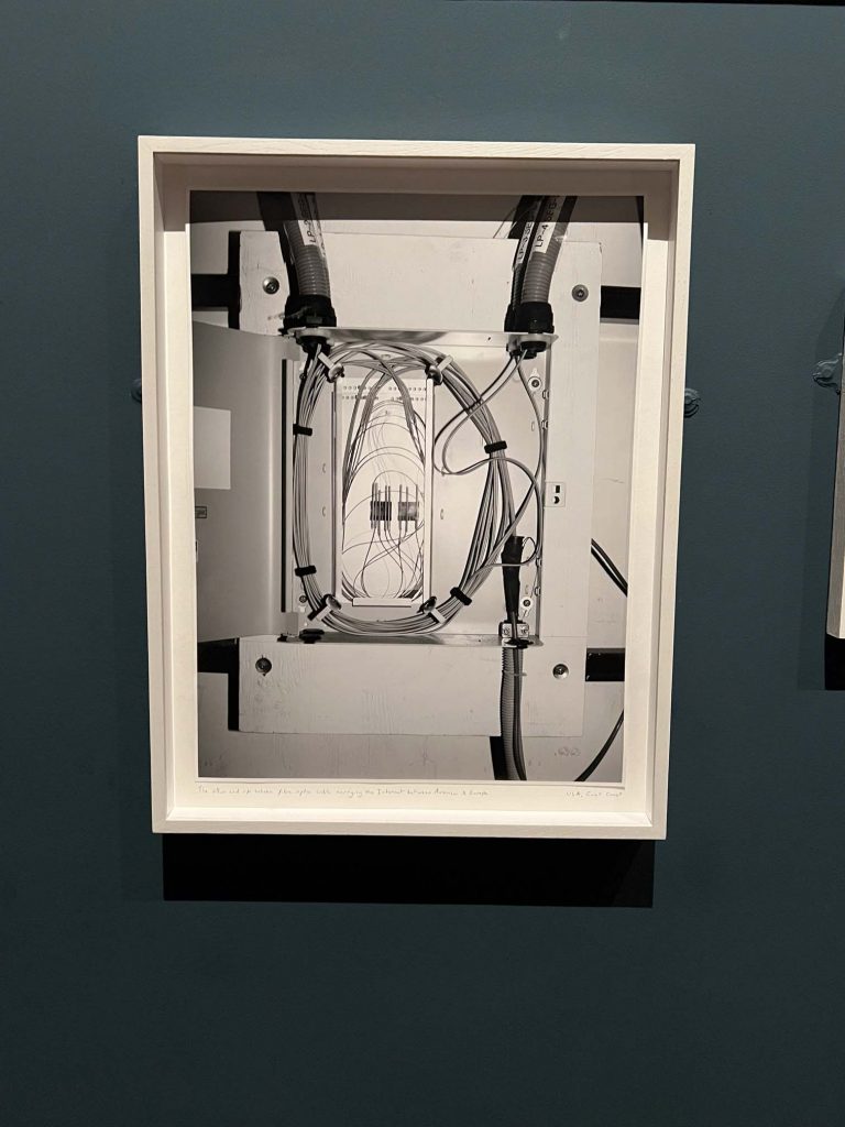
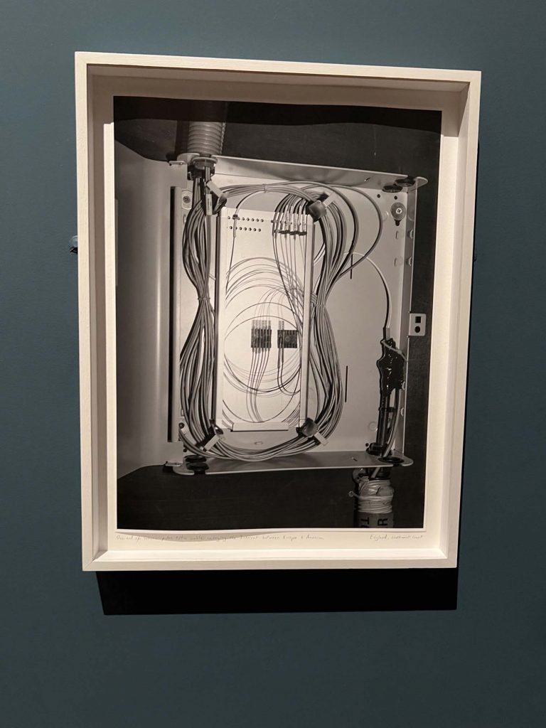
On one wall is a selection of all types of photographs depicting all manner of images that leave you feeling uneasy for some reason or other. The image below shows a wall painted in a dark bluey-grey colour to appear beize like, almost snooker table texture finish. The photos on the wall are all in white frames, but some larger and some smaller, none are spaced equally or in any sort of order.
The two photos showing the cables in their boxes represent a fibre optic cable used to connect the USA to the UK. The photographer Andy Sewell took photos of both ends of this cable, on different sides of the atlantic. It’s called “Known And Strange Things Pass” and to most people it might appear like a boring electrical cabinet, it’s fascinating to me to see the cable that transports data and information along the seabed across such a long span. Sewell marvelled at the contents of the ocean above the cable adn all the strange creatures that undoubtedly inhabit the space above the seabed. The cable in the boxes are also pictured in a factual manner, not in a “formal way” using rules of thirds, or other composition rules. This makes them look like actual electrical boxes affixed to the wall. Interestingly these boxes are not displayed side by side, but spread out across the room, the US side at one end, and the UK photo at the other end of the exhibit to point out the distance between the two. You don’t realise the significance of one of the boxes until you come across the second image.
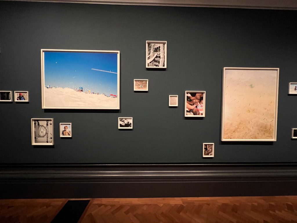
The photos on the wall in a seemingly random fashion simply add to the uncanny feelings created by the strangeness of the images. To view the images you need to get close to see the small ones, and then move away for the larger pictures, it’s disorienting enough without the contents of the photographs. The photo below is a standard family photograph of people sat around a dining table apart from the fact that their heads are covered by small white sheets or towells.
Again it’s discombobulating, why are their heads covered? why are they sitting as though this is normal? Are they dead? Are they ghosts? What does it mean?
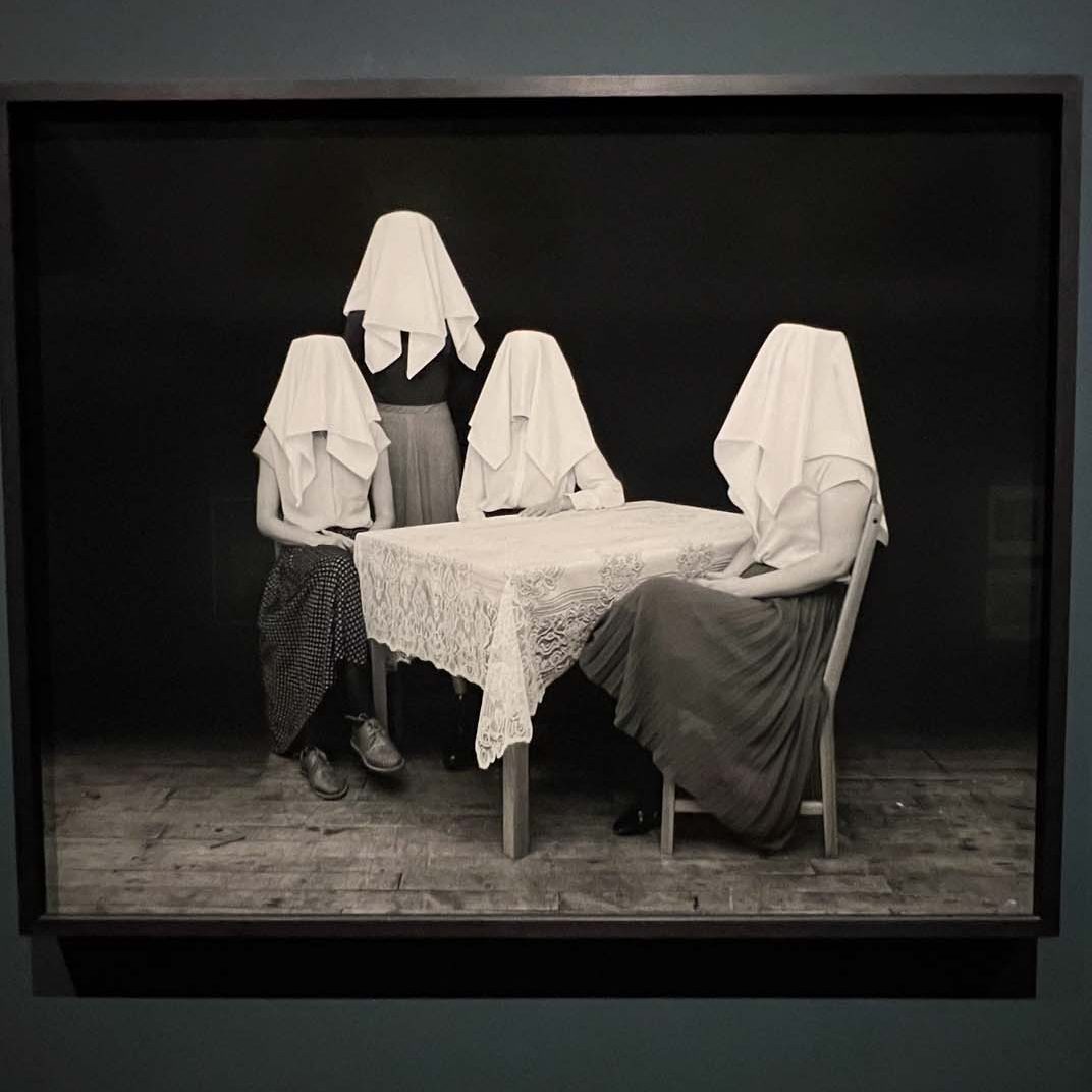
The black frame around this image is similar to the frames on the other images on this wall, they’re mostly of a comparable size and layout, their appearance on the wall is a little more regular but then the contents far from regular. It’s almost as if it leads you into thinking this is back to bein ga normal photo exhibition and then it hits you that the contents of the images are what is making it really out of the norm. This off-kilter effect has the result of making you feel unbalanced and confused.
Strippers
This selection was mixed in with a collection of images from Susan Meiselas “Carnival Strippers” images which is almost a modern day take (from the 1970’s so not too modern) on the older images of the Freak Shows from circus shows. Replaced by young women the photos convey the relationships they have with each other and the punters, along with their show of power over the viewers of their shows. It has messages around gender, society, sex, class and discrimination but they’re not images that we’d be used to seeing on a regular basis. Whilst they present more of a standard exhibition content, with their layout and framing, it is still part of the Known And Strange due to their content, being something that everyone knows about but looking on them today with our newly reformed morales and ideals seems very strange and outmoded.
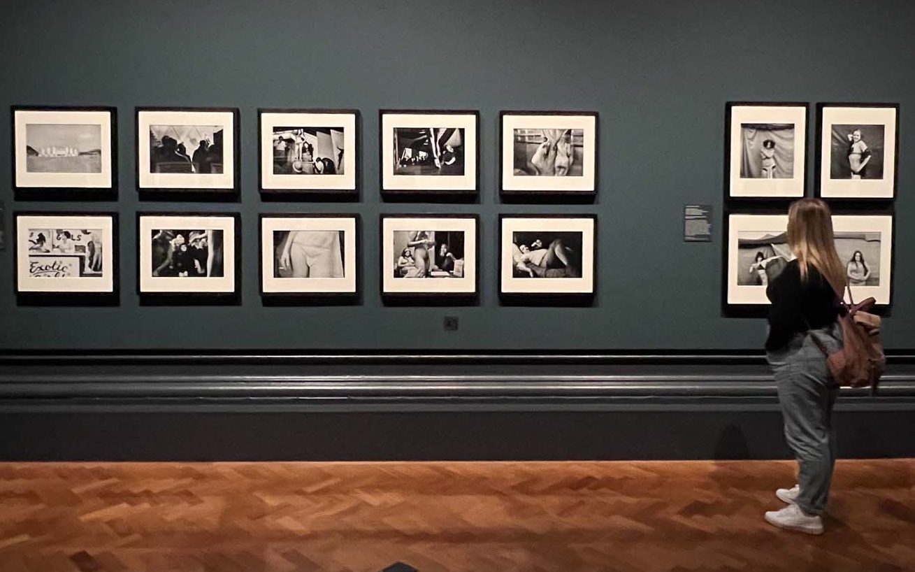
I feel that these images didn’t work for me as part of the overall exhibit but I still enjoyed seeing them as I’ve been following them on Instagram for while on the Magnum channel. They are strange but not as strange as the other images in the exhibition. Maybe it was just filler, maybe it’s a new acquisition so they’re desperate to get it on the wall, even so, I don’t think it fit in as part of the show.
I did like the uncomfortableness that the strange photos created, with their placing on the wall and their contents but I don’t think that many of my images would fit into this sort of presentation strategy.
Most of the other photography exhibits I’ve seen have conformed to the standard plain frames on a block coloured wall, with the exception being Photo London where images were framed in all manner of fashions and hung on walls in weird locations in Somerset House and also in the marquee, but these are probably hung this way to help sell them.
Photography as an art form seems to see itself fit into a rigid structure of display methods, I’ll keep my eyes peeled for any other exhibitions I see where this is different.
Comments are closed.