From the Canvas portal for this week, the contents changed from being around sequencing images and coming up with a logical sequence of images and a reflection of the task.
“This week’s tutorials will help you consolidate your ideas and reflect on how your project is coming together. Focus on coherence, clarity, and conceptual depth.
Student Tasks:
- Bring your most recent work and journal to your tutorial.
- Write a 300-word reflection on how your project has developed and what remains to be resolved.
- Identify any final areas for refinement.”
I got there nice and early and began with some written work, typing up notes and beginning the reflection around my sequencing that I’d started and then continued at uni after printing out a selection of images that I’d chosen from my collection of Shirehall photographs.
The evening before I’d laid out on my desk at home some of my favourites and moved them around, toyed with them being black and white or colour and then concluded that I did have a favourite photo, maybe two that I would include in degree show exhibition if I was taking part in it. I am not scheduled to exhibit in the degree show this year, my coursemates are, but as I am a part time student, that part of the level 6 study will happen for me in the next academic year. Luckily though I have been accepted to exhibit at the Shrewsbury Museum and Art Gallery (SM&AG) with the Civic Society exhibition from April until June, so my choice of an image is going to be aimed at this exhibition, and a single photo at that.
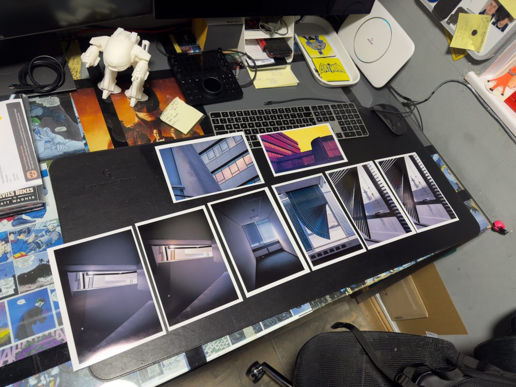
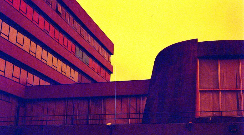
On the desk in the photo above you can see six photographs with two of them replicated with no colours. My attempts at using redscale film for the project are not wholly satisfactory and whilst the yellow toned image at the top of the selection is funky there is just too much grain and noise from the scan and colour restoration process, as was previously described in this post. It might make a good instagram post but I don’t feel it gels with the remainder of the project which consists mainly of muted tones, blues, greens, greys, blacks and whites.
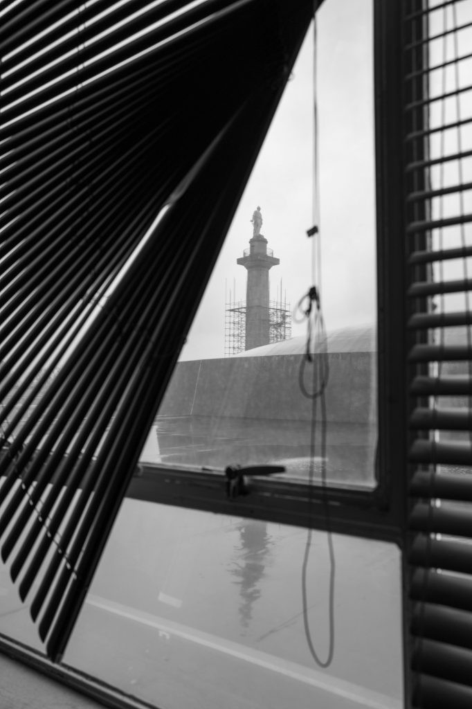
My favourite image is the blue coloured horizontal window blind that has got stuck when being closed. It has a wonderful curve that reminds me of a fan used in the heat of summer, (remember that?), and the lack of detail of the view outside creates a mystery as to where this might be. It could be an office block anywhere in the world. It’s obviously an office due to the electrical sockets and computer RJ45 sockets in the dado trunking, but it could be in a completely derelict urbex style playground or a functioning office building. The light coming through the window is also grey as it was a rainy and dreary day outside, aiding the overall impression that it is a grey and lifeless place. The blind to the left is mainly fully closed and the other to the right is slightly open, allowing light in but no idea of the world outside.
This photo works well with the one directly to its left in the topmost picture. It shows an empty office that would have once been populated by someone senior at the council, names and positions are on the door labels, but the same balance of a closed blind and open one appear in this obviously different location within seemingly the same building. The muted, tired, and grubby green carpet plays well with the blue from the blinds. The limited amount of sunshine streams through the slightly open blind and illuminates the wall to the right whilst the blind on the left appears to be hiding something outside. This is the Lord Hill’s Column but it could equally be a large industrial chimney, or other structure. The brown of the skirting and the trim around the radiators built under the windows pleases me and balances off against the false ceiling with its own grid work mirroring the gridwork carpet tiles on the floor.
These two images work well side by side in my opinion and would be my choice for the degree show.
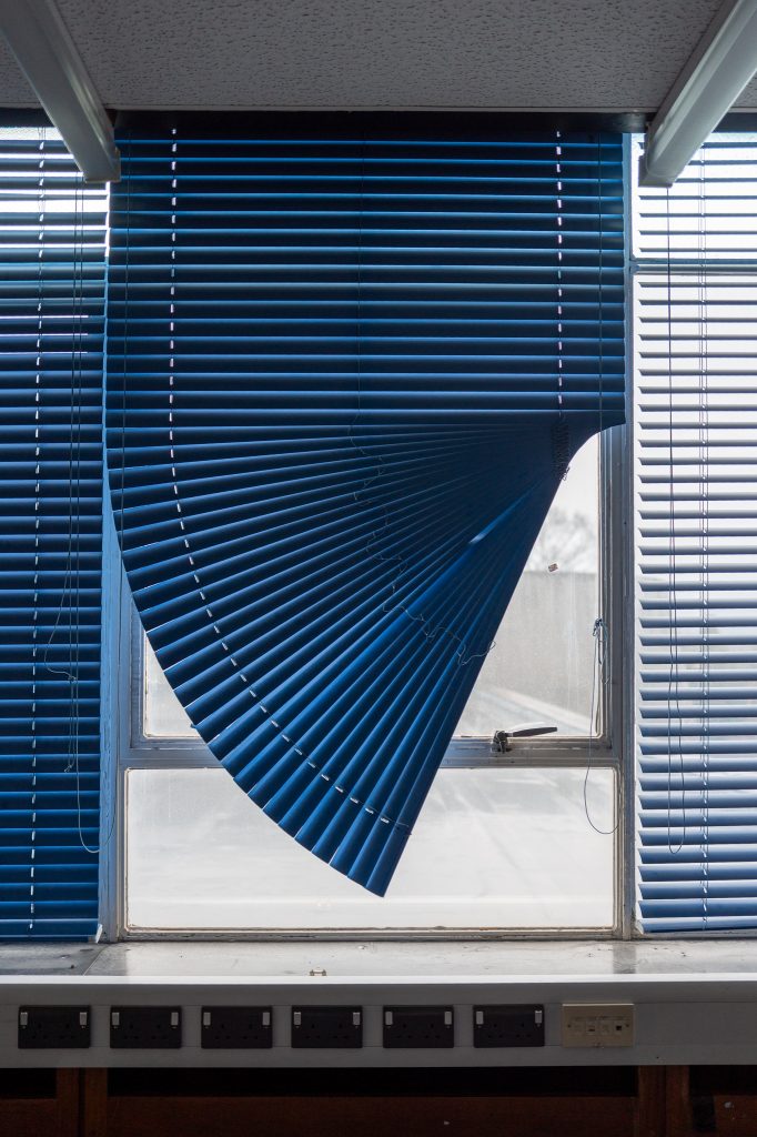
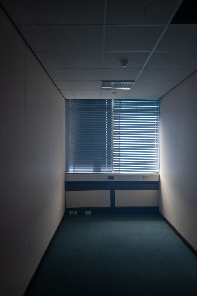
I think that these two work well together with a similar colour pallette as well as the blinds and the lighting. I do have a wider view of the window with the curvy blind but the rest of the image didn’t align nicely and I feel that the sockets, blinds and window frames seem to carry through the two images.
There is also another image of the same blind that I think works better in black and white, with more of the view visible out of the window including the tall tower monument that was under restoration at that time.
With this photograph the blue of the blind is lost mostly by the exposure of the sky being highlights and almost silhouetting the foreground. There is a bit of colour on the glass caused by the dirt and dust that has coated the windows over the last few year but it make the image look brown and muddied, less so when it is in monochrome.
The fact that you can see the Lord Hill’s Column being unveiled after its makeover framed in the triangle gap and then the reflection on the wet roof continuing downwards makes it a pleasing image to me. The reminder that we are looking through a window usually covered by a blind is there from the correctly deployed blind on the right side of the image. The cord hanging down obviously shows its purpose and helps frame the monument whilst the concrete dome of the council chamber can also be seen too, highlighting to those who know the building, exactly where it was taken from.
There is another photo on the desk that is there in both colour and monochrome versions but I think that it works better in monochrome. The stairs are a mixture of white and cream colour with som eof the light being natural through the windows, and some from the lights in the building. A mixture of different temperature light lends it a strange feeling and one that doesn’t sit well with me.
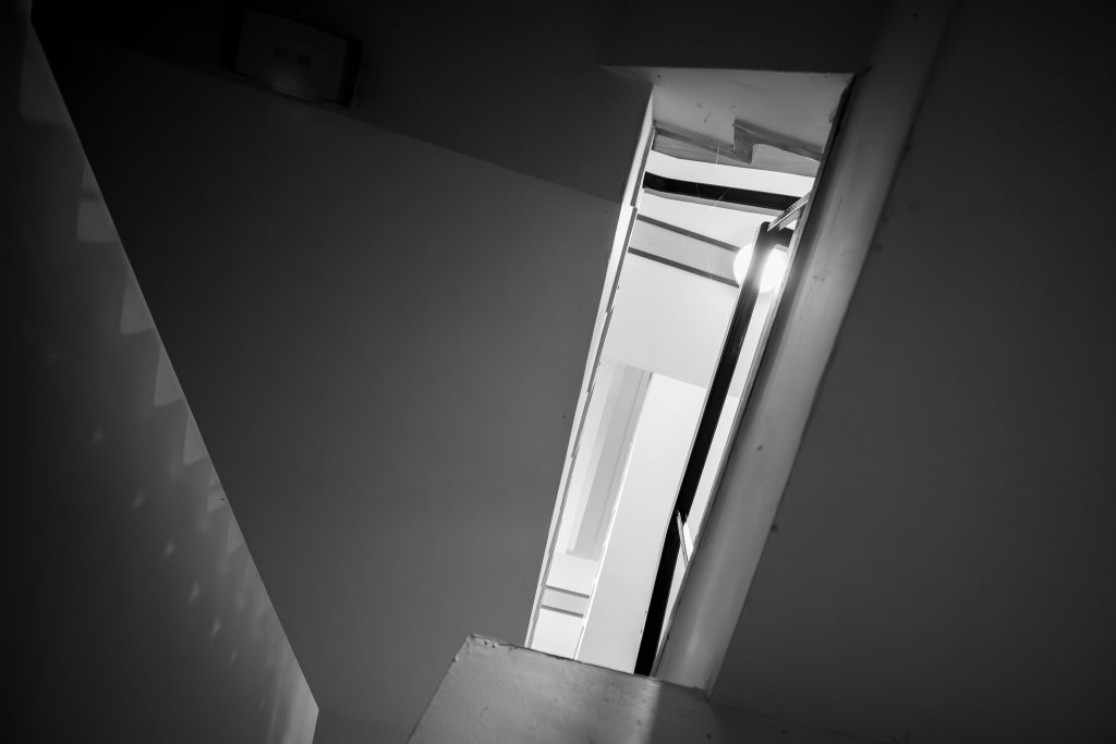
In black and white, the light is consistent temperature throughout the picture, the view upwards is a lighter tunnel than the foreground and the sawtooth form on the left wall is also hinted at on the top of the image as well as slightly on the right hand stairs below what would be the handrail. The circular light being partly obstructed also shows where some of the light is emanating from and I had to remove, using lightroom masking and removal tools, a small area on the emergency light which looked like a crap lens flare.
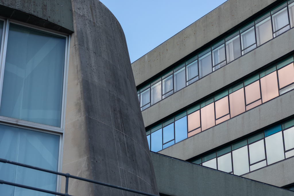
The other image on the desk is seen as a wider view from outside showing the reflective glass film on the main offices and a section of the circular council chamber dome. You can see the pattern on the net curtains inside the chamber and the lovely Portland Stone nearest the window frame, moving out to when it becomes grotty and unkempt. The lines of the offices and the fences of the chamber and walkway provide a flattened out V shape with my eye being drawn to the centre immediately and then wandering off around the image to explore what it consists of. The steel of the safety hand rail, the aluminium of the tall windows, the different clean and dirty Portland Stone, the mosaic green tiles heading out to the bottom right and then the mirrored windows and black window frames, all topped off with the blue sky make this appealing to me. It could almost be a collage of two different images.
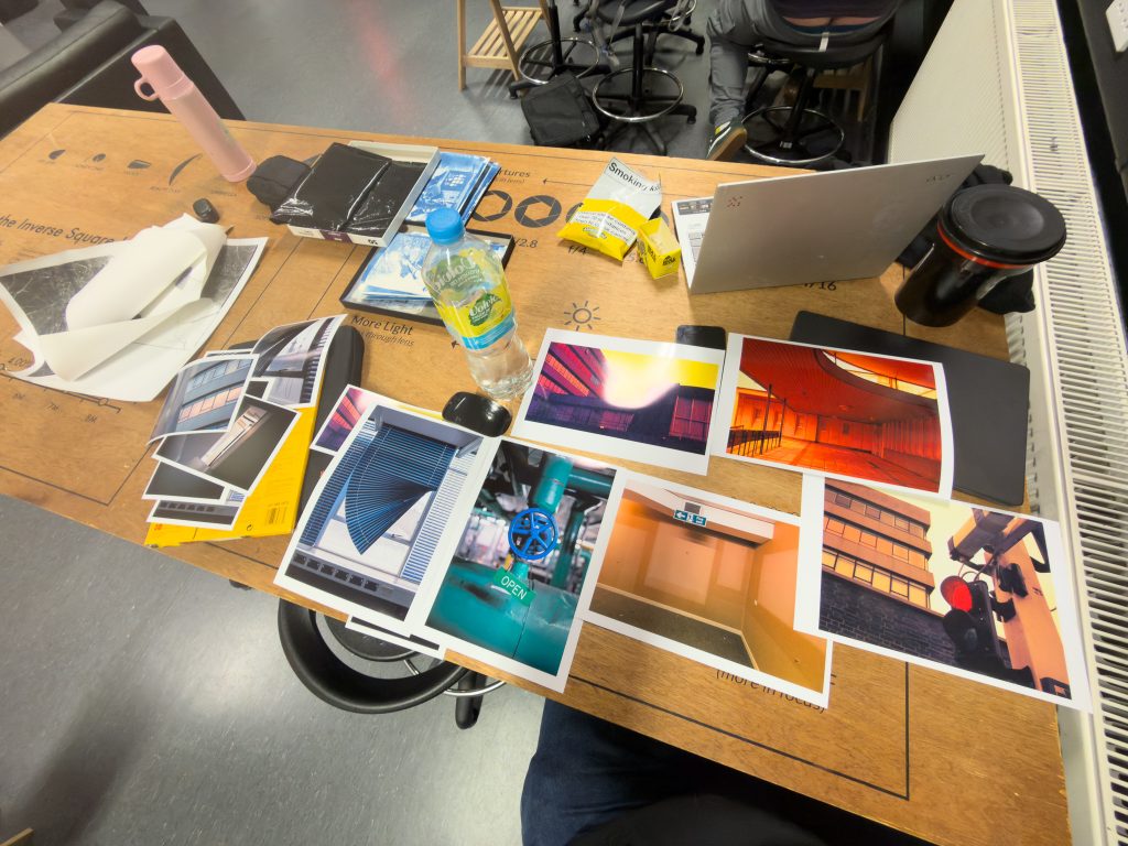
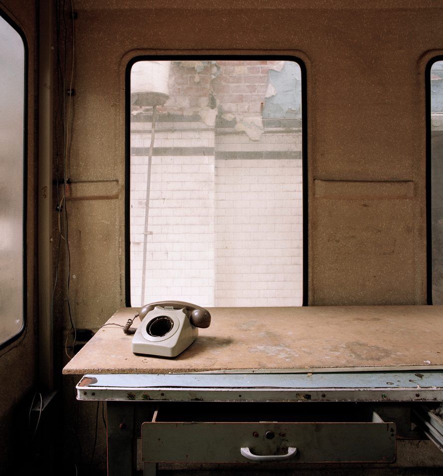
The evening before the day in Uni I decided to print out a few larger versions to try these out, as well as a couple of others that I thought might work in a larger format. You can see from the workbench in the photo below that I have the blind printed on A4 as well as the redscale weird coloured image, and then have chosen two other redscale photos, the walkway that looks really orange and then the red light and offices which have a slight red tint to them. Underneath these is a photo of the bare walls int eh emergency bunker. Next to this is a green and blue image of a valve on the water heating system that I quite like but I don’t feel it sits well with the overall look of the project. There are a few other colourful images that I have from interior shots that I think it might fit with but I feel it doesn’t inform me of the Shirehall and its decrepitudity.
Influences
Whilst these images reflect my view of the Shirehall building and perspectives that other people may not think to examine it is important to note that photography and art is subjective. My selection of these pictures in particular might display influences and a preference for photographers that I have mentioned in the past such as Peter Mitchell, Mark Power, Maurice Bloomfield, Morley Von Sternberg, amongst many others. The empty office seems to be a Mark Power influenced image and it makes me think back to a couple of years ago when I was studying a photo from his Airbus factory series, shown on the right in the three photos below.
The photo to the left of mine is one of Stuart Whipps’ from his series in the Longbridge Car Factory. The window showing the decay outside and the vacant office or workshop inside is another influence when I compare and contrast the output of my Shirehall project so far. You can see that the colours are muted in all three of these images, and whilst I’m not comparing myself to Whipps or Power, I think that you can see their influence in some of my work.
My work feels pretty coherent to me and I’m happy with my selection from over 1500 images on digital and film cameras. A wider selection of these images that I like,have been uploaded to my Adobe Portfolio page on my website under selected works and then Shirehall. The same images are also being posted, two per day onto my Instagram channel to keep the Shirehall in the forefronts of the minds of those who follow my Insta feed.
Future
Exhbition
I need to get on now and print out my final image for the exhibition at the SM&AG and also consider how I can best use some of this material in my final year which will start in September. I may be able to use the video and printing as part of the material around my photography exhibit, if I’m still photographing the Shirehall at that point. I could look to get Jim in the Print Support Hub to print it out
Modelling
I still have plans to create a 3D model of the Shirehall using Tinkercad or similar software and then print out a small scale model using my 3D printer. It would be nice to be able to model it and paint it as though it were the real thing and have this on a plinth at the exhibition. I could even do a SpacePlay and use it to create a mould and then produce a concrete model of the buildings. That would be cool, but a bit outside the remit of the project. Might make a good summertime project though I guess.
Dissertation
I also need to edit my dissertation a little after my results from the draft hand in assessment so this will take a couple of weeks to complete before the hand in which is likely to be at the start of May sometime.
American Road Trip
If the Shirehall story dries up over the summer break, I might be able to change tack and start working on the lines of William Eggleston or Alec Soth with a road trip across the USA planned for July and August. Our plan is to drive from San Francisco on the West coast to New York on the Eastern seaboard, using a campervan/motorhome and stay at some campgrounds as we travel across the country. Maybe I’ll have some good photos of the roadside gas stops, cafes and motels that I’m imagining seeing. There are two nights planned for both Las Vegas and Chicago so there will be some busy city and nighttime photography available too just so I’m not missing my usual content.
Be First to Comment