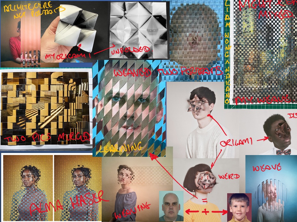
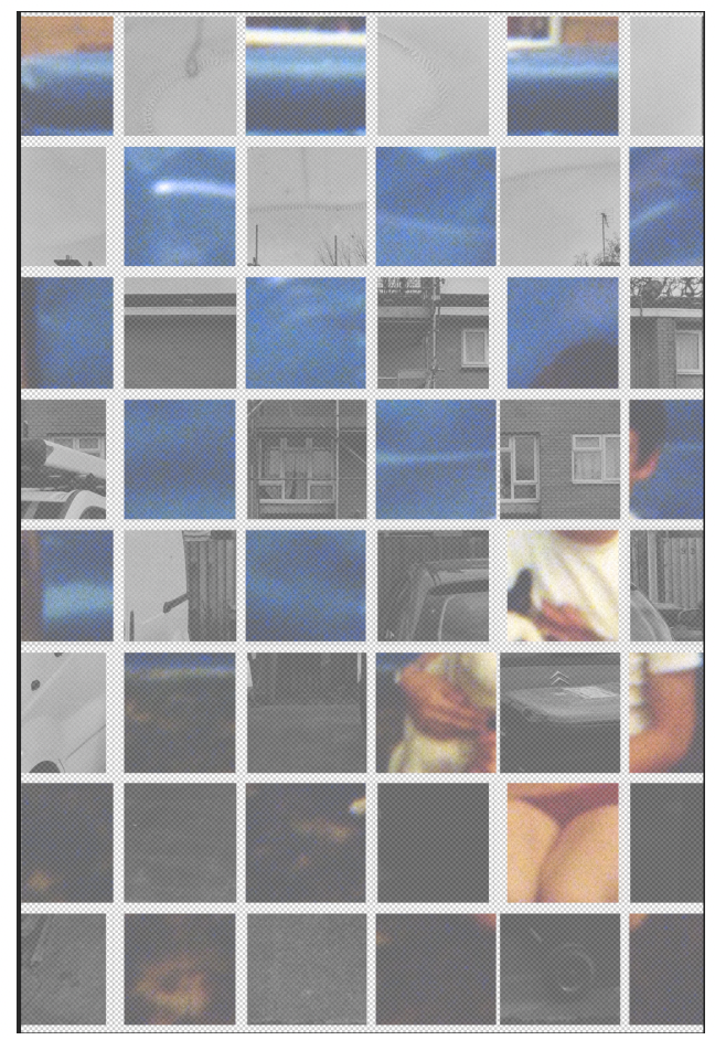
A brief overview of my progress throughout the whole year of this project leading to a photo of the body of work.
Way back in September 2022 we were introduced to the concept of a Year-Long Project that would be a part of our next nine months work. Alice gave us the brief that would guide us through the learning objectives and the phrase out of this for the year long project, henceforth called YLP, is seen below.
Based on a starting point of your choosing, you will develop a body of work in negotiation
Alice Hodgson, 2022
with an assigned practice tutor. For example, this might begin with a process, medium, topic, issue, or theme. You will work independently, supported by weekly tutorials that will encourage you to reflect upon and develop your work.
The actual learning objectives that we must use to ensure we meet the marking criteria at the end of the project is also seen here:
LEARNING OUTCOME 1: MAKE
Develop speculative and reflective approached to material experimentation and processes.
LEARNING OUTCOME 2: RESEARCH
Respond to contemporary and historical cultural contexts and show the curiosity to develop personally focussed research.
LEARNING OUTCOME 3: COMMUNICATE
Document and communicate with others about how your ideas have evolved and explain your decision making in support of project outcomes.
LEARNING OUTCOME 4: REFLECT
Reflect and evaluate your own performance and that of your peer group in relation to appropriate contextual references.
LEARNING OUTCOME 5: ENGAGE
Manage your time and studies effectively and demonstrate a positive attitude to studentship through attendance and engagement in taught sessions and independent practice
Brainstorm
In mid-October I had produced a brainstorm for project ideas to see if there was an area that stood out more than others, I initially thought that industrial photographs were important to me as my whole career has so far been spent in the same location in Perkins and Caterpillar employment. I spend a lot of time around computers nowadays but in the past I have been involved with hardware on the factory floor, gearboxes, engines, electronics, cranes, lighting, electrics, vehicles and all sorts of other engineering practices. This was in my mind as I’d seen a Maurice Broomfield exhibition at the V&A and his images were amazing.
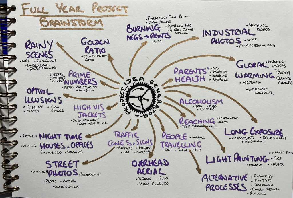
Distressing
Whilst I was considering this avenue of work I was visiting exhibitions in order to begin writing the Exhibition Review and this took some attention away from the YLP but it was still rolling around in my head. As part of the physical workshops around this time we were also being given a 35mm film and a camera to go out and get exposed then developed so I was in the colour darkroom a lot. I’d also been playing with some negatives I’d made in August whilst on a road trip around Scotland. Touching the negatives and being in the colour and black & white darkrooms is an enjoyable thing for me, unlike some of my classmates who found it a real bind.
With a look in my notebook back to a trip to Tate Modern in June there was a bit about distressing of images, adn aa note i’d made about distressing or damaging negatives/prints which can be seen on the top of the page of the brainstorm. The piece of art that caused me to make a note was Death Of Sun by Ku-lim Kim in 1964, it was a painting that had been burnt, charred and I found the textures fascinating. Niki and I spoke about this and for me this fit the “Experimentation” part of the course title a little better than the industrial photos. I’m not used to messing about with photos once I’ve made them so any changing like we’d discussed would be outside my comfort zone. Experimental Photography: A handbook of techniques (Antonini et al., 2018, pp. 92-93) has a section on negative distressing so what I thought was an original idea definitely wasn’t, a scan around the internet brought up masses of information about this subject too. This feeling of being saddened by my ideas that I’d come up with independently only to find it had been done prior is a constant throughout the YLP.
My negatives from recent shoots were valuable to me and I couldn’t face damaging them on purpose so I considered the possibility of damaging the paper that would be used to enlarge onto.
Alternative Ideas
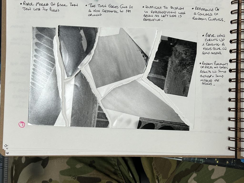
My initial idea is to rip the sheet of photo paper up, place it in a random order under the enlarger, expose it with the set up negative and then piece it back together in the right form afterwards to see what happens to the image when it’s ripped apart and spun around before being stuck together. The I started thinking about jigsaws too and more research on this brought up Tim Klein who is an artist using jigsaws to merge two different images together, in much the same way that Dave Gorman had done a number of years ago.
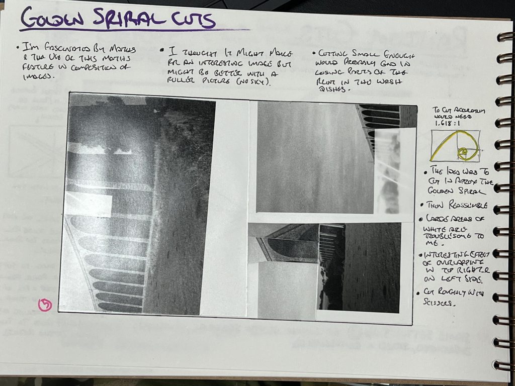
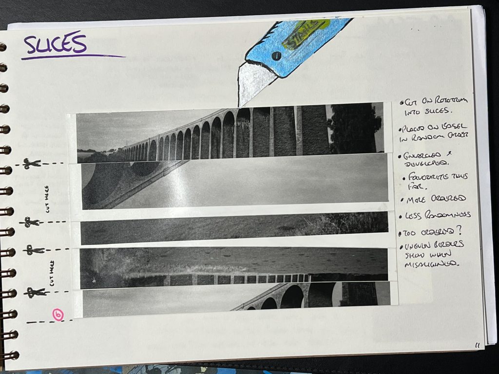
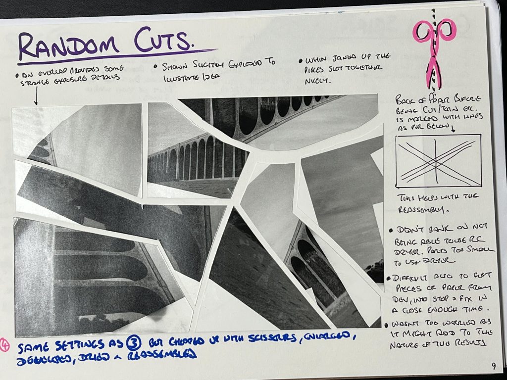
My first attempts at destruction of prints by jumbling up the paper before exposing them to the enlarger worked ok and I was relatively happy with them but it felt somewhat limited. I played around with strange orders such as cutting it up into pieces of a “Golden Spiral” before exposing and then reassembling, then slicing up a paper before jumbling up the order and then putting it back in the original order again.
As well as disassembling the paper and then exposing it I wondered about interrupting the light getting to the paper and Niki and I discussed it with the result being an idea of using acetates with circuit diagrams, or chessboard to mask of parts of the image that I didn’t want exposing. As well as this I figured that engineering drawings might make good masks to imprint on the paper owing to their relevancy as Cyanotype, “Blue” prints so it might fit. We discussed the reasons why I was visiting this route and engineering arose again, as well as my fascination with taking things apart and trying to get them back together again.
Behind The Mask
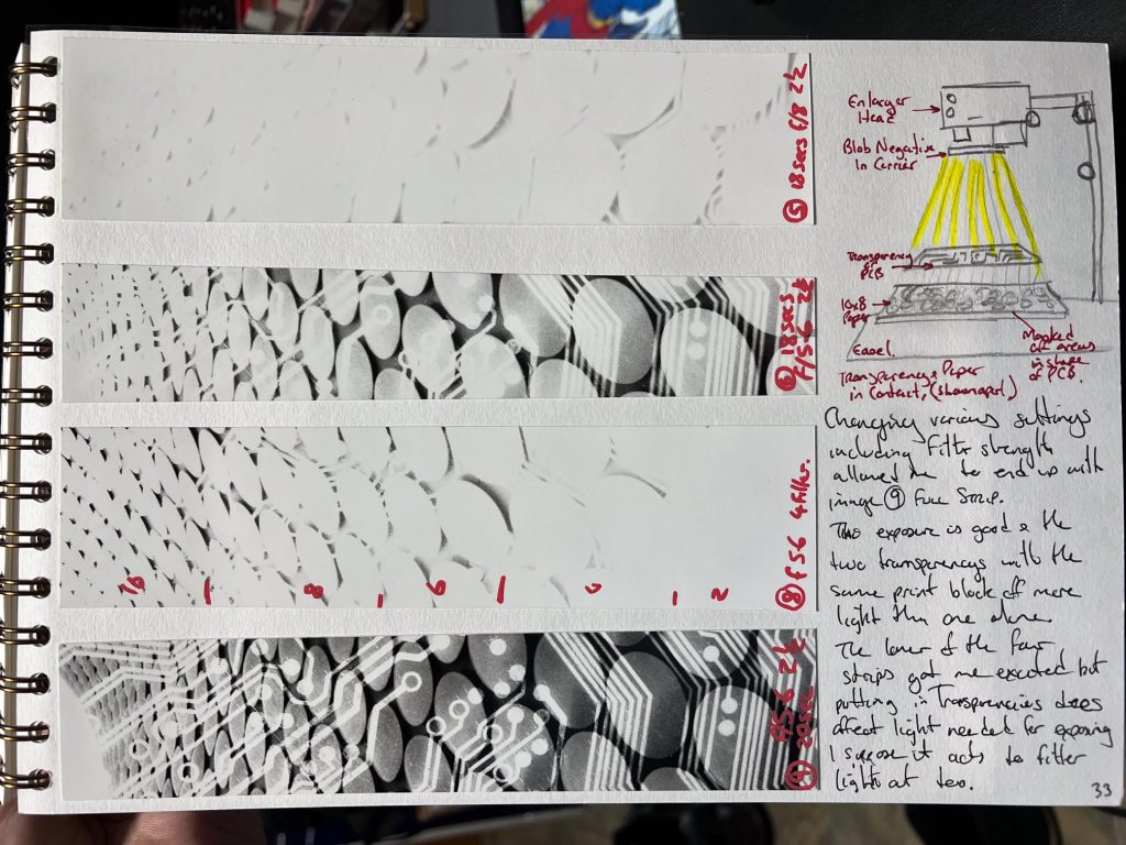
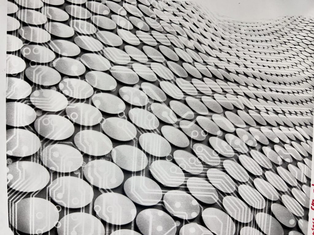
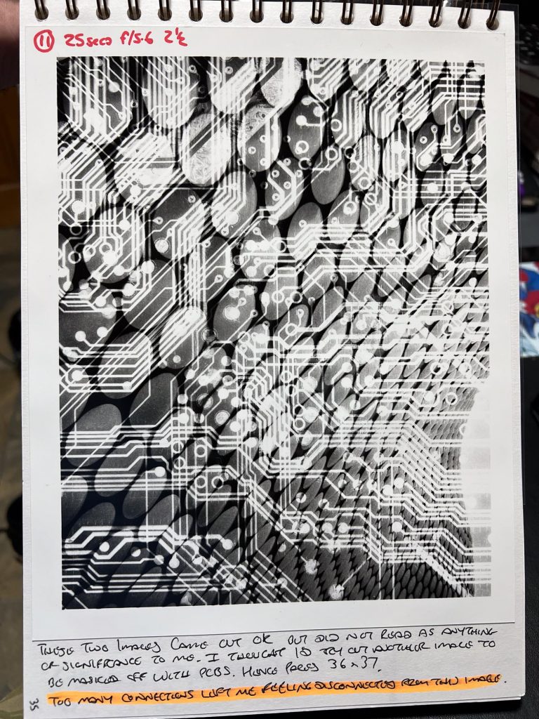
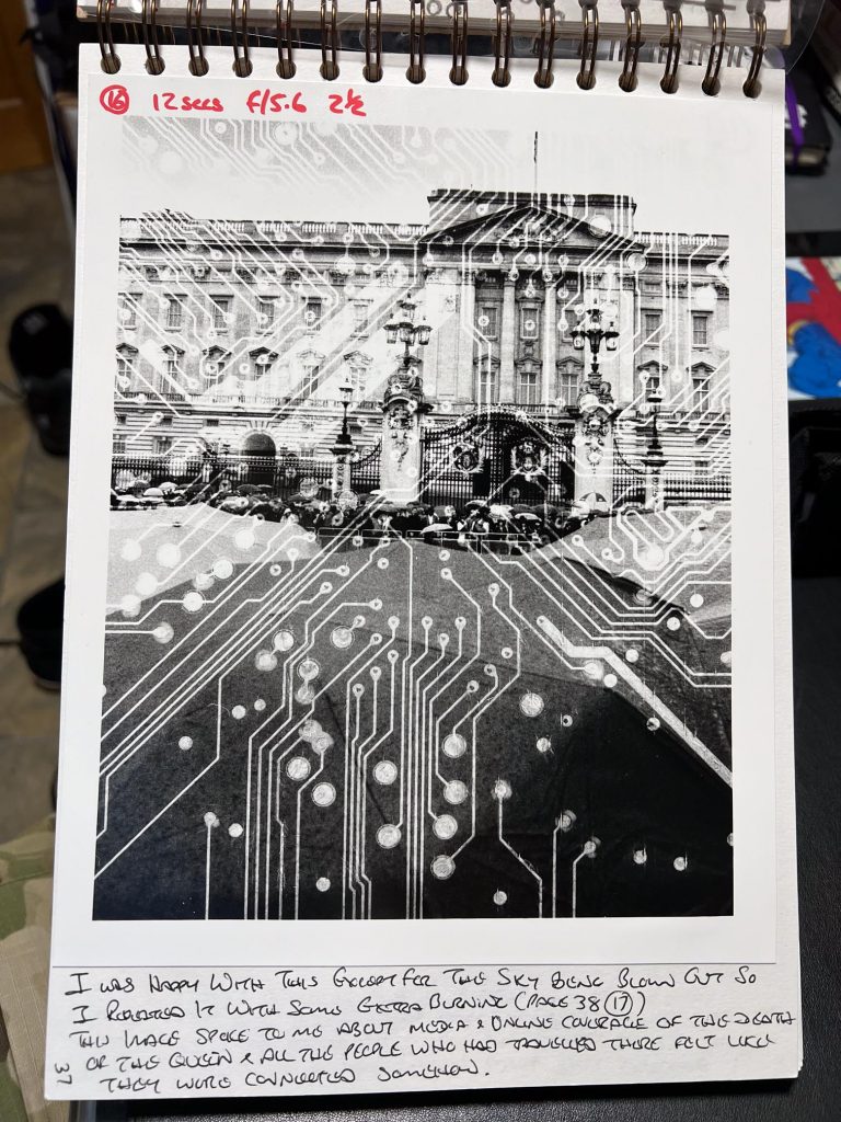
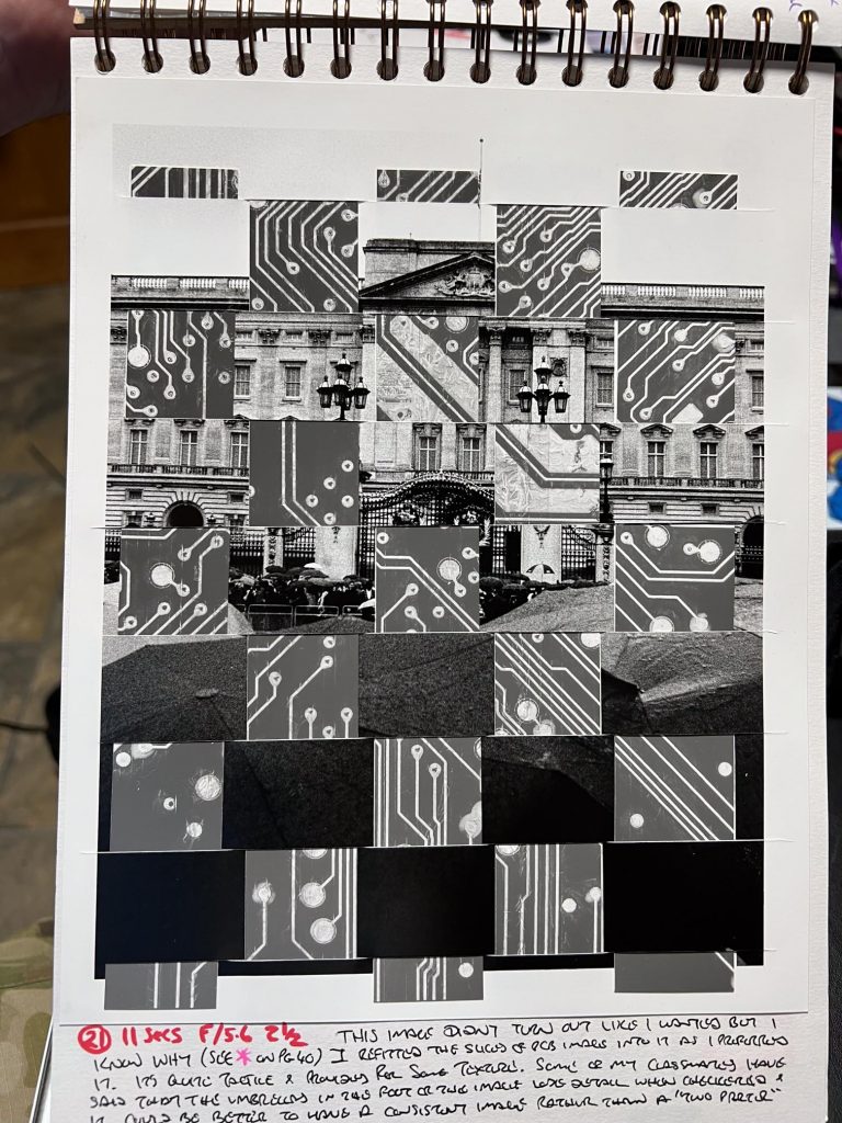
During this time I started trying to create prints in the B&W darkroom with an acetate mask as you can see above there are some with a circuit diagram overlaid. Some are more successful than others but I still couldn’t piece together why I was doing this. The images I was working on had no real significance to the project, they were just images I’d made on a trip to London the day after the Queen died. If I was to try to tenuously link the two concepts together it might be that the country has been controlled by the Monarch for the last 70 years and with the death of Elizabeth II the connections were all going to have to be rerouted to make the paths of information and power connect once again. I write this the day after the Coronation of King Charles III so it appears that this uncertainty has now been overcome and the next phase of the life of the country is now in play.
As you can see from above, I was playing with the idea of masking of certain portions of the paper with a circuit diagram and exposing it all then developing it as usual. I had to work out how to cut the strips to fit through the paper for the checkerboard layout. I did this weaving as I couldn’t work out how to cut a checkerboard out of the paper without each square in the centre falling apart, due to not having any support from it’s neighbours.
Once home with these results I figured out that weaving was a pretty good way of merging two images together so thought I’d play with the physical process of slashing up prints and then assembling them to show the two images simultaneously.
Crossroads
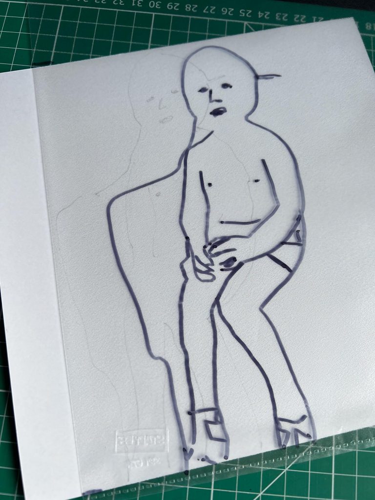
If this were a “Choose Your Own Adventure” book from the 1980s there would be a definite decision page about now, I had to decide whether to carry on with acetates and masking or go down the path of weaving images. I chose the latter and created some pieces of work I called Veeblefetzers. The word means a nonsensical word for some obscure or complex technology, like we use thingamajig, or gizmo. I started off by using my poor quality laser printer to produce some prints that I’d made of self portraits for this work.
I was going to make a woven picture from two so thought about ideas that I might use to prompt a piece of work. I slept on it and then woke up with the idea of making self portraits of my head, front and back, and left and right. Then merge the front and back images before going onto creating a single image of the left and right sides of my face.
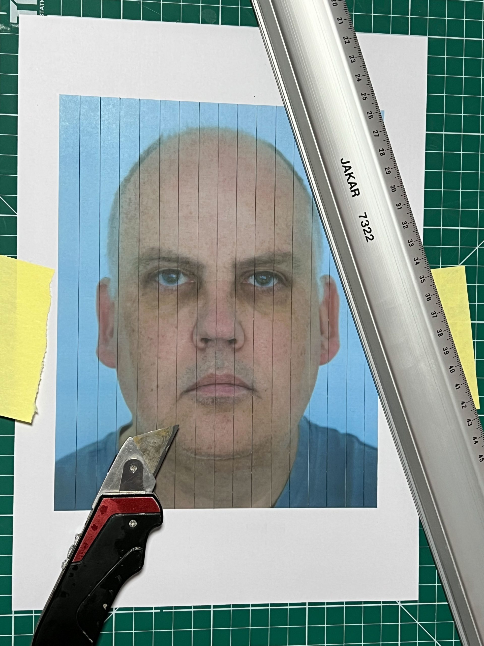

I found it incessantly tricky as I was working with thin copier paper and it was incredibly difficult to weave in and out of each strand of paper. I first took the image of my face and did vertical cuts at 1cm distances and then the back of my head I cut into 1cm strips in a horizontal manner. Weaving these in and out of each other I came up with the finished work “The Front and Back of my Head”

It is tricky to see what is happening in the image as it looks like a corrupted front view of my head. It’s not immediately obvious that the rear of my head makes up 50% of the final image but I did enjoy the process, as frustrating as it was, and the final outcome. I thought I’d do some more.
The second of these Veeblefetzers was called Sideways and doing some research on weaving looms taught me that I could use a shed stick to reduce the amount of fiddly work by almost 50% which would speed up the process. I picked up the idea of a Beating Comb too, which would help me force the strips further home into the position they should be.
Sideways was a mixture of two photos, I made of myself and consisted of the left and right side of my head, which I thought might end up looking like head with two faces from a distance, much like Professor Quirrel in Harry Potter.
About this time I was researching other artists who were doing weaving of images together, alas it seems I was not the first to do this stuff. Gutted. I noticed that the others, like Jason Chen, did not rely on a purely checkerboard pattern and had good success in different patterns so I decided to try a photo of my face merged with a school photo of myself from when I was around 10 years old.
I cut the modern picture in diagonal strips and then fed the school picture in in vertical strips and it looked effective, especially with the eyes almost matching up.. I had some good feedback from classmates, tutors, friends and family as well as people on Instagram on this image of me merged with myself. I got in touch with Jason Chen about his work and he kindly responded back to some questions I’d written him. One of the things that stuck out to me was that he liked to include Time in his weaving work, whether it is the time it takes to physically produce or the the time between the two images that are represented in the final image. It was an interesting point and one that I considered when carrying on this practice for the YLP.
So far the pictures I’d used were not really selected for any reason other than convenience, and I talked to Niki about how I didn’t want to concentrate on Portraits too much as I’d like to include some architecture or urban landscapes, this was due to me not being a big portrait photographer. Little did I know that this would be a major part of the final body of work.
I had a colour film or two that I’d filled with images of low light scenes and was spending some time in the colour darkroom, helping my classmates with theirs too but I only found a couple of images that were suitable to merge in a Veeblefetzer. These two were of some concrete supports in a multi storey car park and I printed them out in larger than usual colour and took it home to try and weave them together using a different pattern to the usual checker.


I liked it a lot but something didn’t look right with it, it wasn’t overly interesting but it did mix up the two images. I think that the Pic1 above is a nicer image without it being merged, and it’s beauty is somewhat lost in the merged version. The woven image does appear to be corrupted as the ZX Spectrum Loading Screens often used to when loading a game from cassette tape.
Further Research
With a group review to talk about teach other’s work, Alice had seen mine and suggested another photographer called Alma Haser, that might be worth looking into. Haser had a really interesting project with jigsaws and identical twins as well as some origami methods to create weird and wonderful effects. I did also buy some jigsaws but the size of them when they were assembled was a bit restrictive so they’re still in the boxes. It’s something that I will try out in the near future that’s for sure.
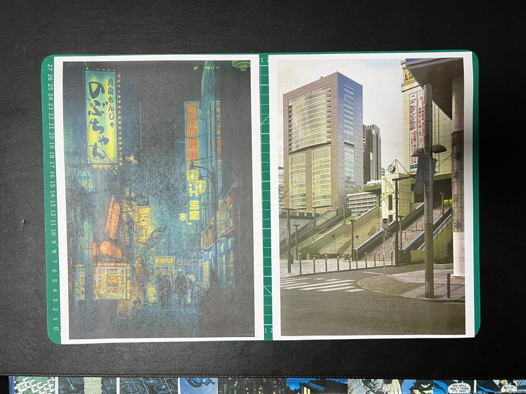
As part of a Reinterpretation exercise for Alice I found myself looking at some images by Liam Wong and Masataka Nakano and I chose to join two of their images together to act as my submission for this exercise task. The Liam Wong photo I used is a night time shot in Tokyo and the Nakano (who Liam Wong suggested to me) image was that of Tokyo in the daytime from his project Tokyo Nobody. Someone mentioned in the group review that they wondered what it would be like if the strips of paper were smaller than I had been doing so I figured that I’d give it a go.
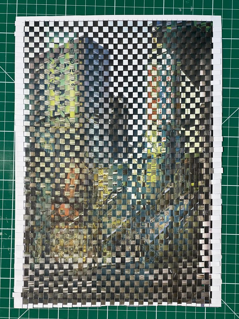
The number of strips of paper were considerable and to fit them together to give me a view of Tokyo in both night and day took me a total of 7 hours. It does look a little muddled though but I can see what each image is in the mixed up image.
WHY?
It was in the next group review and tutorial that I started asking for advice to make sense of why I was doing what I was doing. I wrote a full page in my sketch book of a brainstorm and talked it over with Alice and Niki.
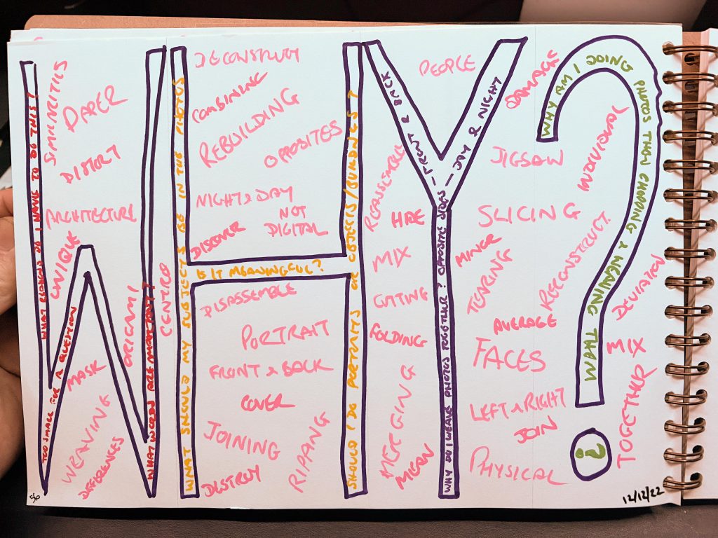
During one particular discussion with Niki as documented in this post, I found that I was looking at opposites, polemic arguments or contradictions. I was talking about how as grown adults, the people of the world should be able to sit down and work through their issues rather than going hell for leather launching a special military operation or a misguided invasion of a country looking for weapons of mass destruction. Obviously those are the extremes but what about people who don’t have a faith and those that do, people who are staunchly firm about their beliefs on sexuality and then those who just want to be treated as they see themselves? Is it too much to ask to show a bit of respect to each other.
I still hadn’t damaged any negatives at this point and didn’t want to but I had recently been researching Shaina Gates’ work along with that of Rohn Meijer.
Gates makes photograms by folding negative film up before exposing it to light. Once exposed it’s unfolded and developed before being refolded into the original shapes and placed on a wall or mirror where light from a spotlight or window plays through the film and creates a pattern on the wall or surface. They’re interesting items and her work is progressing well if you look her up on Instagram and the work she’s producing today looks very polished and professional as well as wildly interesting and different to anything I’ve seen before,
Meijer on the other hand was a fashion photographer who left his negatives in a damp cellar to return to them 15 years later to find they’d been attacked by time, chemicals, biology and other processes. The effects were very psychedelic and he produced a series called Metamorphosis which is fascinating to see. Images in my sketchbook shows that these pieces of research led me to think about damaging negatives using needles, nails, abrasives, sandpaper, stone and concrete, burning and water. I still couldn’t bring myself to do this to my negatives, not on purpose anyway.
After this tutorial I was working in the darkroom and found that there were lots of fogged spots on my paper which was due to holes in the black plastic bags used to take the paper into the colour machine input room. Whilst I was puzzling this I had a thought about using a bar magnet and iron filings to create photograms. I searched for these online and didn’t find any so it was off to ebay for some magnets and iron filings. With my new purchases in hand I practiced to see if I could get the typical magnetic field lines in the filings on a piece of paper, so I could then recreate it on photo paper under my home enlarger. It didn’t work as I thought it should as the magnets were much too weak and the patterns didn’t appear. It’s something I stopped at that point, I was in the middle of several other paths and wanted to continue down those, so I’ve a big note about returning to this in the future.
Niki had also helpfully guided me to think about the subjects of the work, something I’m interested in and then shoot them and play with the prints, or the negatives. This made good sense as I’d been playing with images that I wasn’t that connected to.
Accidental Damage
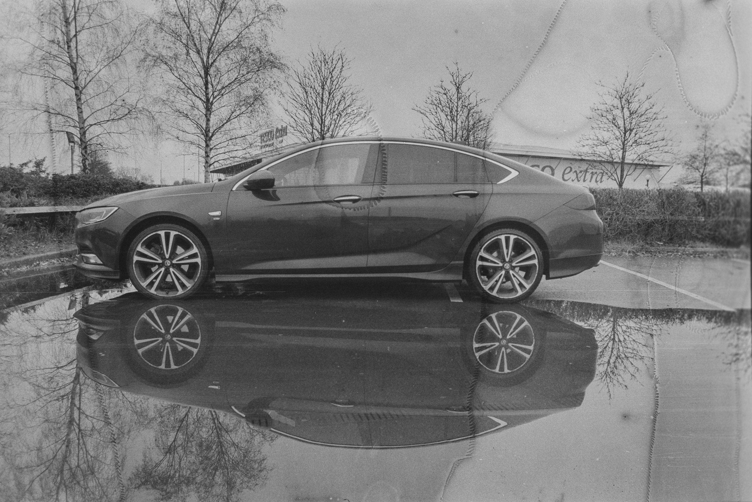
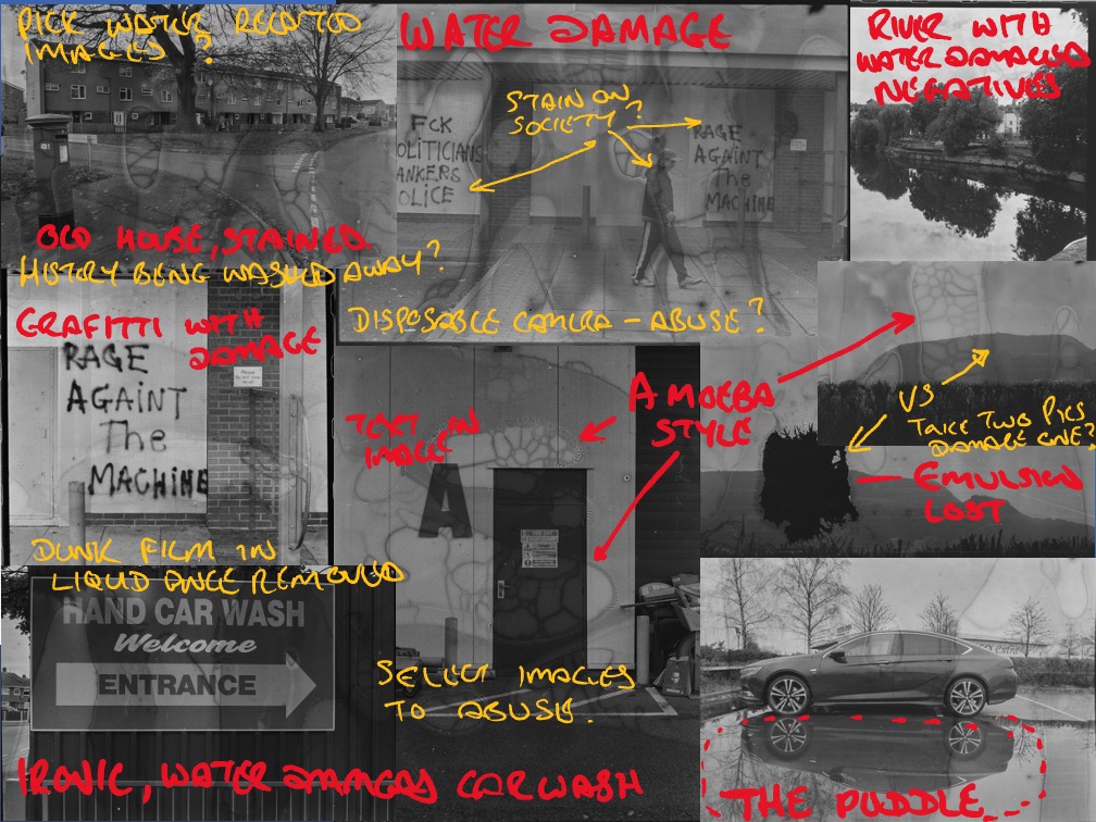
After looking at damaging negatives through different processes and deciding against it I found myself accidentally exposed to the process. It happened one day in January whilst photographing reflections of my car in a puddle, shooting with both digital and 35mm I bent down to get close to the water surface with the digital and my Canon A1 was squeezed out of my pocket and plopped into the puddle I was standing in. Gutted.
Long story short, I got the film out of the camera after winding it back into the cassette, then developed it at home, noticing some stickiness when feeding it into the Paterson spiral. It all came out ok but with lots of artefacts and damage, water damage to the emulsion, in some places the emulsion had stuck to the surface of the film above it in the canister but I got some images out of it.

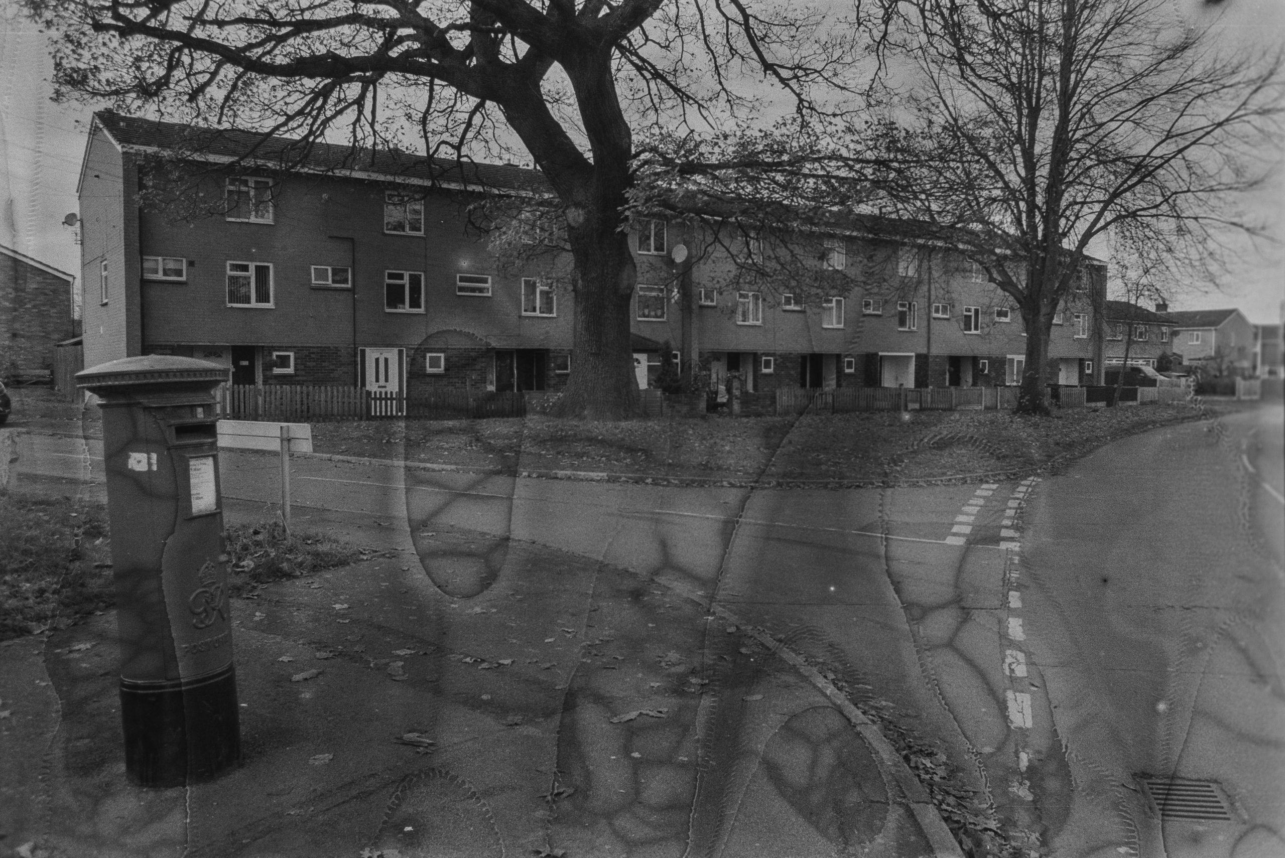
Something about the water damaged images struck a chord with me and I found myself creating a story about each frame and as to why I found it interesting.
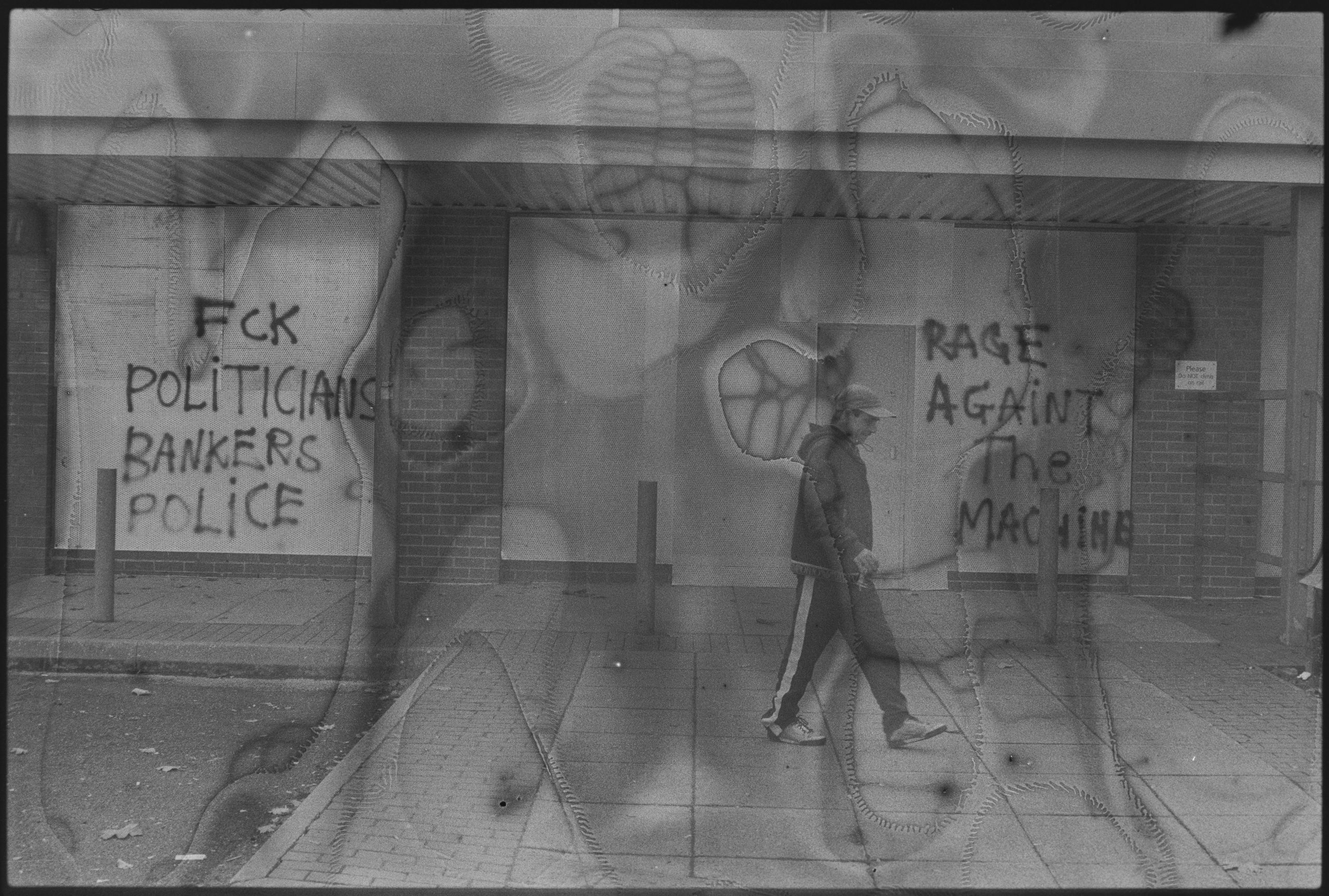
The one photo. in particular that piqued me was the three storey houses and postbox, which is where I grew up from about the age of four until I was about eleven. The water marks could have been linked to liquid damage caused by alcohol that my Dad was no doubt addicted to in a big way. It felt like a connection was being made to my own history by this damage, perhaps I should damage a film by submerging it in Banks’s Bitter or Strongbow Cider.
Even More Research
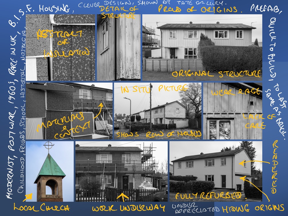
With the advent of 2023 kicking in we were to do a group review of work and demonstrate our body of work so far with a look at getting critique and feedback from our peers and tutor about the essay for the other half of the module. The first research board I produced was of the area I grew up playing in and the houses of Tin Town in Belvidere/Crowmoor in Shrewsbury. I’d been around taking some photographs as I’d played there as a schoolkid with my friends, I liked the buildings and after researching them in a book called Concretopia by John Grindrod I read up further on them. Some of the houses with steel frames and metal corrugated cladding were being refaced so I wanted to capture the originals before they’d been wiped out. I went back a couple of times to shoot the houses in various states of reconstruction, some where I could see the insulation boards and then again when they were covered over. As part of this I sent out a questionnaire to ten of the houses and asked them questions about what they though of their upgrades, or why they hadn’t upgraded. I never did get a single response back.
Cheating a little, as most only had one research board, I showed the images from the negatives dropped into the puddle and some people liked these more with some good comments. Some of my classmates liked the effect but I could not see how an essay might use these, they might be more beneficial for my YLP.
The last of the three research boards I showed for essay ideas and critique was about weaving again as per my YLP. As hard as I tried the link between Weaving images would not leave me alone and I started to consider using weaving for joining two images together of my life story. In a way this essay prep of research boards had helped me link weaving together to my history, as I had already experimented with a picture of me today and me at school I felt there might be some mileage in this for my YLP.
Bus Stops
It was talking to Niki about my idea of merging two photos together with a time between them that I mentioned about a local news story featuring replacement of some bus stops so I had been in touch with the council to find out which bus stops were being modernized first, in which locations and in which order. I contacted the council about this and got some great information which then helped me prioritise which locations to shoot first, I shot with both film and digital.
My idea was to document the bus stops that I’d waited at as a kid with my Mum when we used to go into the town centre for the supermarkets, long before the likes of Asda Tesco and Sainsbury’s large outskirts supermarkets were a thing. If I could capture the old, decrepit and damaged shelters then revisit their locations with the new installations it might be something I can use. The idea might be to weave the two images together somehow to show off old and new, before and after. It would contain my memories and time passing along with the regeneration of old infrastructure. Some of the newer images were included in this post as we had another crit where anonymous notes of critique on images were provided by my peers.


Research continued on other artists about photographic damage, such as the work of Walead Beshty whose iconic images of the East Berlin Embassy were damaged by airport x-ray machines, which led me down a rabbit hole of finding out that higher ISO films are more likely to be damaged this way and why.
Amanda Means is another artist who does something similar to Shaina Gates but folds up photographic paper before exposing it to the sun. Aldo Tolino folds and cuts paper to create abstracted images too and these were all good bits of information which led me to want to carry on the paper manipulation rather than the negative distressing.
Niki recommended a book called the Memory Illusion by Dr Julia Shaw which came in handy for my essay about memories and photography along with more information about why we remember photographs or don’t, When Nostalgia Was A Disease by Julie Beck tells us of times when people were thought to be mentally ill when they were just feeling nostalgic and homesick perhaps. Some of this work linked in my small art brain together with photographs of locations from my past and triggered a number of memories, in what are termed Engrams in the article Memory engrams: Recalling the past and imagining the future, by Sheena A. Josselyn and Susumu Tonegawa
Family
This bit of discussion and research has led me to hone in on an idea for my body of work for the year long project, which you will see appear soon in this post. The week after, we had a seminar with Alice about Family Albums and I had dug out some photos from my past up either in my scanned lightroom catalog or the original paper images that were stored in albums and boxes in my parents house.
Whether it was my reticular activating system making more of the next seminar too or whether it was designed to prod us in this way, the next seminar from Alice was about work made that caused questions to be raised about the ethics of the images. Richard Billingham’s Ray’s a Laugh, and a couple of others (Martin Parr, Boris Michailov) were shared with us and Billinghams images of a council property that was not too dissimilar to mine when I was growing up caused me to further reach back into the family albums for more images to look at.

Focussing in on my YLP end goal of producing an image or multiple images of two photos merged, maybe including some damage to the images was the plan now and as I’d been soley concentrating on damaging film, paper etc I had neglected to play with digital images so I started to merge photos in photoshop using masks, that would produce an effect comparable to what I had been doing in the darkroom.
This post explains what I was doing to try and get a digital image that was as pleasing to the eye as the physical weavings I had already produced and how I’d spoken to Niki about the results.
We discussed how I felt that practical effects like the weaving were more important to me than the digitally superimposed photos, I think that the process of manually constructing these pieces from joining them together is an integral part of the reason why these mean more to me than the digital versions.

Visual Disruption
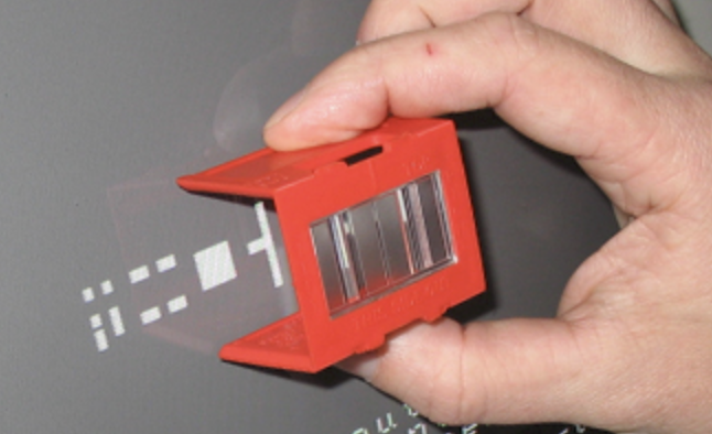
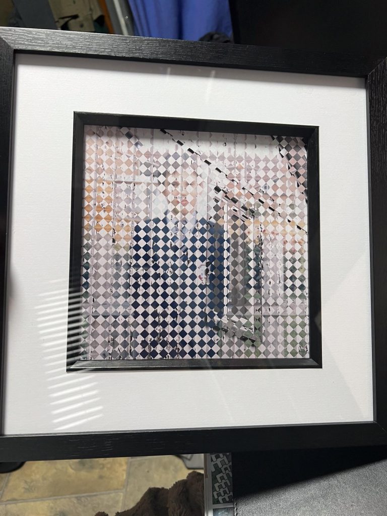
Further discussions with Niki occurred again when she remembered a book she had in storage that used a piece of plastic to slide over the page of an image to make it appear to be animated. This was called Grid Barrier Animation and is a sheet of clear acetate with black lines on it or prism style design that shows one line of the image underneath at a time, and the sliding motion then uncovers subsequent frames of the animation. Very clever and I started to investigate it when she brought it in for me to take a look at, it was a book called Vento by Virginia Mori. I did also print out a sheet of acetate with the same diagonal pattern as can be seen in some of the images above. When the transparency was moved across it uncovered one image and revealed the other. It was ok but felt a bit “cheap”
Further research online showed that this could be done in MS Powerpoint but it wasn’t something I wanted to copy for my year long project. This Barrier Grid took me into long-past times of using a LensLok device which was a plastic prism used to prevent copying of computer games back when we played Elite on the ZX Spectrum. I wondered whether I could create the photo with some distortion that would be corrected by the prism type device or whether an interesting effect could be achieved.
This device and the method of creating digital weaves did remind me of the 8 Bit computer days when I had even partaken in some computer art pixel by pixel using Deluxe Paint 3. We discussed together as a group and with the tutor the relevance of digital graphics and whether it would fit in but I was concerned that I was moving towards another wormhole of work that took me away from my chosen path of the weaving so I chalked it up as another thing to look into in the future.
Another Direction
The following week saw us in a group review where my work was briefly shown on Padlet so we could canvas for feedback. One comment was related to something I’d thought about during the Riso Printing Workshop with Jim, in terms of having two images that were visible using Red/Blue 3D glasses so one images was visible when closing left eye and the other when closing the right eye.. I wasn’t overly enthralled by removing all of the colour from the image, save for blue and red, and I didn’t think it fitted with what I was trying to communicate.
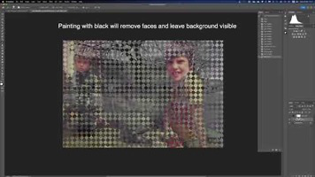
As part of this seminar we were discussing how images could be presented, Alice shared with us some work by Patrick Tosani who included some Braille in his images using embossing. I was considering this later when I thought about Morse code and how it fits with engineering and communications, I wondered whether I could use it in a piece of work as holes so that the viewer could only see the image through the holes that made up words.
It was a good idea but again another I left on the shelf to look at in the future as I didn’t have the time to develop it further apart from a mockup of what it might look like. It’s something that I will play with at a later date but not for this project. Focus Bob Focus, damn you man!!!
Family Albums
As you can see from the photo directly above, I had been raiding the Family Albums for old photos of me and my family. We had a seminar about Family Albums with Alice and it raised some important points with me that I thought about after the session had ended. One thing I did was to ask my Mum why she kept these photos in an album, what was special about these images in particular, but Mum’s MS has made these conversations all but impossible and we went back to discussing Bergerac or Heartbeat whatever was on her TV at the time.
One of the artists we looked at was Donovan Swann whose work Say Cheese looked a little like my woven images or Veeblefetzers without it looking like I was copying her work wholesale.
About this time in Mid March my father was taken into hospital suffering from Pneumonia, he didn’t survive it and we were then thrown into the emotional washing machine of life and death. Whilst I was getting my head around the grieving process I was also having to delve into Dad’s archives for paperwork and documents that would be needed for HMRC and Probate requirements. Along with this was finding a load of old photographs that I’d never seen before. It’s like the family album seminar was aimed squarely at me for this moment, weird how life is eh?
Thinking back to my childhood and seeing some images from further back when my Dad was a teenager got my creative juices flowing. I now knew what the subjects of the photos that would be woven together were going to be. Images from the past mixed with photos of present day.
Tin Town Again
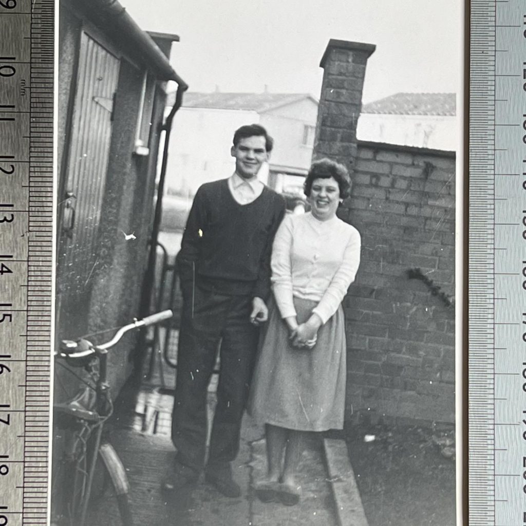
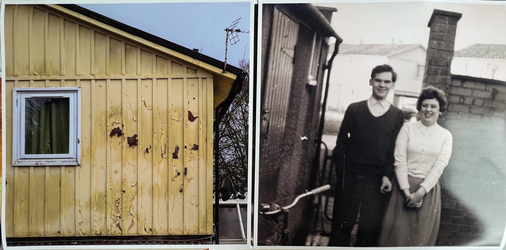
In the post on Tin Town that I did around the time I found a photo of my teenaged father and his sister standing in the yard of the steel B.I.S.F houses that I’d been photographing in the ast few months. One or two of them showed him standing in the yard and I could see that the houses in the rear were tin town, the pier on the end of the wall stood out as an identifying characteristic.
I went off to find the wall and then turn around to check the background of a picture taken there, I’d found out where my Dad used to live, number 11 Caradoc Crescent. This was confirmed the next day when going through his school reports to create a narrative for the funeral celebrant to use to talk about his life.
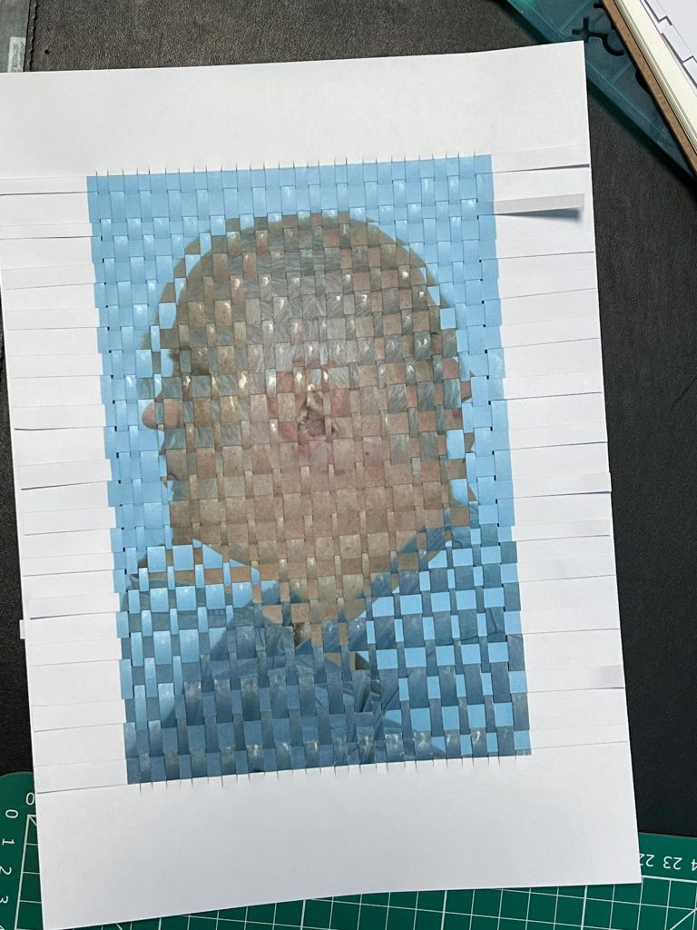
I took this image of Dad and decided that I would merge it with a photo of the house or neighbouring houses today. This would enable me to connect today up with the past, the time that has passed between then and now was not important whilst Dad was still alive but it now seemed like I needed to connect the two together. This strange set of coincidences all teamed up to get me unknowingly taking photos of the place my Dad grew up, mixed with delving into family albums, and it felt like I needed to do something with this set of circumstances.
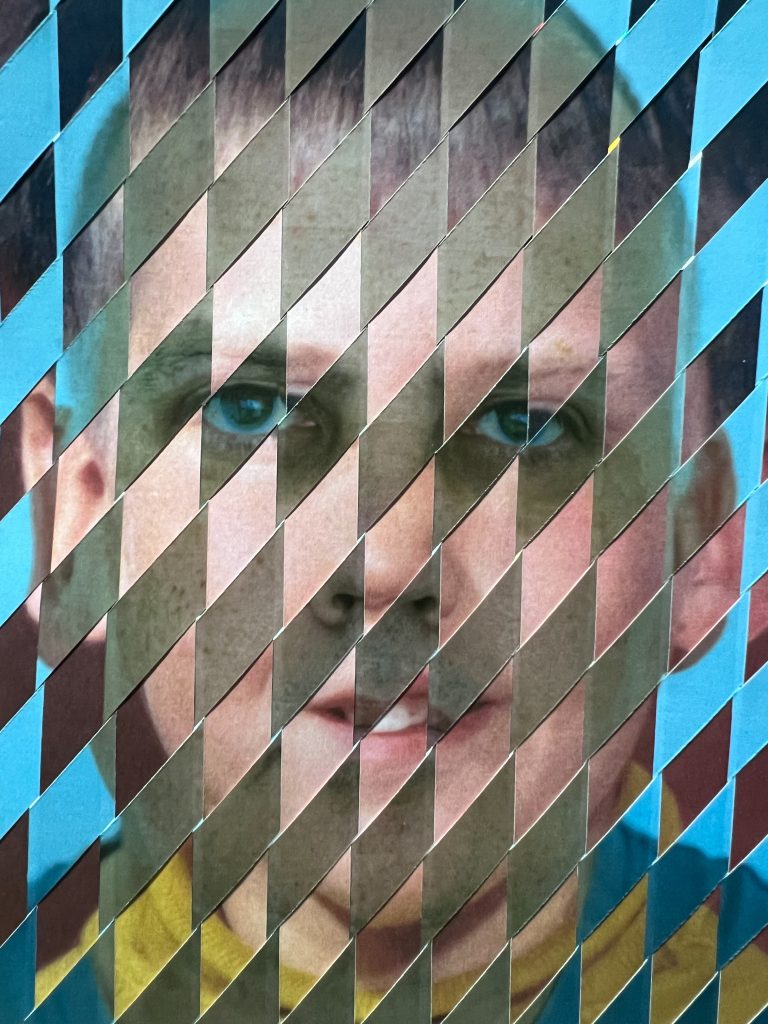
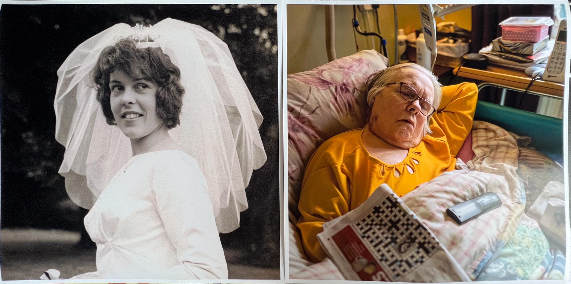
I felt also that along with this image of my Dad, I wanted to represent my Mum, who is still with us but has been ravaged by Multiple Sclerosis for the last 30 years and is now bedridden and fed through a tube into her stomach. I’d come across a photo of her on her first wedding day, not to my Dad, but she looked beautiful, full of life and energy and I wanted to use this in a woven image to merge with a photo of her today. The image I took for this purpose is not an uncommon one, I;ve got tonnes of these in my library but it shows Mum, asleep in her bed with the TV remote control and her newspaper and crossword. To the untrained eye it jsut looks like I took a photo of my mum asleep in bed but further examination reveals that itsa hospital style bed with all of the associated accoutrements. She can only move her left arm now, slowly too, so is totally reliant on it to help her do what she needs. Her carers and family do the rest for her, it is terribly sad to think of this change from her younger days to where she is today. Her attitude is still the same though, she still laughs and giggles saying some ridiculous things to make people laugh. The time that has passed for Mum between the two images has not been easy.
The same is true of Dad in his picture outside his B.I.S.F. House, he’s now no longer with us, but the time between Dad in the old image and the house in the picture of today with it’s worn out and peeling paint, corrosion and general tiredness speaks of the issues he suffered throughout his life. He had addictions to smoking and alcohol and needless to say these weren’t condusive with a super healthy lifestyle, he had a stroke over ten years ago and had slowly been getting weaker and less able to care for himself since then.
I do have pictures that I made whilst Dad was in hospital over the years and also in his last hours, as well as some after he had died. The use of these photos would not have sat right with me at this point, it is too soon, so I chose to go with the house being a metaphor for his ailing body and appearance.
Beginning the Final Pieces
I took the photos from the old days and scanned them in using my DSLR camera to get the best possible reproduction that I could then use to print out the photos larger. Once I had the images prepared and on disk I took them to Jessops photo shop in Shrewsbury and had them printed out in a. 12×12″ square format as I think that the square ratio makes these images look more designed, as if they were the old format Kodak square prints from back in the day.
As you can see from the images in the gallery above, the colour images are the photos taken this year and they will be interlaced with the black and white photographs scaled up.
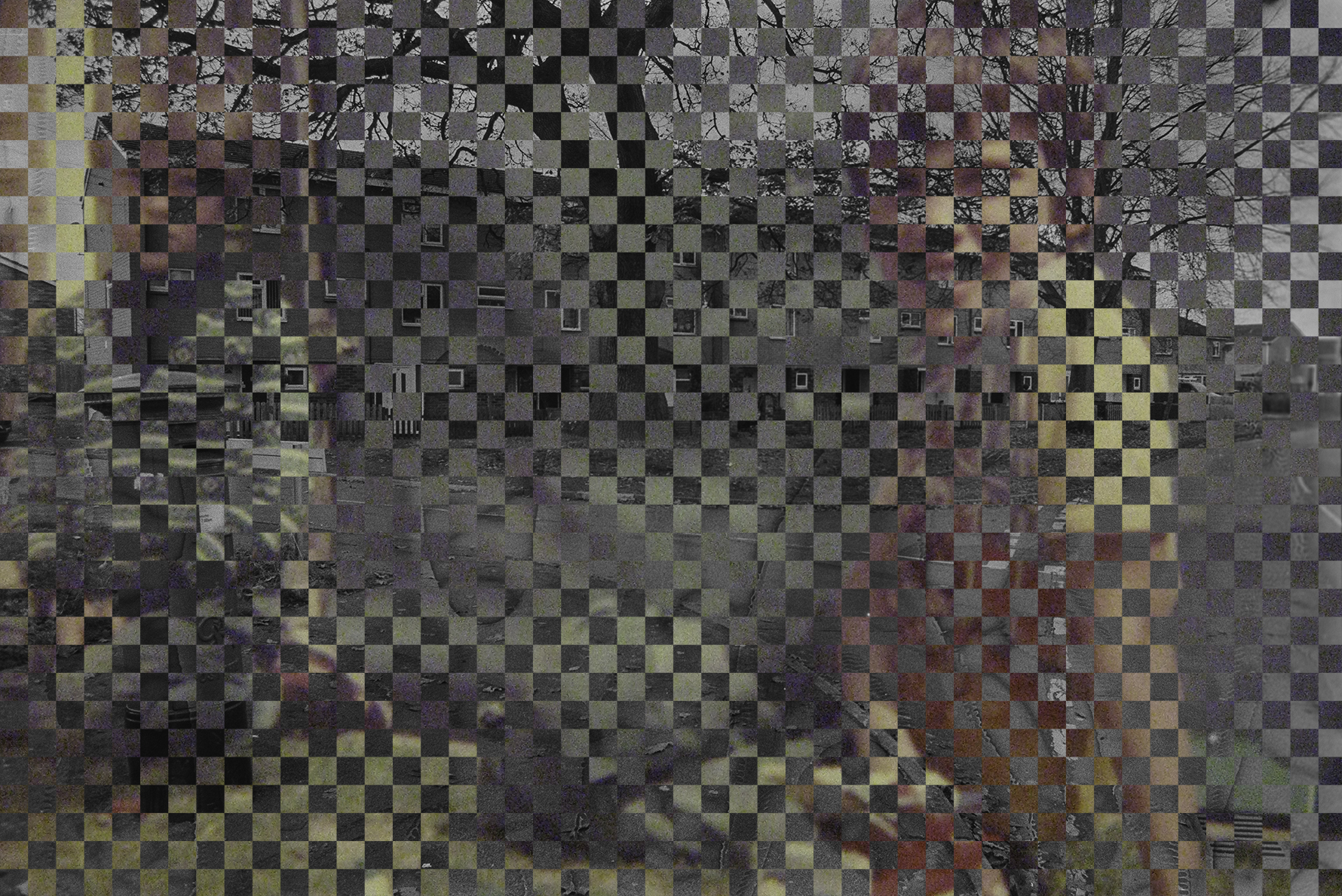
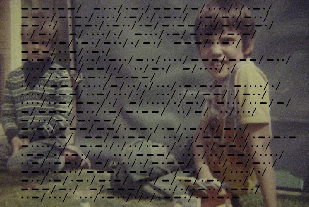
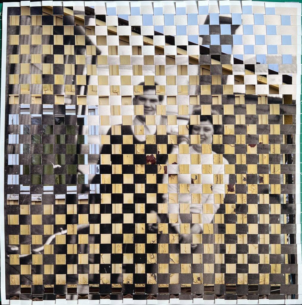
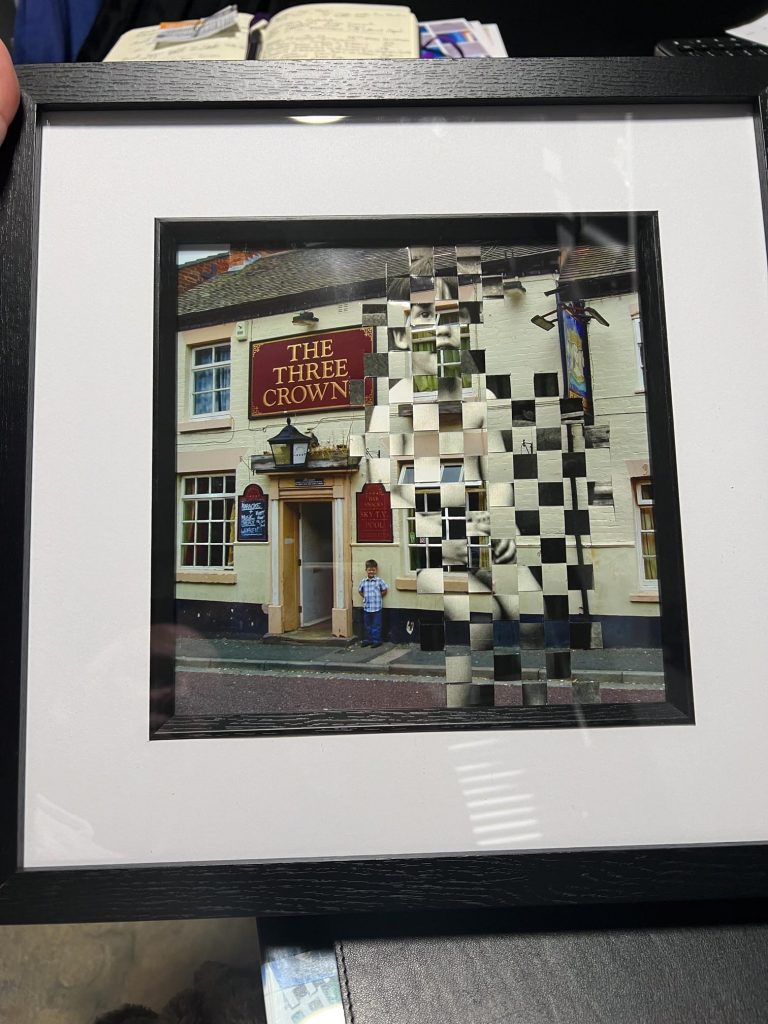
I started with the Dad/TinTown (Caradoc Crescent, Then & Now) images and began to slice them to allow me to weave them together. The process can be seen in the YouTube video embedded below.
I did an alternate pattern for this image so every other strip was over and under rather than under then over. The difference I made in this image from previous images though was to keep the eyes visible. Dad’s eyes and my Aunt’s eyes would have fallen on an underneath pass so would have been lost beneath some corrugated steel so I bucked the trend on the pattern to allow this.. With this image becoming an important part of the last two months I felt I couldn’t hide Dad’s eyes as I wanted him to look out of the image at the viewer to remind them that there is a person trapped in time. Jason Chen who also does weaving can pick out parts of images he wants to ensure are seen so I figured I could do it also, I think I’ve got some justification to do this too.
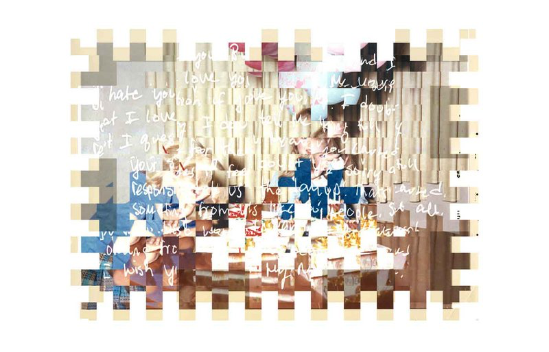
Mums Merged
The second merger was the Two Mums image which you can also see in the video below. I was really happy with how this image came out and I think it’s a better result than the TinTown image due to the ability to pick out the contents of both pictures. I wasn’t too concerned with the eyes in this image
They are more easily distinguishable at a distance too, a close inspection may allow you to see small details but you need a macro view of the image to really appreciate it.
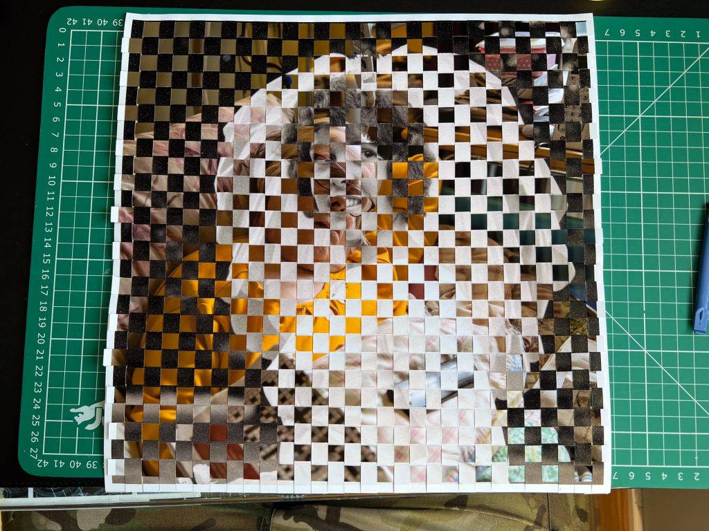
There is a digital aesthetic to the images which is pleasing to my eye and appeals to me from the outset. I also like that the images are merged together so that it’s not easy to make them out. Using the Grid Barrier mentioned earlier, on these would show the individual images but I think that might spoil the overall effect.
I’m happy with the end result as a document of the early days of my parents lives and something to represent their latter days without resorting to what might be considered a shock tactic of an image of my Dad post-death. I have those images as part of my story of his later years, taking pictures of him with the family, in the pub, in an ambulance, on his mobility scooter, having a haircut, in the pub, at the doctors, in the pub, at the hospital, in his coffin (closed) at the funeral and then pictures of family at the wake, in a pub. They did not fit into this year long project as it is too soon after his death but I think that I will make something with them in the future.
Presentation
The next thing to do was to find a decent enough frame to hold these pieces of work, there were plenty of choices of frames for A4 and 10×8 for example but a smaller selection for 12×12 square frames. I chose the particular ones I did from The Range, they were more expensive end of the selection and had an internal mount and border which meant that the photo paper would not be pressed hard against the glass. I felt this was important as squashing it flat might hide the texture of the crudely woven paper, this extra space under the glass give the work some breathing space. Ironic really that it’s breathing space when Dad was finished off by pneumonia and breathing difficulties.
The frames hide the roughed up edges of the work but I don’t see this as too detrimental. It’s not that I’m hiding the edges but the detail I want people to see is in the centre part of the image so the edges are not as important.
Before I bought the frames I had considered using an electric sewing machine to run around the edges of the image to tie it all together, as the tape on the rear is doing. I felt that this would be a good technique to use but I couldn’t justify why it would be sewn on a machine or with thread. It didn’t fit my vision at the time so I plumped for these frames. Looking back at it now though, sewing them on a machine might appear to be repairing or patching up time and memories. It’s something that I will look into in the near future.
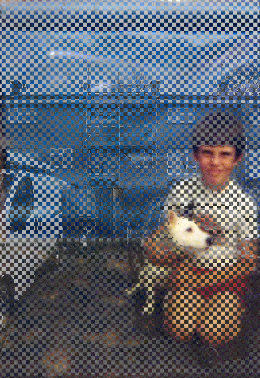
Another Pub?
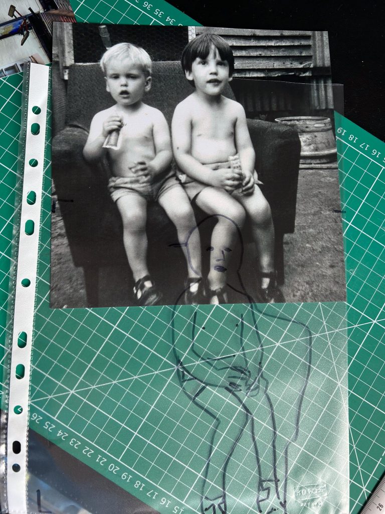
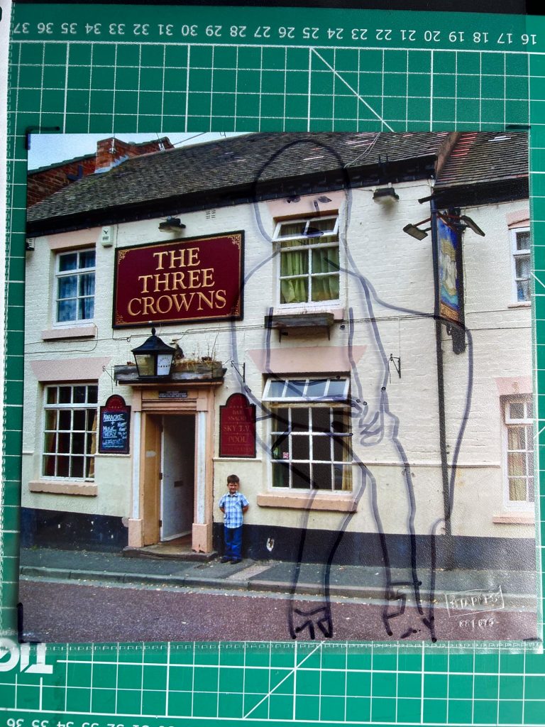
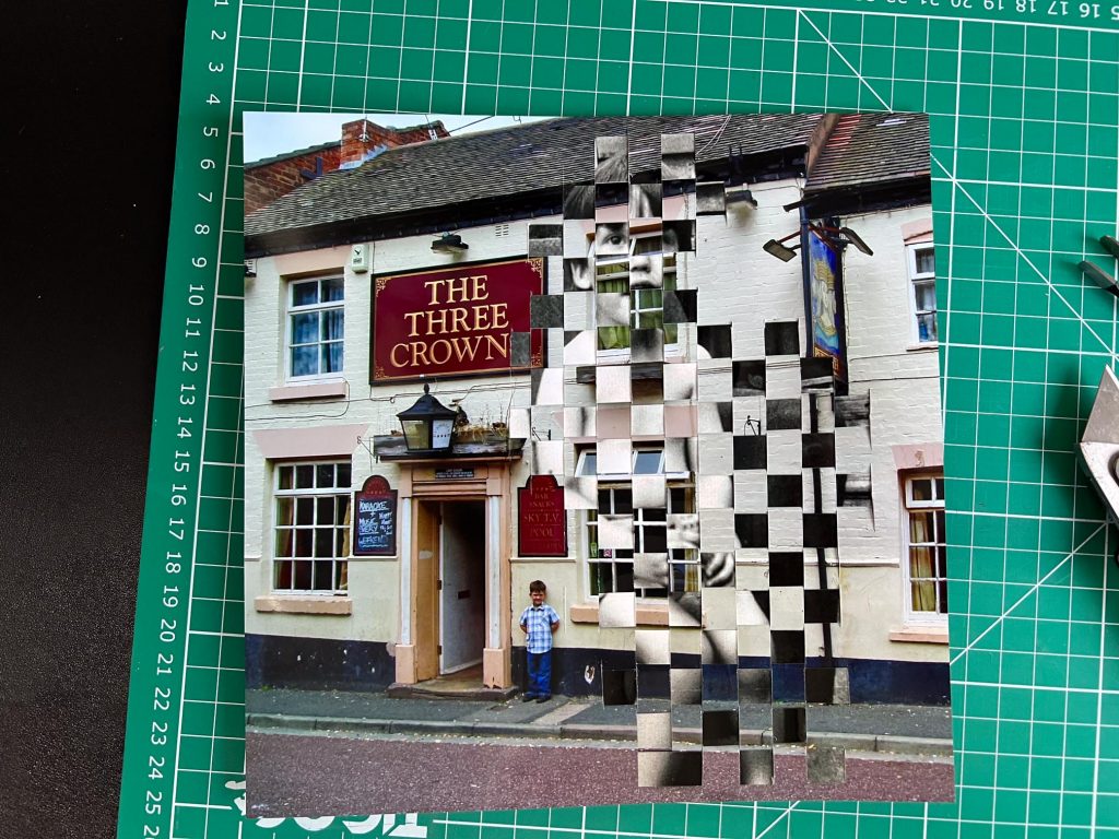
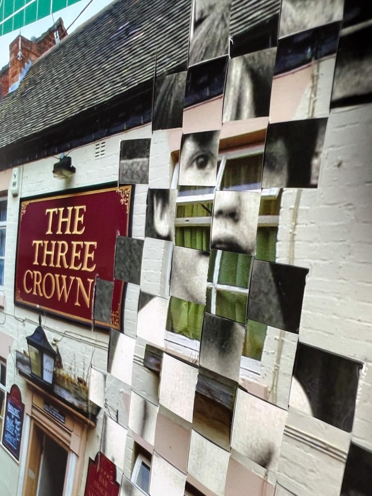
As part of the image selection process I also chose some other photos to merge, one of them resulting from an image of me as a boy sitting in the back garden of the pub my Dad used to run when I was 3 years old. I chose to play with the strips and their placement in this image to not cover over the entire base image and only allow parts of the black and white image to overlay the base. This way it would show me as a small child over the top of the pub I was living in, with my son , Ewan, being visible standing beside the pub door.
I was very pleased with this image too, but it’s smaller (8×8) than the two above, and the later picture was taken over 15 years ago, the older picture was from 47 years ago. The age of the later picture made me feel like I couldn’t really use it in the submission as it’s not from a recent shoot. I won’t be submitting this alongside the two 12x12s as it would look odd and not meet my criteria.
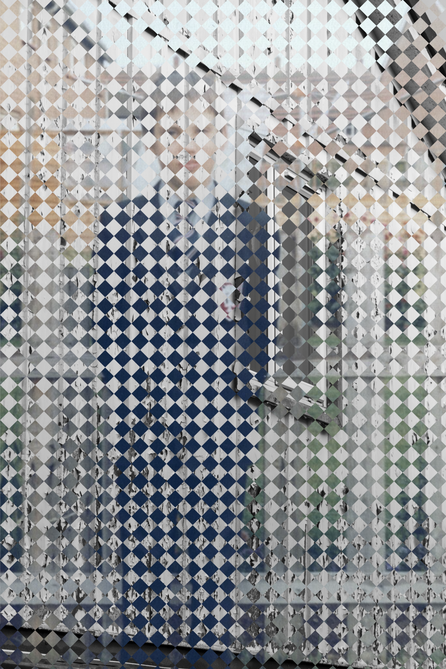
Digital Merger
I also had another 8×8 frame so I used it to mount a picture of the digital merger of myself in my Belvidere School Blazer and the Tin Town area in Belvidere where I used to play, the same area as Caradoc Crescent mentioned earlier. Whilst I do like the image and the overall effect, I don’t like it as much as the physically manipulated images. I’m happy that I chose to not do digital pieces for my final submissions.
You can see in the image below that the images are clearly distinguishable and I chose to not have a clear space around the eyes on this one as I felt it detracted from the overall effect. This was not the case in the Caradoc Crescent Then & Now Image. Perhaps it’s because I don’t need to see my own eyes, as I am still here and can check them in a mirror at any point I want to. Not that I gaze lovingly at myself in mirrors all the time… Honestly.
The Final Submission
For the final submission and to be the end point of this longer than usual blog post, I have chosen to submit the two images Caradoc Crescent Then & Now, and Two Mums .
I have taken some photos of the final pieces but I think I need to turn them in in physical form for the staff to see the nature of them. Overall I’m pleased with where I’ve ended up, through a weird set of circumstances and processes leading into one another. Research into BISF houses led me to look further at an area I’d been photographing recently and then it all fitted together with family history.
The death of my Dad helped me to galvanise on an idea for the final pieces, rather than carrying on experimenting with one of the many different ideas I’ve gone through during the process.
In terms of experimentation, the end result might not be ground breaking, but for me this is well out of my comfort zone as someone who usually just takes photos of things I like. The research element has been interesting and conversations had with lecturers, classmates, peers, level 5 and 6 students, family, friends, work colleagues and even strangers who live in the Caradoc Crescent area have led up to this point.
I also have a number of things that I can play with. over the summer holidays, Grid Barriers, Negative damage, digital manipulations, optical disruption, morse code and braille effects too.
Now to get the two pieces handed in on the 16th May and see where we go from there.
Thanks for reading this extended post and as always feel free to send me any comments on my instagram account which can be seen at the top of this page.
[…] far, the biggest part of the year is my Year Long Project which can be read about in this post which documents my project from it’s initial genesis in a brainstorm and chance encounter […]