This week we were going to have a tutorial and a library task but owing to an illness in the family the lecturer was unable to make it. I had a couple of black and white films to print from and also had a chance to get some feedback on my Tokyo photo book.
When Sylvia sent us the message about not being able to make it in on the evening before I took the opportunity to book out the Black and White Enlarger and 120 kit along with the Contact Printer.
I had a new roll of Ilford HP5+ that I needed to develop after using that in London on the trip to the V&A and Photographer’s Gallery earlier in January. I took this and ran it through some D76 Developer before the Stop, Fix, Water Stain prevention and then the dryer. It took 13 mins for the developer stage and I used the Massive Dev Chart app that allows me to set up timers in there so that I can keep track of the time it’s been in the paterson tank.
Printing
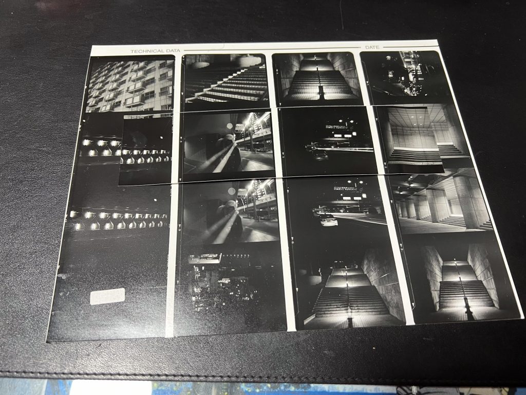
Once that had gone into the dryer I headed into the dark room with my goodies from Tokyo. I had a couple of rolls of 120 in sleeves, one from Hiroshima and another from Shinjuku so I made up a couple of contact sheets first followed by a few prints from a couple of selected negatives.
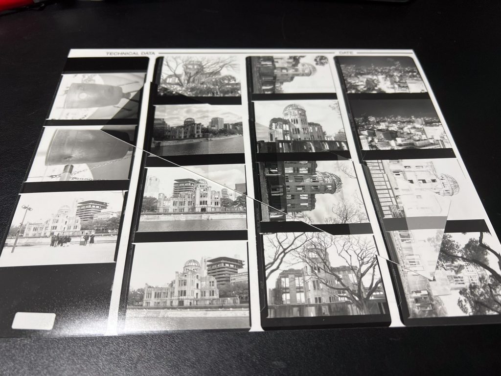
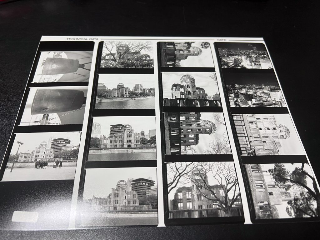
You can see from the contact sheets that they came out ok in the end, with one test strip each (laid on the top for photo) I was looking into the photos on the sheet and didn’t feel inspired by many of them, I was a bit disappointed I think, as I expected more from these than I perhaps should have.
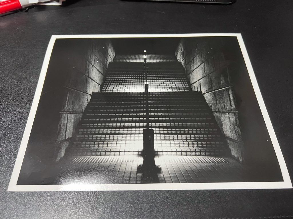
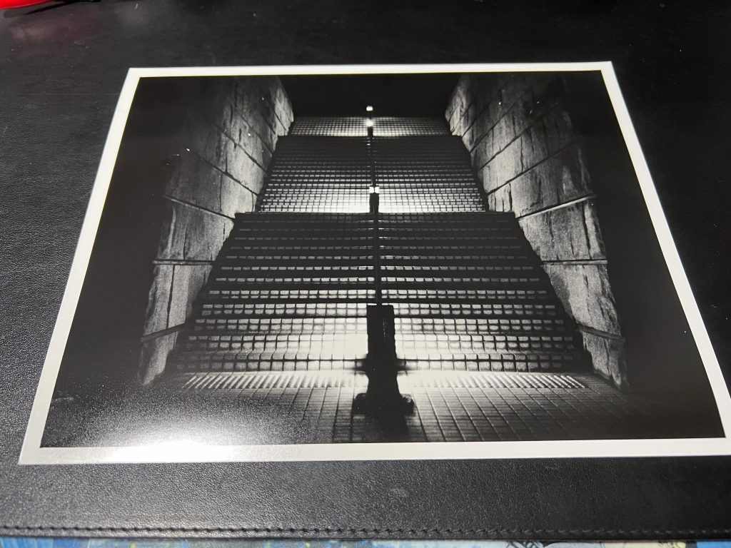
I chose a negative to experiment with first which showed the stairs under a bridge in the Shinjuku area and it came out ok but I wasn’t moved by it or anything.
You can see the test strip placed on the print here, but the lights in the top left corner seemed to dominate the photo so I thought I might try lifting the enlarger up a bit, lengthening the enlargement time and getting a slightly cropped in photo.
The cropped in version did look a bit more pleasing to my eye without the glaring spot lights but it did go from 9 secs at a wider angle to 14 seconds for the crop. With the inverse square law of light, the further away I moved the head of the enlarger the longer the time it would need to correctly expose the image.
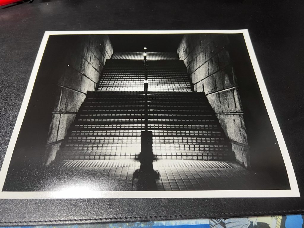
In the three images above you can see the full strip overlaid onto the print and then I noticed where the top of steps was too light so I made another. When I got this second print from the developer I noticed that instead of making the bright bit darker by burning (exposing further) I’d actually dodged (making it lighter by blocking light) The second image shows this quite clearly and the third photo saw me trying to do it but the whole picture was not worth it.
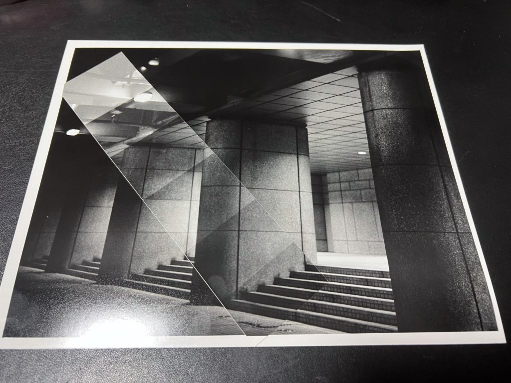
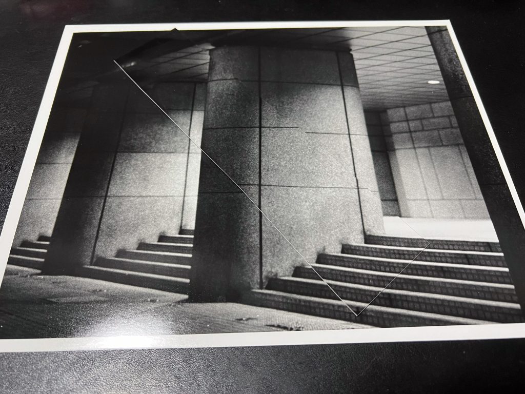
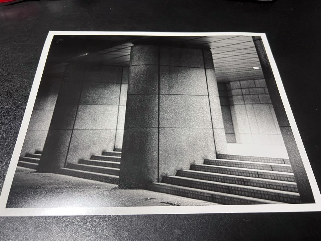
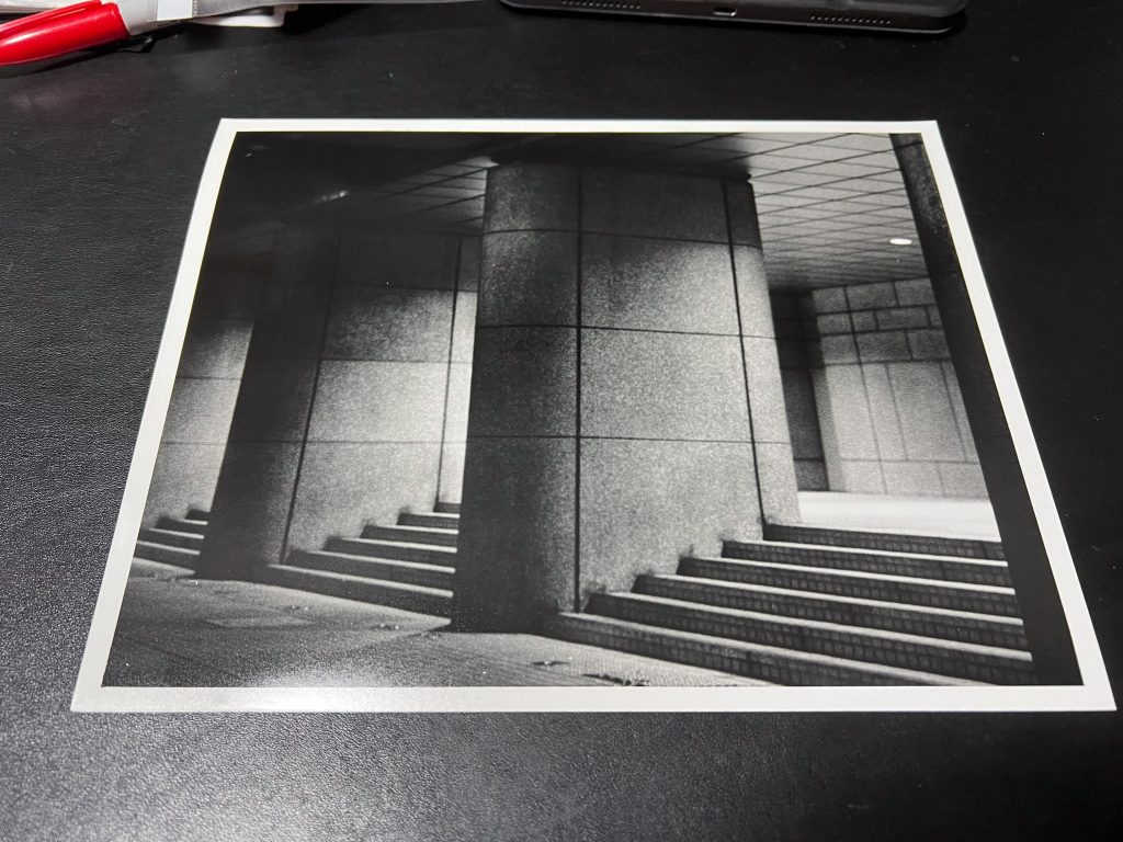
I chose to move on and concentrate on a picture I’d made of the stairs in the Tokyo Metropolitan Government Buildings area. It was clear from a digital photo on my iPhone that it looked nice, but I was again underwhelmed by the film photo. It was obvious that the stairs were exposed correctly but the lights on the stairs led to some burnt out areas.
I did actually burn the images further for a few seconds more each time and it was ok but it just didn’t feel as crisp as i’d have liked it to. Disappointed again, I moved on to a photo that I didn’t think would work, and I was right.
The photo of a taxi parked on the side of the road whilst other traffic passes by and underneath the gantry, was captured on two negatives as I thought that it would be too dark when I was on scene.
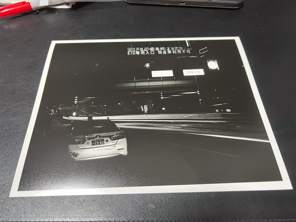
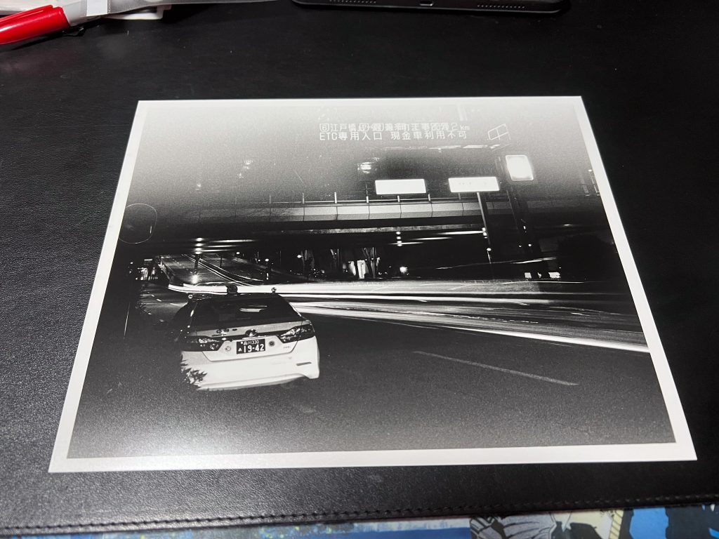
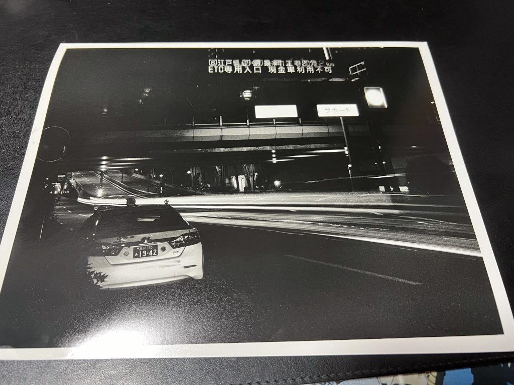
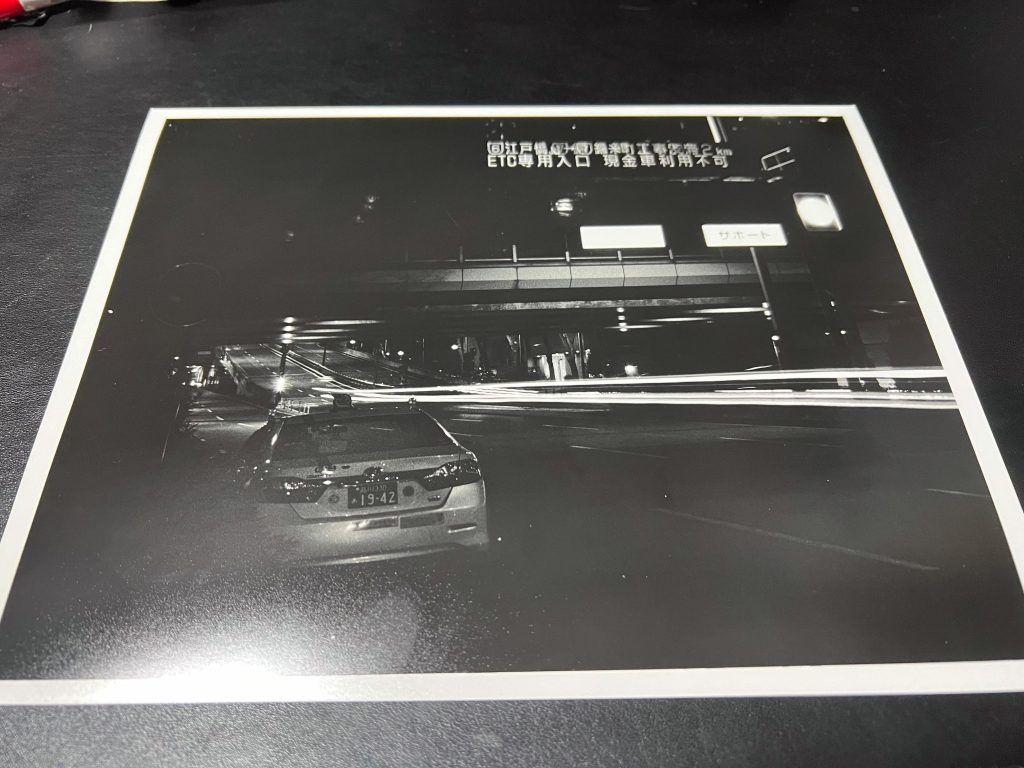
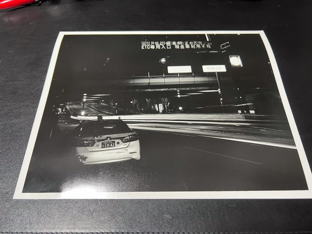
In this shot you can see that the white illuminated sign on the gantry is unreadable but after a couple attempts at dodging the darker areas and burning some of the lit up areas I was able to get some text to display but it still didn’t look nice. I burnt the image further by making a spyhole with my hands under the enlarger lens and guiding the light into the right location, whilst leaving the rest of the image alone.
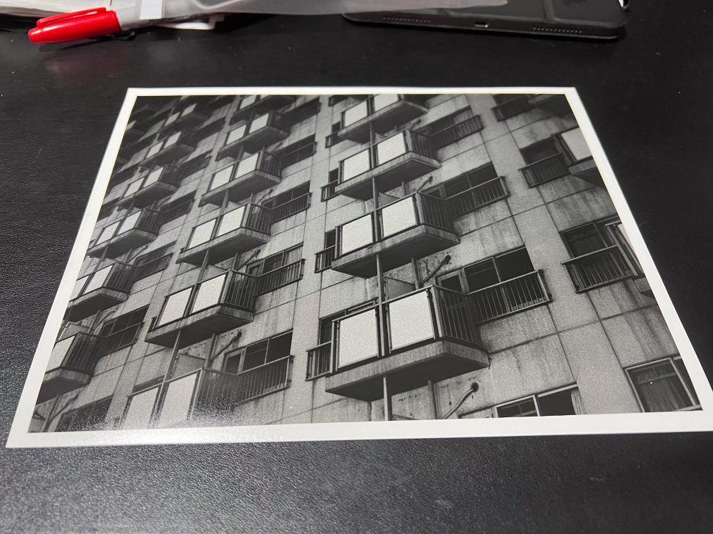
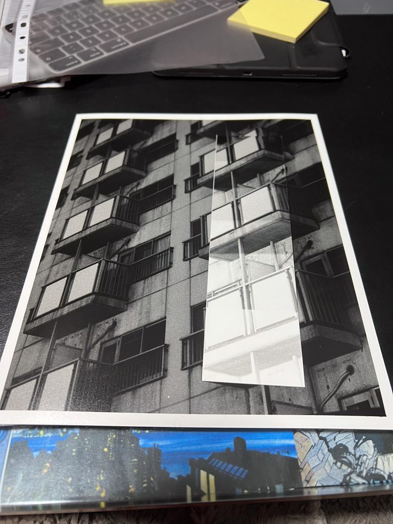
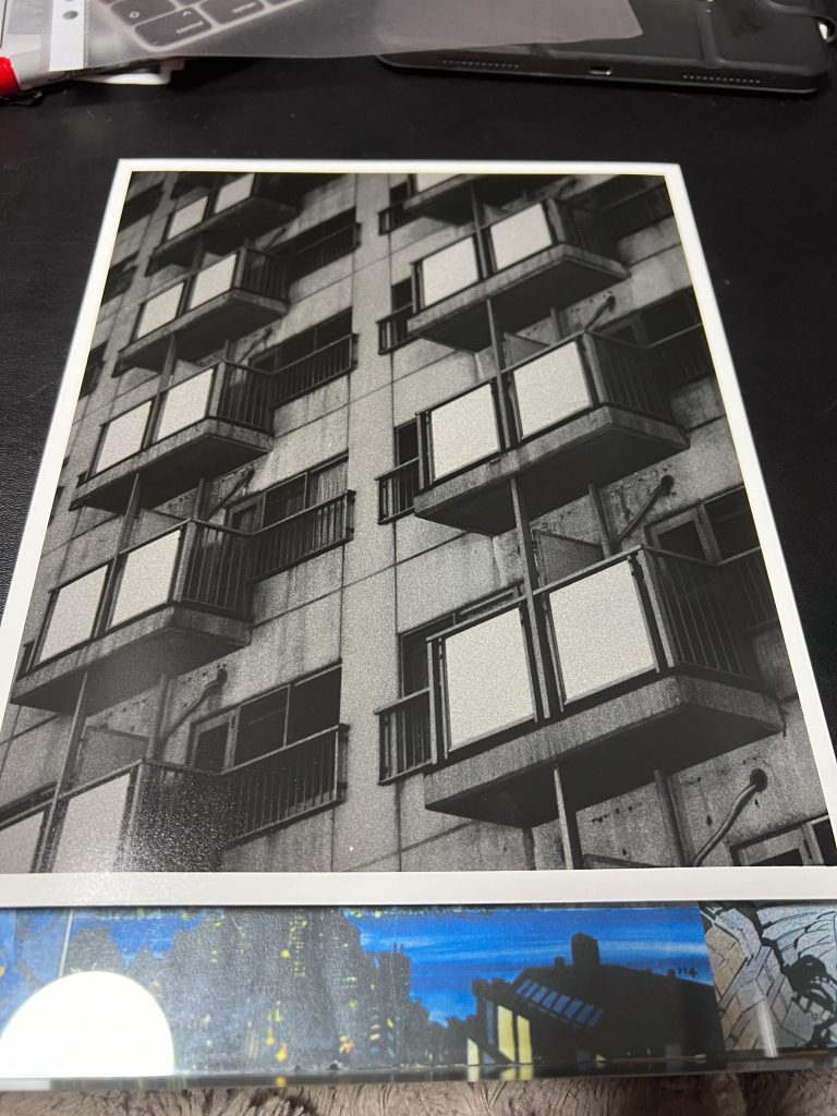
The last image I printed was from a negative of a tower block of apartments as I liked the regularity of the pattern of balconies and windows. As it was the same film (#65) i used the same exposure settings and when I felt that I’d want to crop in again I move them around and then did a tighter crop on the windows, but again it still didn’t rock my world.
Postmodern Photography
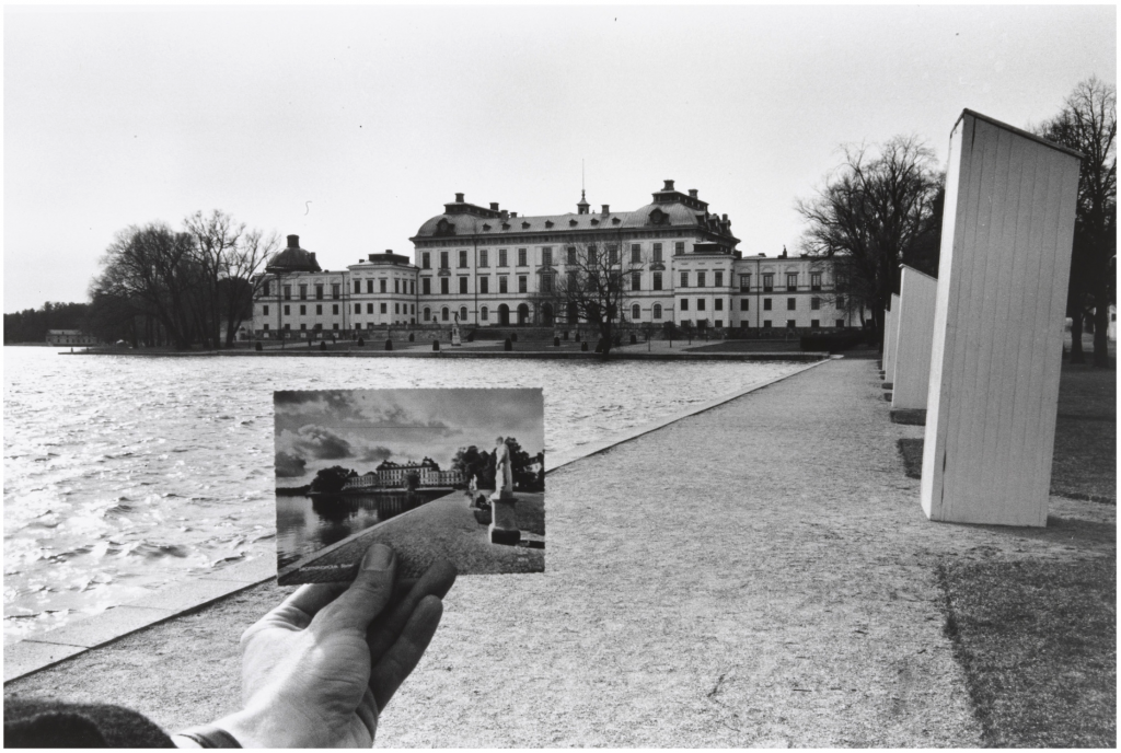
Once I’d done this I took a look at the task Sylvia had set us, it is about Postmodern Photography and starts off with a task to look at some postmodern photography by Ken Josephson, in particular one of his images Drottningholm, Sweden.
Sylvia’s notes tell us that;
Postmodern Photography has been described as a departure from traditional rules of art and photography. With postmodern photography you might notice compositions may break rules by placing subjects in odd arrangements, or there may even be an absence of a clear and definitive subject.
Sylvia Theuri, 2024
Josephson’s Jokes
Looking at Josephson’s Drottningholm, Sweden, I’m seeing a photographer who is skilled and technically good at composing an image, controlling a camera and using the tools of photogrpahy to ask questions of the viewer. It’s not easy to get the foreground and the distance in focus together especially when it appears to be an overcast day.
The overlaying of the postcard into the scene is unconventional as many people recreating a scene with a postcard would place the image of the central building over the part of the background showing the same building. This way we see both the building as it was previously to Josephson photographing it and as it was when he photographed it, which means both are now in the past to the viewer.
When Josephson was holding the postcard up, he didn’t align it with the current building, the postcard was instead aligned to the edge of the pool of water in front of the large building. This bank/edge lines up pretty well and I think the size of the postcard is the same framing of the view that he has photographed here. If the post card were closer to the camera it would be same size scale but as he’s holding it forwards the scale looks different.
I wonder what it would look like if he rephotographed it with an arm holding this photograph, of a photograph of a postcard. It would be like videoing the TV that you’re streaming to, it would be like a big infinite loop tunnel of pictures. I’ve re-edited the photo to do this and the result can be seen below the original image. The line of the waters edge remains in the correct orientation.
Double Drottningholm
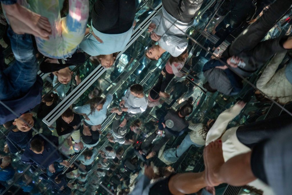
An edited version, by me, to add the original photo in the hand of the photographer. It’s an interesting proposition to test, and it’s one that I’ve tried to recreate many times in a lift with mirrored walls and recently in a room with mirrored floors and ceiling at an exhibition you can see this beneath the edited version of Josephson’s image. There are other recent examples of this such as the painting of someone holding a painting of a swan, which was recreated with someone else holding the photo of the woman holding the painting of the swan. This is called the Droste effect after the original appearance of this on a tin of coffee which we discussed a few semesters back.
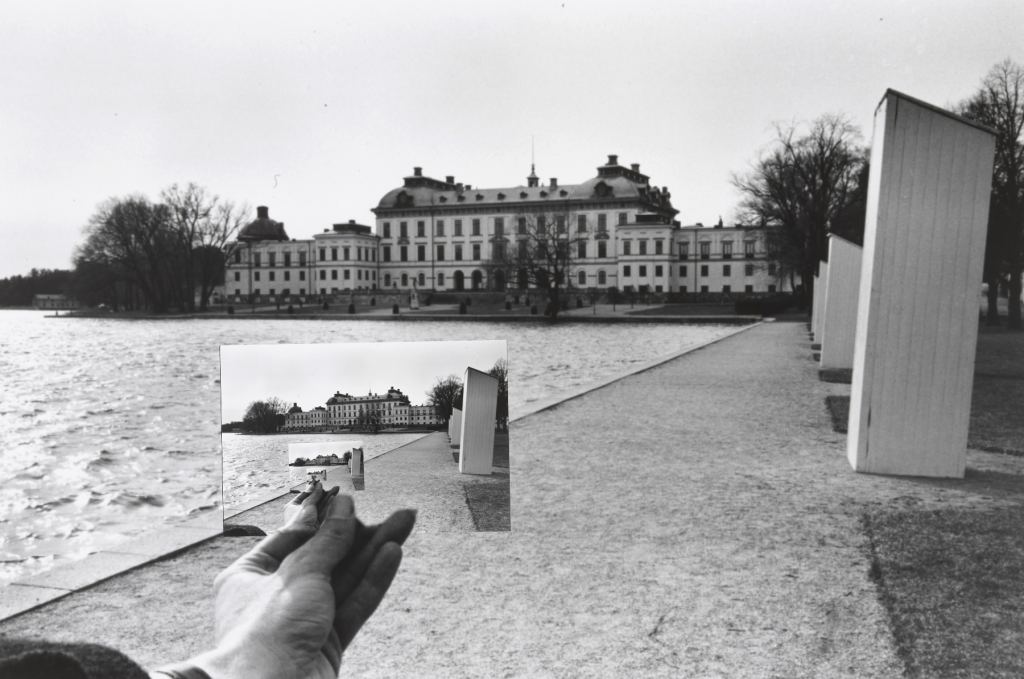
Below is an image I made in Tokyo of an art exhibition with mirrored floors and ceilings, I love the infinity loop style effect of people going on forever.
5 Observations Of Drottningholm
Sylvia’s task asks us to identify 5 things that stand out from the Drottningholm Photo.
- The alignment of the waters edge in the postcard to the background of the photo.
- It’s almost a Droste Effect photograph.
- There has been some time passed by between the postcard and the photo being taken.
- The weather is opposite from the postcard to the photo, postcard has cloudy sky and still water, the photo has clear (overcast) sky and unsettled water.
- Difficult to get the postcard and the background in focus using a narrow aperture.
Other Josephson Work
Josephson’s work has a humour for me, he is happily making a fun image from what might otherwise be a boring photograph. He is playing with the subject and how the viewer perceives the subject and the overall image. In the photo below he holds a card up and takes a photo of it against a car.
Adam’s Hand
When I first saw this image, after the Drottningholm image, I assumed he was holding up a photo of a hand on a car window frame, against a car that happened to be there. We’re told what he is doing, by the shadow on the car fender (or wing) he is shooting the hand of a car driver through a piece of card with e s seemingly framed square orifice in it. We know this as the shadow shows a plain aperture in the card. The photo to me feels like an homage to The Creation Of Adam by Michelangelo in the Sistine Chapel. It shows one hand, of the photographer, reaching to another hand that belongs to someone else. It’s odd too that the card that presents us this hand is responsible also for anonymising whom the hand belongs to.
I also like that there is a behind the scenes shot in the main shot here, it’s a hand held photo, by a man wearing a large stetson hat in the street of a driver of a Chevy Malibu. The Robert Koch Gallery tells us about Josephson;
His experiments require the viewer to consider the act of photography and convey the artist’s desire to question the medium and reject the illusion of realism.
Robert Koch Gallery
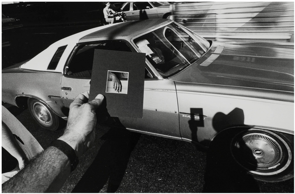
I think that, as Koch mentions, he is trying to explain that reality isn’t the photograph, and as we’ve discussed in seminars about other surrealists and postmodernist photographers, the contents of a photograph are not real, they are a version of what was happening at a point in time , that was captured on the film by the photographer. It ignores all other events surrounding that particular photograph and tries to steer the view into thinking about it one way when it’s really a play to misdirect you and create a confusion.
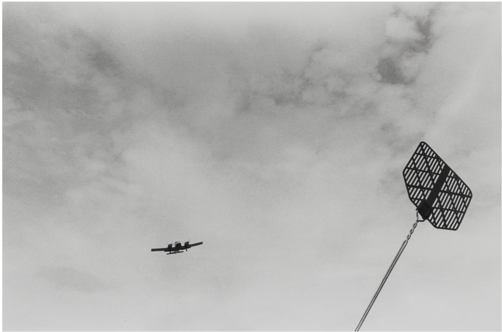
Swat
This next photograph shows a twin prop aeroplane flying through the sky and extended from the photographer’s point of view is a fly swat. The insect eliminator is seemingly pre-loaded with a release being all that is necessary to swing across the image and curtail the progress of the whining aircraft. It’s another image that is humorous and clever in my opinion. The fact that Josephson has a fly swat handy is testament to some forward planning and a knowledge of the flightpath of aircraft in this part of the state. Again, it’s a cleverly constructed photo as the swat and the plane are in good focus so the aperture must have been quite narrow something like an f/16 or f/22. To me the smart feature of the image is that the plane appears to be a small item capable of being thwarted by the swat, or the swat is massive on a scale to be able to smash a full size plane from the sky.
It is a surreal photo and a good punchline that needs no explanatory title or description it’s a juxtaposition of two different scaled items in a manner that equals them out. It’s similar to the forced perspective photos of toy cars that have been photographed “on” real roads.
Three Further Examples
We were asked to find three other photos by different photographers that incorporate, abstraction, unconventional compositions and surrealism, then explain the choice.
Elliott Erwitt
PHOTOS REMOVED AFTER BEING ACCUSED OF COPYRIGHT VIOLATIONS,
One of my favourite street photographers, Erwitt has a wit and an eye for the unusual in everyday life. In the photo I’ve chosen above we see a person sat on a stoop of a building with their two dogs. One of the bulldogs is sat on their lap and the dogs head appears to sit exactly where the persons head should reside. This leads to a funny image of a dog with arms and legs sat holding the lead of a normal dog. It’s a smart image that plays with perception and perspectives that lends a surreal feel to the photograph. It’s a photograph that many people would accuse the photographer of using photoshop to edit in these digital times, but this was achieved by Erwitt’s talent to spot the blending of the dog’s fur into the person’s shirt fabric.
Jeff Wall
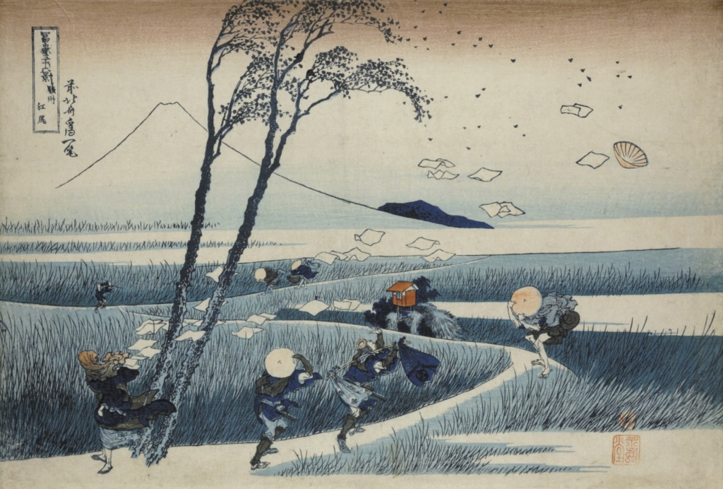
Another photographer that Euripides also mentioned after looking at some of my Tokyo photos this week was Jeff Wall. I’ve come across some of Wall’s work before and one of those being A Sudden Gust of Wind (after Hokusai) (1993). The image shows an homage to a Hokusai woodblock print A Sudden Gust Of Wind.
Although not a direct copy of the Hokusai print, the scene was put together by Wall and using digital composites he collaged elements together to produce an image fo someone’s papers being blown acrss the sky and seemingly being chased by a suit-clad business man, whislt other subjects int he image hold onto their hats. The tree, the open ground and the water are all included as are the leaves off the tree.
To me it’s an image by someone who is appreciating the original work that was created and then putting a modern spin on it. It’s digitally put together so easier to be precise with placement of items, than a film photo like Erwitt’s mentioned above. I find this one humourous too, but not as laguh out loud as some of the others I’ve seen in the past.
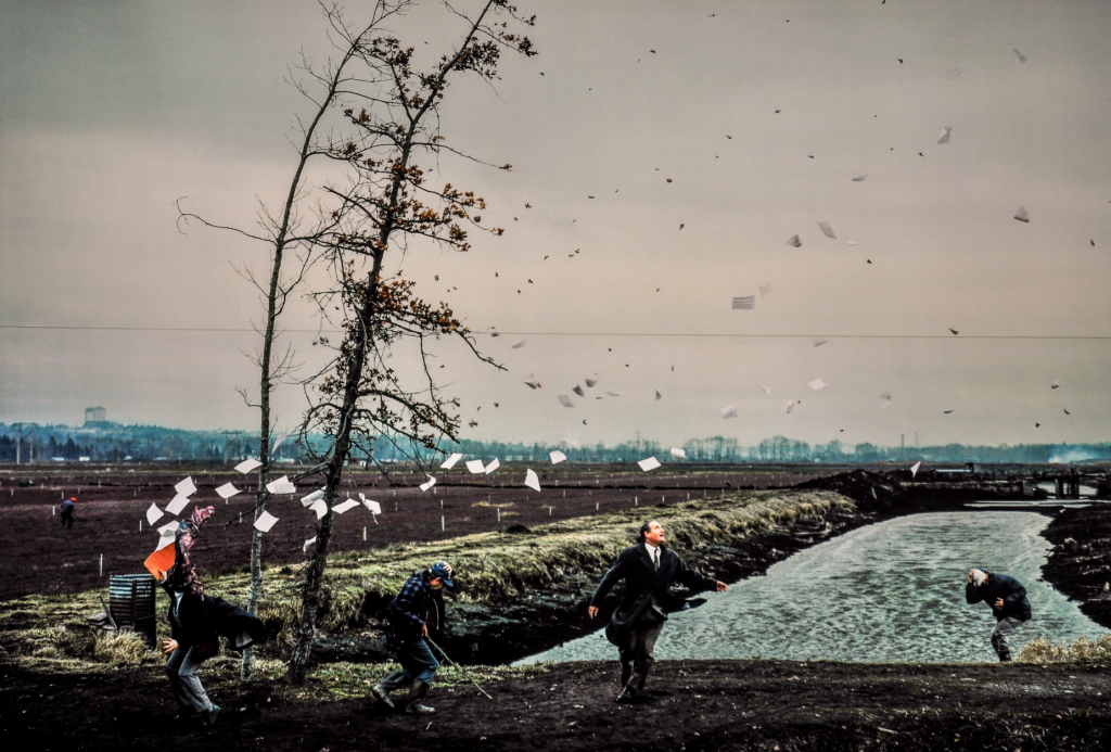
Below we can see the original woodblock print by Hokusai that featured in his work 36 views of Mount Fuji. Jeff Wall imitating Hokusai isn’t the only one.
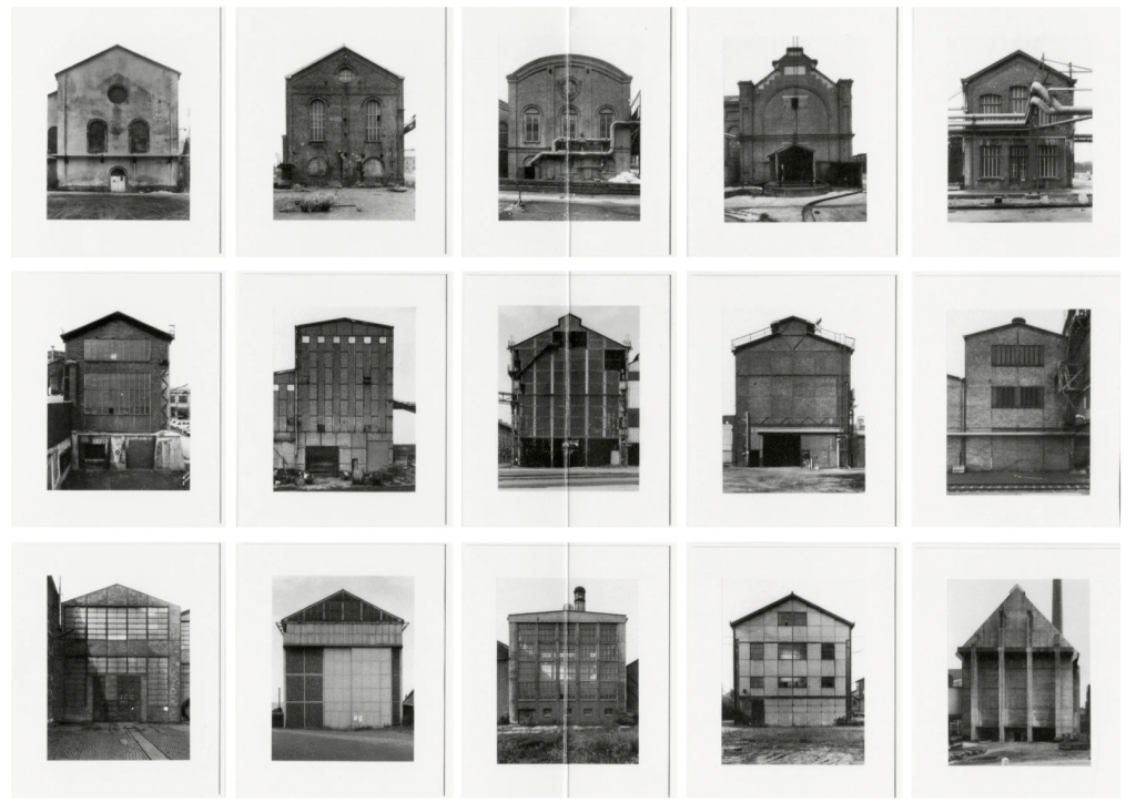
Becher
The last photographer (or photographers) I chose for this are Bernd and Hilla Becher. They made photographs of buildings, structures machines that could be grouped together into typologies. The composition in their work is very uniform with no artistic license being used, no interest in the surroundings of the subjects they chose to capture. Their work focussed solely on the structures, how they related to each other and how they might have been different from one-another.
Show these images to a viewer and they might wonder what was going on, why was this person just cataloguing these buildings, that’s what they feel like, catalogues of images being preserved for the future study by generations to come. Many of these buildings are probably gone by now or converted into use for some other purpose.
In a normal composition of an image to feature a building the image would normally contain some surrounding geographical information and maybe some people for scale but the Becher’s images contain no superfluous information, it’s a standard that they stuck to for many different typologies.
Other postmodernist photographers we’ve looked at or I’ve read up a little on are
Cindy Sherman, William Eggleston, Hiroshi Sugimoto, Nan Golding, Gregory Crewdson
Five Photos
Our final part of the task was to go out and take five photographs that appear to break rules by placing subjects in odd and unconventional arrangements. We would collect these and take them into Uni next Tuesday.
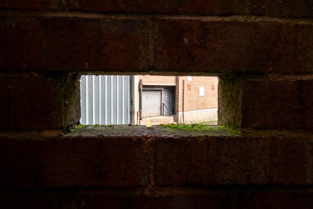
Another Brick
This was taken to document the closing of the Riverside Shopping Centre in Shrewsbury Town Centre as it will soon be bulldozed to make way for a new tourist friendly area of leisure by the River Severn. My take on the image was to capture images of the area using different angles, this one uses the brick missing from a wall as a frame with which to view the loading doors of the rear of a shop. It’s not a standard composition as far as I have seen and the moss and tired looking mortar in the brick joints hint to the age of the structures as they prepare for demolition.
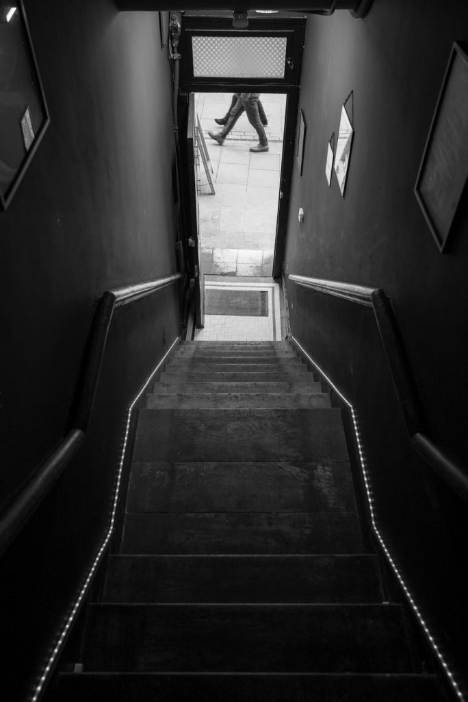
Disembodied
A view of the main Pride Hill shopping street in Shrewsbury Town Centre from within a building opened up recently as an antique centre and cafe, as well as a mental health charity headquarters. I stood at the top of the stairs inside and waited for some pedestrians to stroll past on the street. I like the composition of this as the stairs leading downwards is unusual especially with the lights on either side. It’s reminiscent of a runway for aircraft at the airport. The legs have no bodies either, just stopping at the waist. I did try lower down but the addition of the people’s upper halves seemed to lessen the impact of the images for me. The fact that the two people are in lock step too is pleasing to my eye, with the triangle of legs almost being the point of an arrow that starts at the photographers feet and heads downstairs onto the street.
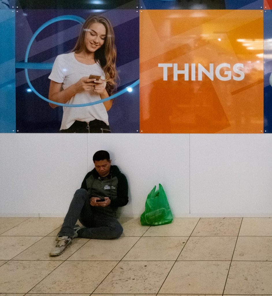
Things
Captured in the Centre:MK after visiting the Saul Leiter exhibition at MK Gallery yesterday this photo of a man sat on the floor using his phone looks pretty standard until you notice who is text messaging him. It’s not a great image but it does feature some elements that make up postmodern photography such as a fictional narrative of the young woman texting the guy, the reflections in the orange part of panel look into an alternative reality and the scene could have been collaged to make this image. To me the word “things” replaces a shopping list and the chap sat down has been sent a list of items to go and buy from the shops, but instead of a comprehensive list she has just been ambiguous and sent the single word. So, that’s what he has in his bag, “things” or “stuff”.
Vertex
From near the car park in Milton Keynes there is a small sculpture park featuring some shiny stainless steel figures such as spheres, cuboids and cones.
This photo is of a shiny cuboid that I noticed had no really useful reflections in it’s view, I was trying to get a reflection of an illuminated car park but alas no.
I got closer to this one particular corner to see what it allowed to be reflected and I noticed the grass surrounding it being shown in the shiny metal surface.
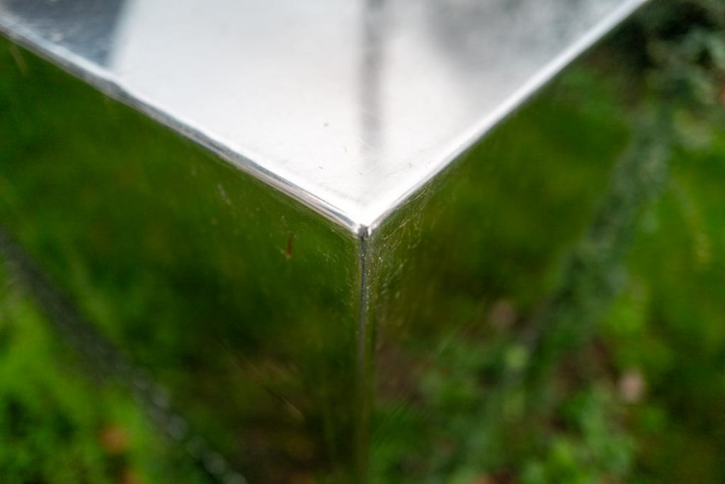
It’s an abstract image, which I do enjoy making, but not particularly standard image for me. This is one that was found due to the prompt of finding unconventional arrangements of subjects. The grass reflected in the image and the weeds and leafs of the plants surrounding the metal sculpture were not interesting when I focused on them in the reflection, but more interesting was the single point on the corner of the object and then the greenery appearing blurred in the background due to the wide open aperture giving me a really shallow depth of field. To me this image could represent an object in spacetime that floats along like a window in to a wormhole leading to another place in the universe. It reminds me of Kubrick’s Monolith from the Arthur C. Clarke based film 2001: A Space Odyssey, the huge black rectangular cuboid that links galaxies together through mysterious scientific forces.
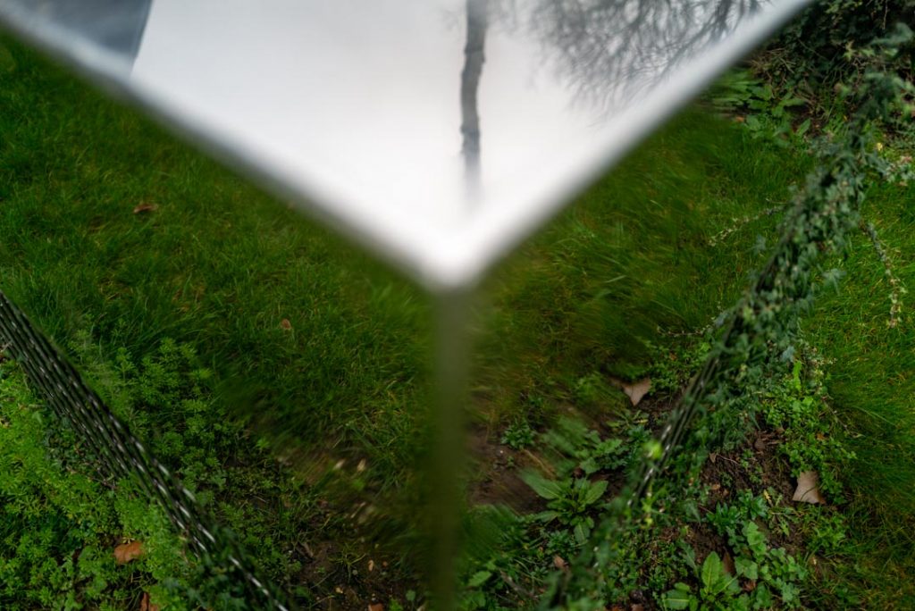
If I show you the image with the focus concentrating on the grass you’ll notice how this turns from being a partly surreal abstract to just being a snapshot of the ground. To me this image isn’t as strong as the one above, but what do you think?
Victoria
The next photo is from yesterday in Milton Keynes too, I was trying to capture an image of someone framed differently but fell back into one of my favourites, a silhouette against an illuminated background. There were a couple of people that I liked their outlines when eclipsed by the pink and white illuminations from the Victoria’s Secret shop in centre:MK, Milton Keynes.
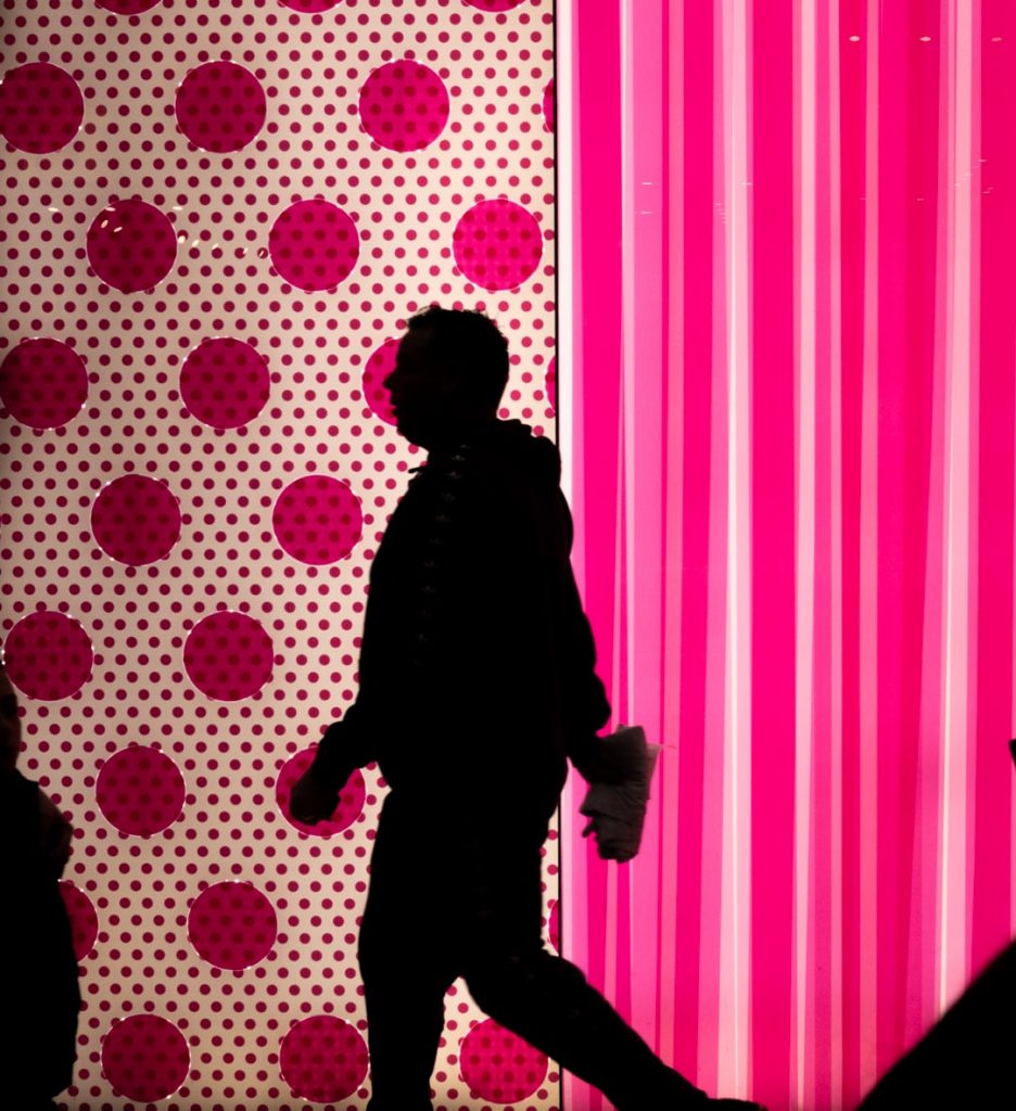
The shopfront was bright and illuminated people in the pinkish light but I changed my settings to allow a silhouette to be produced without any blurring. Looking at it now I think it might have been a stronger image had he been mid step on the dividing line between the dots and stripes. The image looks like it could be a digital manipulation or an AI generated photograph. I’ve cropped it a little too as the floor in the photo was distracting from the top half of the image.
Task Conclusion
The task to look into postmodernism in photography is something that we’ve touched on before and some photographers have been studied before in our last few semesters. The fact that photographers break rules on a regular basis makes it easier to find photographers that fit the bill but aren’t thought of as postmodernists. A good example of this might be Saul Leiter whose photographs I saw yesterday in Milton Keynes MK Gallery. He often uses very unorthodox framing within a frame often cutting off the top or bottom or even most of the image apart from the top corner. (See Canopy bleow)This doesn’t make him a Postmodernist photographer though, for some he is often seen as a documentary type image creator capturing the lives and environments of the subjects within his photos. Abstraction is also another of Leiter’s commonly used devices but again it’s to capture the scene rather than make a postmodern photo that purposefully uses techniques to remove you from the environment as many other postmodernist photographers do.
I think it’s difficult personally to go out and take photographs that use the techniques of postmodernism but I would tend to go out and make images using my own instinct and if they are considered as postmodern then it’s purely because my instinct aligns with it’s goals.
Be First to Comment