This week, I had a few things to do but one thing I wanted to ensure got done was to take and show my recent photo book from my trip to Japan to some of the people I trust the most, in the hope that they might offer some useful advice and assistance that help me to progress and improve the next time I choose to create something similar.
Book Feedback
After returning from Japan with over 5000 digital images and over 100 film photos I found that people were asking me to see some of the images of where I’d stayed and things that I’d done whilst over there. Many of these can be seen in the series of posts on this blog from my days in Japan. I did though, want to print some out and have them in a format where people could look through them, not one of the crappy photo albums with 4×5 photos in that nobody can see any detail in.
As it happens, SAAL Digital had been sending me some information on a free voucher to go towards the printing of a Photo Book. Other photographers I know at the Shrewsbury Photoclub group I am in have also had this and made use of it so I thought “why not?”.
To gain the discount, one needs to apply for it and once it has been checked that your eligible you receive a code. This allowed me £100 off the cost of a book. Which sounds an awful lot of money, even the cost of a book at £100 is a huge number so I wasn’t sure if there was a catch.
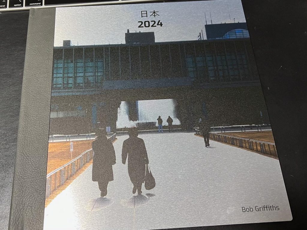
I installed the SAAL app on my Mac and did the business after selecting around 40 images to fit into the book. The pages I chose were a 30×30 cm square format so it meant that some images in my lightroom library fitted better and some were cropped, but in some cases this improved them.
I received the book back from SAAL and I am super happy with it for a quickly put together book, I did very little curating when putting it together as it was mainly some arty shots with some holiday snap type images.
The front cover I had printed on brushed aluminium too, which looks dope but is way over the top for what I needed.
The book has been shown to a few of my friends and family with some positive comments generally and also a couple of bemused looks at some images, but that’s all par for the course. It’s all subjective and I am aware that this means some photos are liked and some aren’t.
Expert Opinions
With the book in hand I visited Dan, the technician, in his area to see if he had a moment to take a look at it. He was happy to browse through it and offered some words of advice that made perfect sense, he used a sheet of A4 paper to mockup a crop on some of the images where he thought I could have cropped tighter to remove some edge detail. He also thought that there were some images that could have been straightened up to correct converging verticals. He was enthused to look at something to talk about I think and we had a good chat why he thought the bottom could be lost off one picture to focus on the upper portions, why a blue sign on the side of the image caught his eye, “we’re conditioned to look at signs, even if we don’t read them” and I value his opinion greatly.
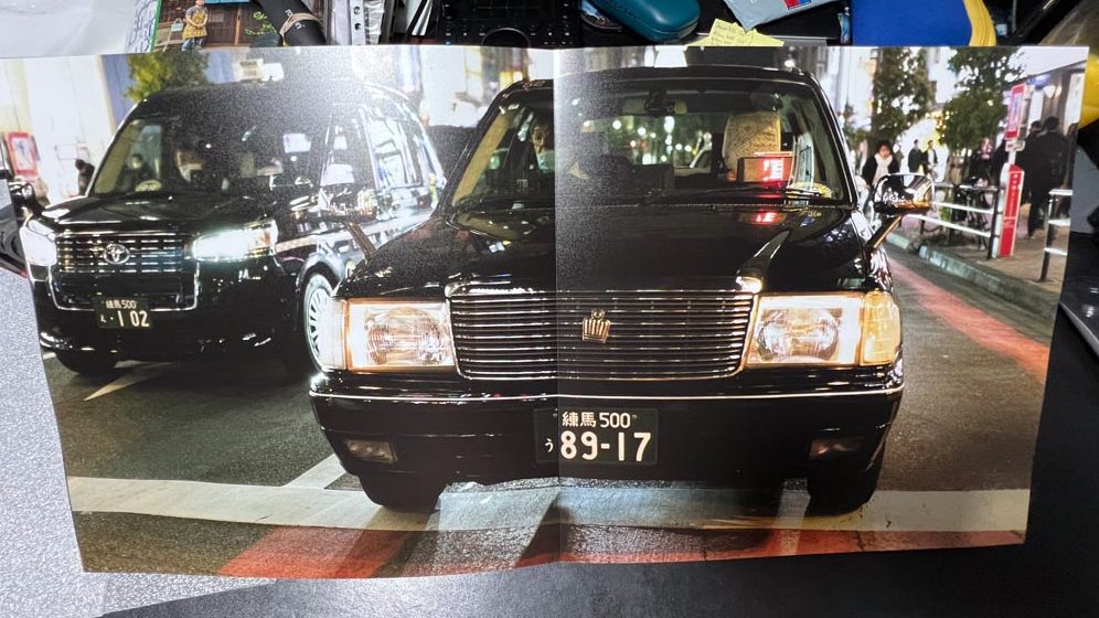
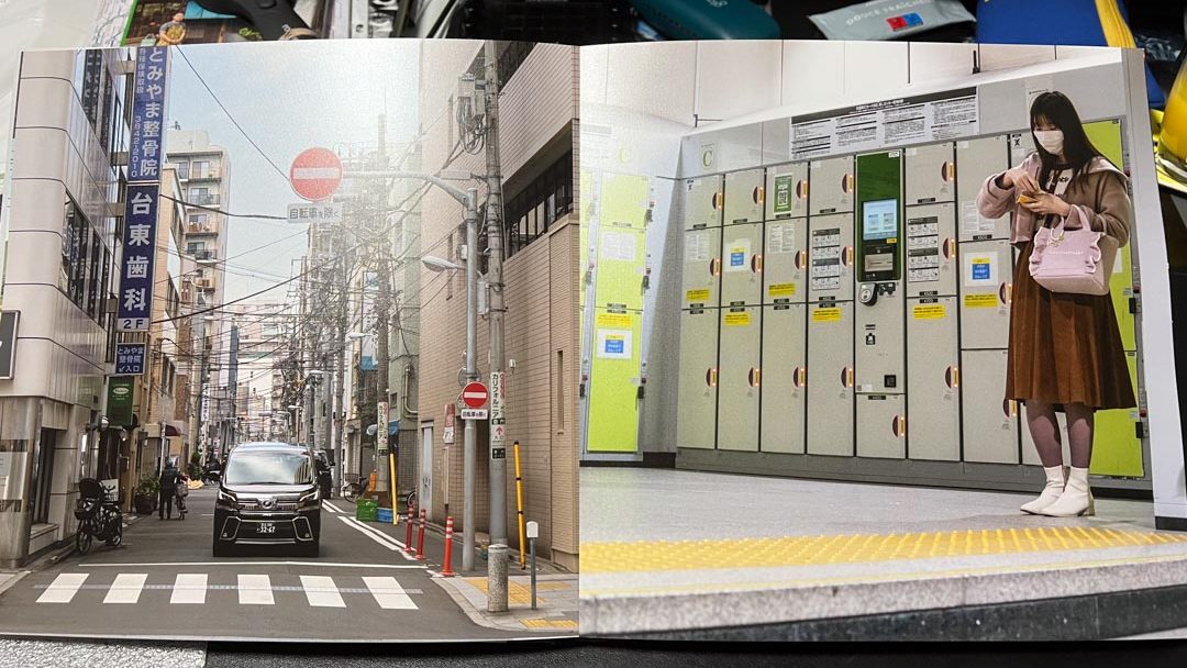
Dan’s favourite photo was the Taxi on the crosswalk as he said he liked to see humans involved in the images and although you could only see the drivers face dimly, it was enough to provide a spark.
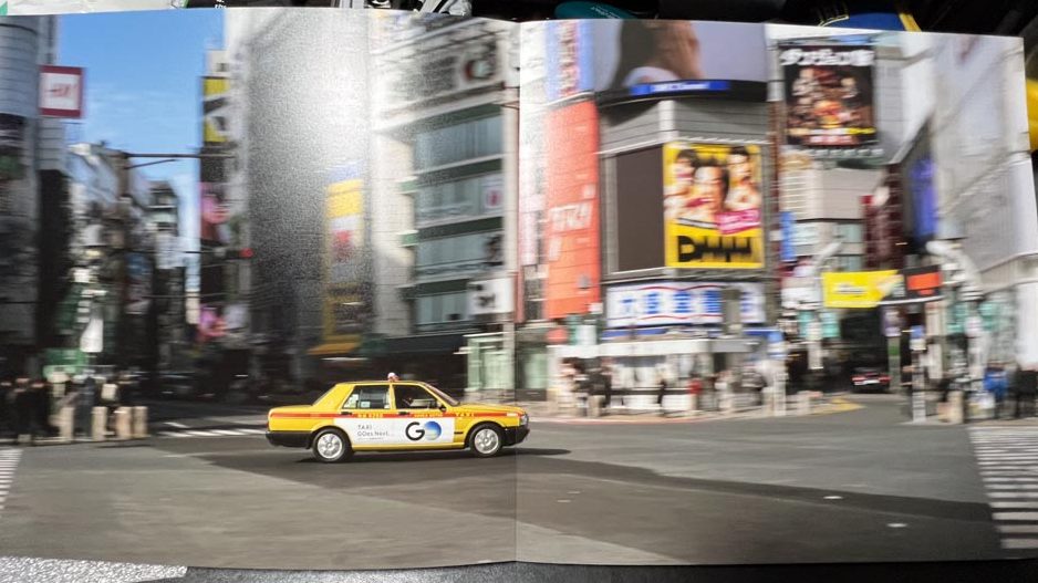
He also like the panning shot of the Taxi going through the Shibuya Scramble Crossing and didn’t mind that the car wasn’t pin sharp, If I’m panning I prefer to get the subject sharp and sometimes have deleted images that maybe are of this quality. Seeing some of the work of Daido Moriyama the week before, I question myself more over the deletion of some images.
Euripides popped in later and we had a good chat about the contents of the book too, he looked through it and liked some images more than others. Some are more successful in this format than others I know and he was also really helpful in helping me understand why he liked some more than others. He told me to not get down on critique and change everything which I don’t really do anyway as I’m always happy to listen to technical advice but where it comes down to my own likes/dislikes I will generally stick to them.
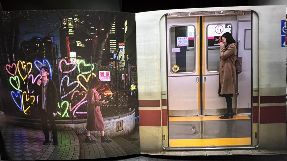
Euripides noticed that some pages had a connection, such as a two photo spread that had a yellow line on the platform to the right page, which appeared to align with the crosswalk in the image on the left hand page. He also said that the image on the left page would have been improved by some straightening of the verticals and I’ve just been into the image in lightroom and I’ve already done that, but the print in the book must have been before that. It’s good to know that I’d already picked that up in the process of going through the photos and a reminder for me to check through all the criteria before putting together a collection of images.
Dan had also mentioned that one photo of a man and woman on the steps would be improved for him as a portrait of the man alone, he used the paper sheet to show a crop of the image and it did look good as a single portrait but I also like the two of them facing different directions. Euripides also said he preferred it as it was and was careful to say that the choice is subjective and not everyone sees the same thing as pleasing, which I totally understand too.
The picture above on the right is also another that Dan mentioned with the blue labels on the train being distracting and it might have been better to cut the right side of the picture off.
Euripides said that the book was good and it was a good exercise in seeing what works, and what might not work or could be changed to work better. We talked about the layout too as I’d said there were some issues with some pictures not fitting correctly on the page due to it being a square and he said that you don’t have to cross completely across the two pages and lose the top and bottom, you can come across into the opposite page and leave a space if necessary.
Both Euripides and Dan gave me some really helpful thoughts and I’ll definitely consider their words when I’m next putting something together.
Related Photographers
As part of the after conversation, Euripides mentioned a few other photographers that he thought of when he looked through this book of mine. He mentioned:
Jeff Wall
Euripides said that most of Wall’s images were staged and usually fitted onto a light box to allow the light to come through. Reading further on the MoMA website it appears that Wall got into photography after seeing a lit up image in a bus shelter and his use of the back lit transparent images courts with publicity and advertising more than art. Some of his best known works are printed on a large scale with some backlit works being 5×8 feet in dimensions.
I’ve recently used a Jeff Wall image in my Postmodernist Photography task, mentioned in a previous post. He stages his photographs quite specifically and precisely to gain an image he is happy with, but the image I used of his was his A Sudden Gust Of Wind (After Hokusai) 1993 which was a collage made digitally to bring up to date a woodblock print from nearly 200 years previous.
Phillip-Lorca diCorcia
diCorcia presents photographs that are usually staged and precisely choreographed to get the desired result. He also takes photographs of informal settings and the people therein but is also known for setting up lighting in the street to obtain photos. He hid flashes in the street and took photos of people walking past with the flash isolating the individual from the rest of the crowd.
One of diCorcia’s photos from his Heads series when he had hidden flashes in the street furniture. The images remind me of the “cruel” nature of Bruce Gilden popping up in front of people with a flash in their faces. dICorcia seems to have found a way to do this without being within arms and fist reach.
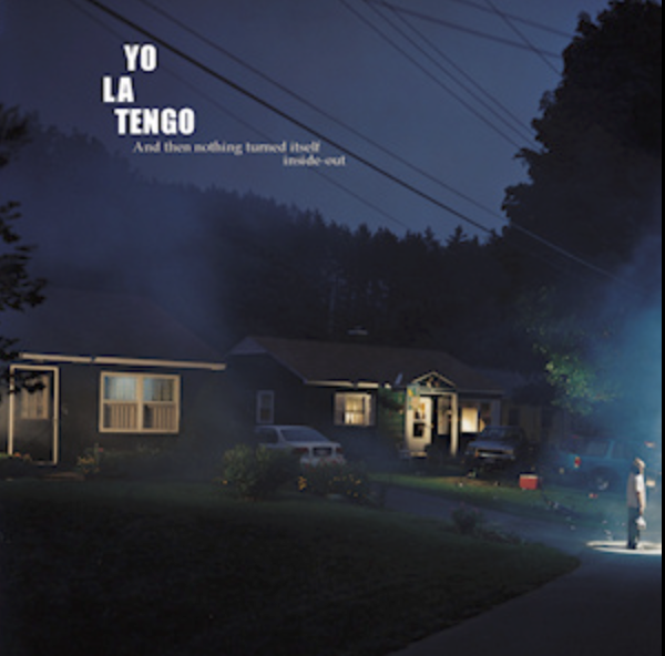
Gregory Crewdson
Crewdson’s work is vaguely familiar as I’ve looked into it before during a lecture on Typography with Marc Austin last year. One of Crewdson’s images was referred to as being the album cover for a band called Yo La Tengo, and I’d also seen one of his images on the Photography and fine art Canvas Page. Again these images are very staged and contribute a small part to the artists overall ouvre. He has been involved in fashion too with prints being put on dresses and has appeared in many exhibitions worldwide.
His themes look to include transcendence, and the passage from one place to another, many of his images deal directly with this and it’s very engaging work.
Further Thoughts
Euripides then said that if I wanted to look further into this I could take a look at booking out some of the battery powered flash heads and working with some larger cameras. Medium format and even large format, he said, would allow me to capture much more detail in images and therefore have richer pictures with more colours and details.
The use of the larger cameras might be interesting for my year long project as at the moment I’m using a full frame digital camera but it’s only 35mm size. The Low light work that I’m looking at with light spilling between arts of the factory could lend itself well to my works.
Sam Says
As I’d arrived early in the morning and set up, I was talking to Sam, the lecturer, and he mentioned that he was going to the RBSA exhibition for Phil Loach who has an exhibition called The Black Country The 1970s – 90s. Sam showed me a few of his pieces of work and they were of someone acting as a press photographer, getting given jobs to go and take a photograph at the scene of a news story and then encouraging people to perform for the camera, so that the image had dynamism, rather than a simple portrait. The work looks fun and there looks like a lot of it so I may go and take a look at this exhibition too. Only problem is that it’s only open unti lthe 24th Feb.
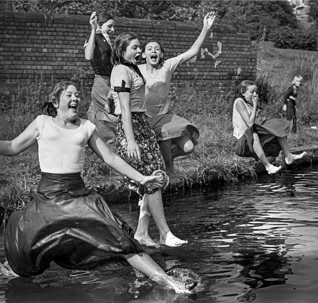
He showed me work by Arthur Tress also, who is known for “staged surrealism” and his explorations if people and their bodies. He has a sense of humour that seeps into his work too, as well as a dark side too with some seriously black humour. Some of his work looks similar to that of Elliott Erwitt whom I also discussed in the previous Postmodernist post. The photo below shows this observation of his surroundings and the ability to capture a fun image. Many of his works are also staged to contain some odd contents and these are also fun if a little wacky to view. I’ll look further into Loach and Tress too for future posts.
Be First to Comment