As part of the Week 10 Progress Review & Riso Completion post you may have read a section about how I need to document more comprehensively the extra work that I do outside of the contact hours in the university day. I only attend Wolves City Campus, MK Building on a Tuesday afternoon and a Friday morning staying into the afternoon if required. As a part time student I get the sme contact hours with the lecturers for my module Experimentation & Dialogues 4FP018 as the others but we should be putting in more hours per week to ensure we’re learning as much as we can.
For me being there on a Tuesday allows me to stay afterwards for Print Club, more on that in a future post, but the Friday seminars usually consist of a download of information and ideas with some conversations, engagement and feedback, followed by a task or two outside of the lesson time. I’ve been pretty well on top of these throughout the year as if I leave them to the end, I will have forgotten what each was about and then struggle.
Book Binding
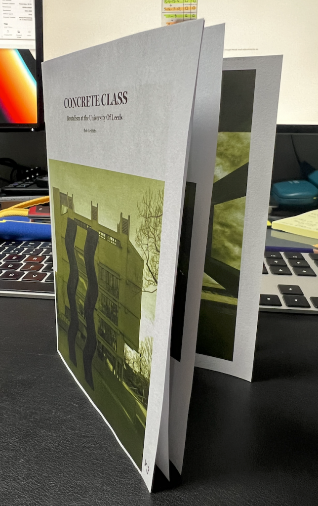
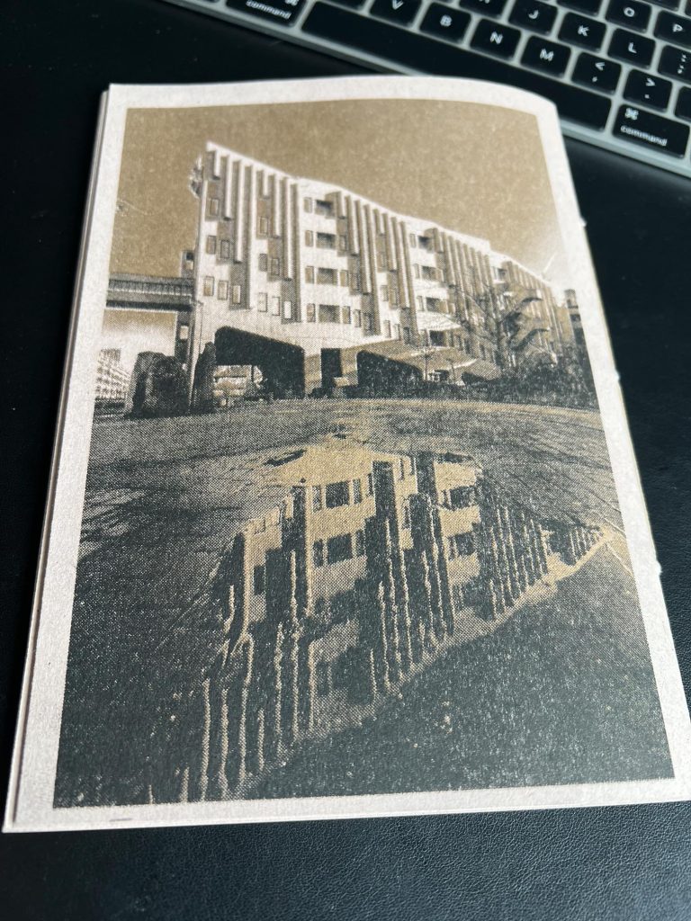
Alice gave us a heads up that we would be doing some book binding and that we should get a cheap kit from the web containing a bradawl and thread etc. I asked at the time if we were to bring anything in to bind together and we were told that we could just practice on some blank paper etc. At this time I had just printed out my car park zine and was thinking of another zine full of images of the brutalist style buildings at Leeds University, West Yorkshire.
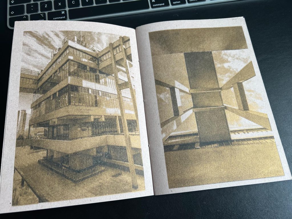
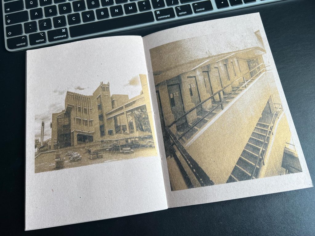
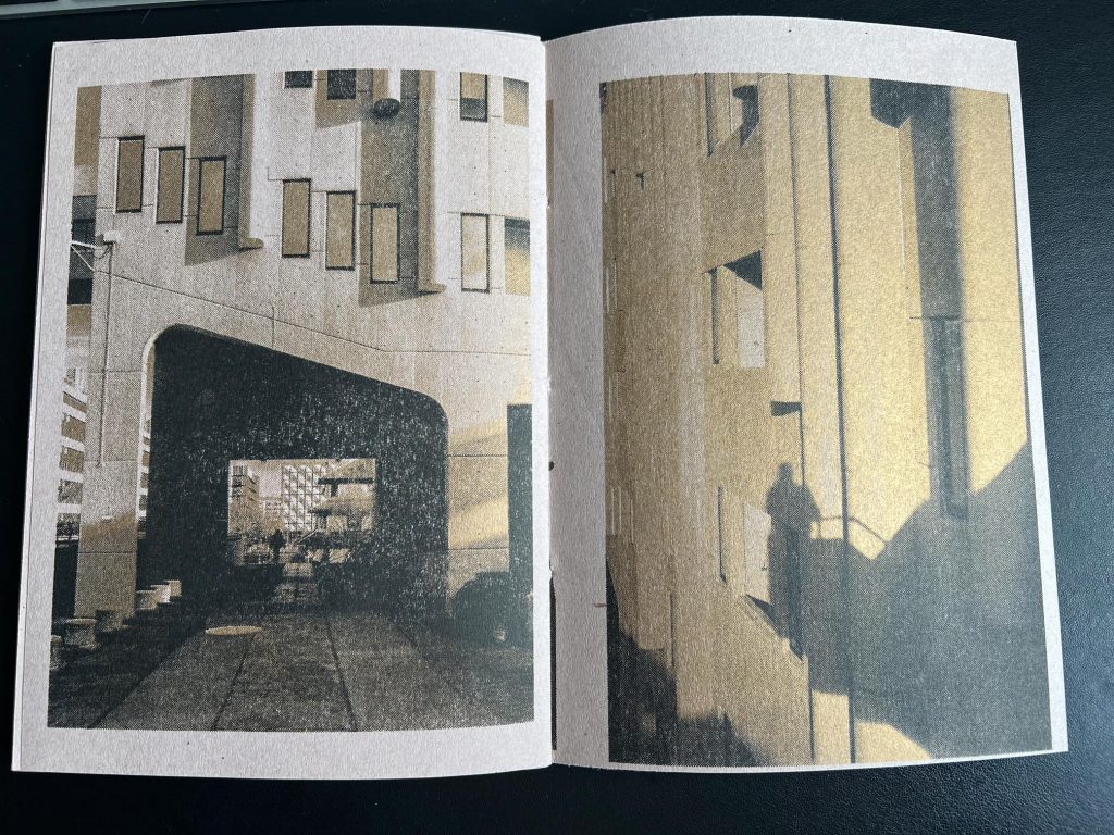
My daughter went to Leeds and graduated in 2021 with a First Class Honors degree in Biology and the few times we visited her in Leeds I got to see the campus and the amazing architecture that it consisted of. The concrete, the scale, the stairs, the angles, the windows, the mirrored glass, the long corridors etc all took my breath away and I have revisited many times over the last few years to take photos. The last time was to view an exhibition about Brutalist Architecture in University campuses, titled Another Brick In The Wall, a previous post of that can be found here.
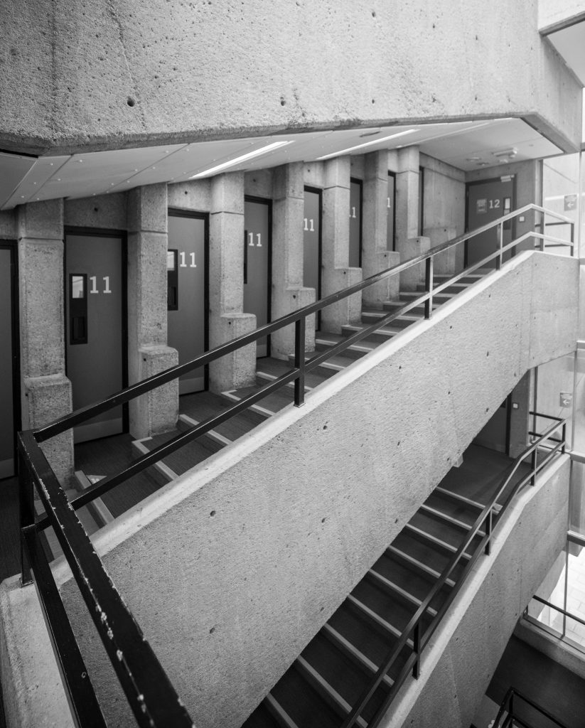
In my library I have a number of images that I’ve made using digital, film and even drones so I wanted to see if I could blend these photographs in with the book binding workshop and also see if I could make use of the Riso Printing Workshop we’d done earlier this academic year with Jim in the Print Support Hub.
Curating
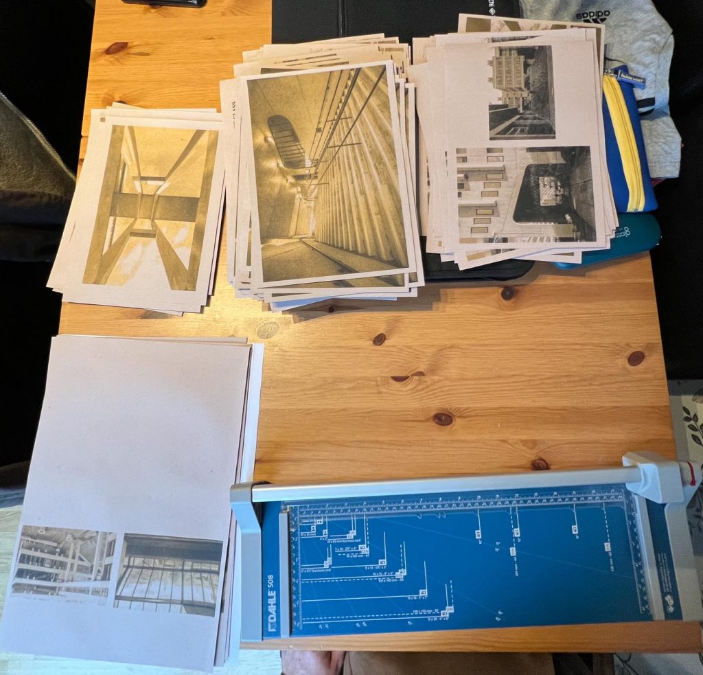
I set about curating some suitable images from my Lightroom library into a collection that I could then whittle down and select a final few images. I printed out the shorter list then chose the order that they might best appear in any zine.
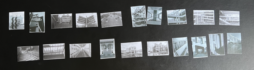
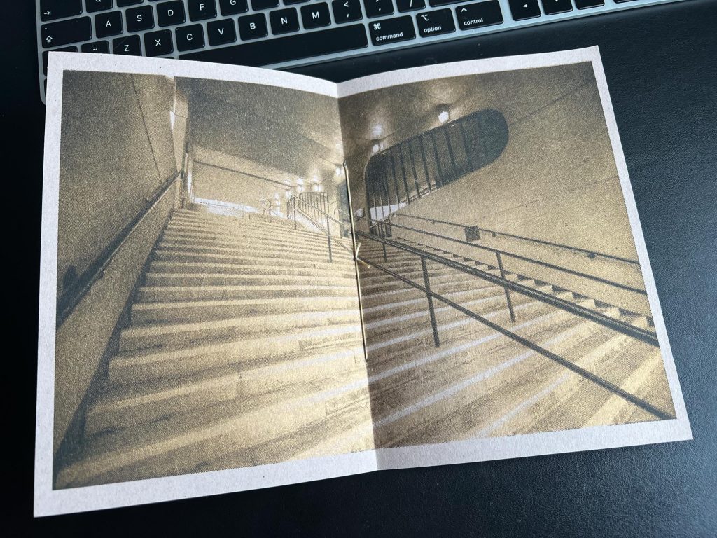
You can see from above that I was happy with many of the images printed on a rubbish laser printer the size of a new postage stamp, ordered them in a way that felt structured, in the order practically that they were taken as I moved through the campus on a visit. A couple were rejigged so they made more sense and I selected the large staircase image to be the centre fold.
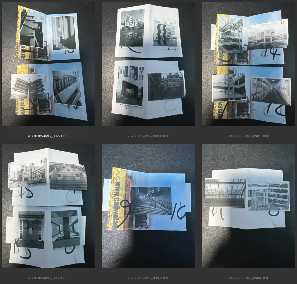
I then made a mock-up or maquette of where I wanted the images to be placed in the pages, making the page numbers super chonky in black marker so that when it was undone I woudl know which photos were to be on which page.
Because this was to be a double sided affair I knew that I had to note down what was on the A side and what was on the reverse side. I would refer to the pictures from now on as F, R and 1 thru 18.
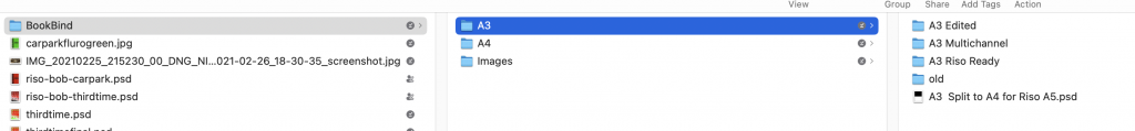
Because we were going to be making an A5 size zine, a folded sheet of A4 would be needed and I remembered that Jim told us the Riso Printer prints A3 sheets most efficiently. I chose to create an A3 sheet with two A4 sheets on it.
In these two images you can see some prints (that I could only do rescaled to A4) but would be A3 size when Jim printed them. They represent the A sides (top) and the B sides below. I made this confusing for myself by doing this as it meant I would need to ensure that the fronts and reverses were not printed on sheets that meant it was impossible so I worked it out and came up with a solid plan. THe top left pair of green coloured images, one with the title above, are the Rear and Front (R&F) the two images lower on that A3 sheet are pages 17 & 2.
Anally Retentive
The schedule of work is to print the three sides of A3 that you can see in the top half, wait for them to dry and then insert them into the printer to print the reverse sides. To do this I needed to make sure I had the order 100% correct so I created myself a little checklist. You can see below that the Rear/Front/17/2 A3 sheet has 1/18/3/16 on the reverse. Once printed I would cut the A3 sheet into the two A4s and leave Rear/Front on the reverse of 1/18 and 17/2 on the opposite side as 3/16
The maquettes I made on a laser printer came out a funny green colour as the Duotone process I’d chosen was Black and Gold ink from the Riso printer and this was the best approximation my printer could do. Once I’d experimented on the first couple of maquettes I realised that I’d left a whole half sheet of paper unused. You can see above that the centerfold (9/10) of the stairs has 11/8 on it’s obverse but it means a whole half of the “master”, inking op and paper were going to be wasted.
To prevent this half sheet being wasted I selected a picture to print there on a single side. Once this sheet were cut into two A4s from an A3 this lower half would become a Riso Print of an image from the zine.
This maquette could be used to demonstrate to Jim in the Print Support Hub how it should appear when complete. From this he could then advise me of any changes being needed. Before it got to the stage of Riso printing though I noticed a few mistakes such as making the images sit too close to the edges or even being misaligned. It wasn’t a bid deal but I felt that I wanted to put as much effort into this to make it a success as possible.
Structured Files
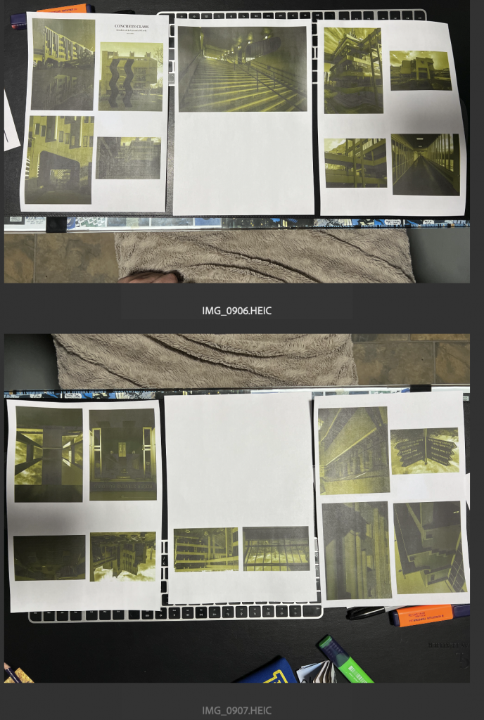
With the final images all complete and all images in the process being saved in case I needed to rejig anything I found that the file structure was quite organised but probably over complex. There were folders of the images, exported from the RAW files, scans etc. Then these were incorporated into the A4 Pages and finally into the A3 sheets which were then treated to the Duotone process and ultimately resulting in two images of each A3 Page, both grayscale, of the Gold Channel and the Black channels. These would be printed out in the A3 printer in the hub and then used to make the masters on the Riso Printer.
Jim looked at the files in our first get together and ascertained that the way I’d created the duotones for the Riso would mean there was loads of gold ink being put on top of loads of black ink ending up with a murky mess. He spent the hour with me going through the, very helpfully, organised files changing the curves of the tones to allow for more white space, that wouldn’t necessarily be covered with gold and black. It would lead to a more pleasant image in the end.
Print Hub Sessions
At the end of this hour long session, Jim used these newly altered images to create the monochrome pages on A3 but we’d run out of time before we could get printing. Another session was to be required.
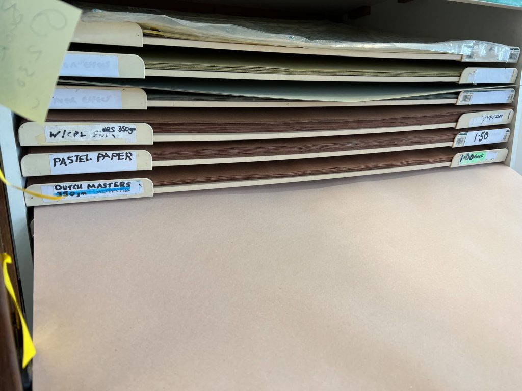
At the second meeting in the Print Support Hub, Jim helped me to select a Paper colour to print on so I chose a grey/pink paper that would have a background of a concrete-like colour. (it made sense to me anyway)
We began pulling out the sheets of A1 paper, marking them up with a pencil and cutting them on the guillotine that lives in Jim’s arena. Once we had a few sheets we tried a couple of prints out and they came out superbly. There were a couple of little tweaks that needed to be made like the strength of the black being nudged up one notch and a couple of times the image was needing a move up a millimetre or so, enabling the Gold to sit square in line with the black. Failure to align them like this means there are weird artifacts left where no ink exists and parts where there are obvious misses.
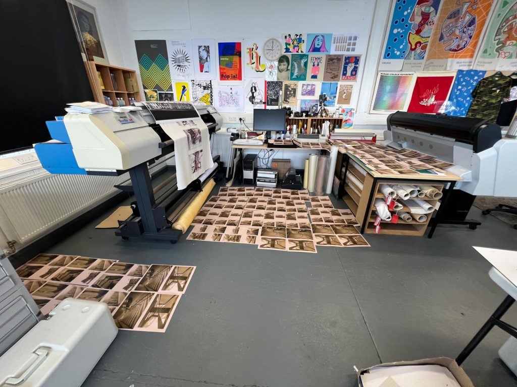
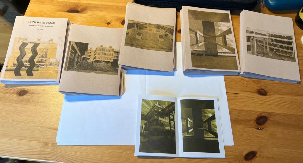
After printing 3 sheets of A3 twenty times each I was left with 60 pages of paper drying all over the print support hub. Jim said to leave them there and he would pick them up on the Wednesday morning and put them up safe ahead of the second session of printing which I’d managed to get booked in for the Friday before my progress review with Alice.
Using my schedule of pages and their reverses I was able to orient all pages correctly and then print onto their reverses with the corresponding page. There were a few issues with the Masters getting stuck in the waste section which meant pulling them out carefully and then getting the soya based oil ink off my hands before going to the next step.
With the reverses printed onto the pages correctly they would be left to dry scattered all around the room from 10am until later in the day. It would turn out that this would be around three in the afternoon as Dan was eager to close up the basement for the Easter two week holiday. I returned to the room and gathered the pages together, happy that my anally retentive attention to detail had resulted in the correct order, orientation and layouts being there.
Once the pages were stacked up and safely in my portfolio for transport home I settled the bill with Jim which covers the cost of the Paper, the masters for the gold and black, and the inking of each colour too. It came out as £33 in total for the 20 copies of the zine. This would give me a cost for manufacture of £1.65 each, so if I was to sell them this is what they’d owe me.
Final Manufacturing Steps
Upon getting home I had a cup of coffee and sat at the dining room table with my guillotine/paper trimmer to start making headway into cutting, folding and assembling the zines. Whilst sat there getting on with the repetitive work I was able to chat to my family and find out about their days. Most of it was crap news with friends having issues with their children, or business owners with significant issues and mental health problems. It was good to discuss this stuff around the table and this is what my family is best at, talking, and communicating. I love it. It was a slight distraction from the forthcoming funeral of my late Father but we did chat about some of the stupid stuff he’d done too.
I found that with the afternoon flying past I’d managed to mark up a 21cm mark on each side of the A3 page so I could cut it in the rotary trimmer, then sliced away one sheet at a time.
Putting them into corresponding piles and keeping aside the single riso prints I was ready to begin the folding. Using the plastic “bone tool” that came with the book binding kit I was able to crease each fold neatly and without a big oily mess from my greasy fingers. Soon there were five piles of folded up pages ready to be assembled into the correct order, so I grabbed the centre page, slid it into the next folded page and so forth until I ended up with the cover being filled out with the other leafs.
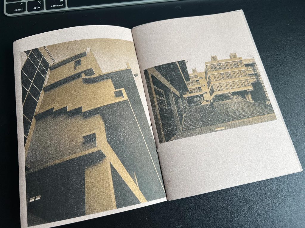
The gold colour on the black looked fantastic and it doesn’t really come through in photographs, but when you tilt the page to the light, the windows of the buildings or highlights of the concrete practically sparkle.
With one of these assembled collections of pages I chose to have a go at the book binding that we’d be looking at when we return from the Easter break so broke out the bradawl and poked three holes in the spine before threading some twine through with a needle and tying up in the centre pages. It looked pretty sick actually and I was 100% happy with how these had come out. I’ll leave one of them for the book binding workshop so Alice can show me properly how it’s done.
The video I looked at to get a quick idea was one by “all well” on YouTube. they made it look so easy, I thought it would be ok and it was.
Conclusion and Reflection
How did this exercise go?
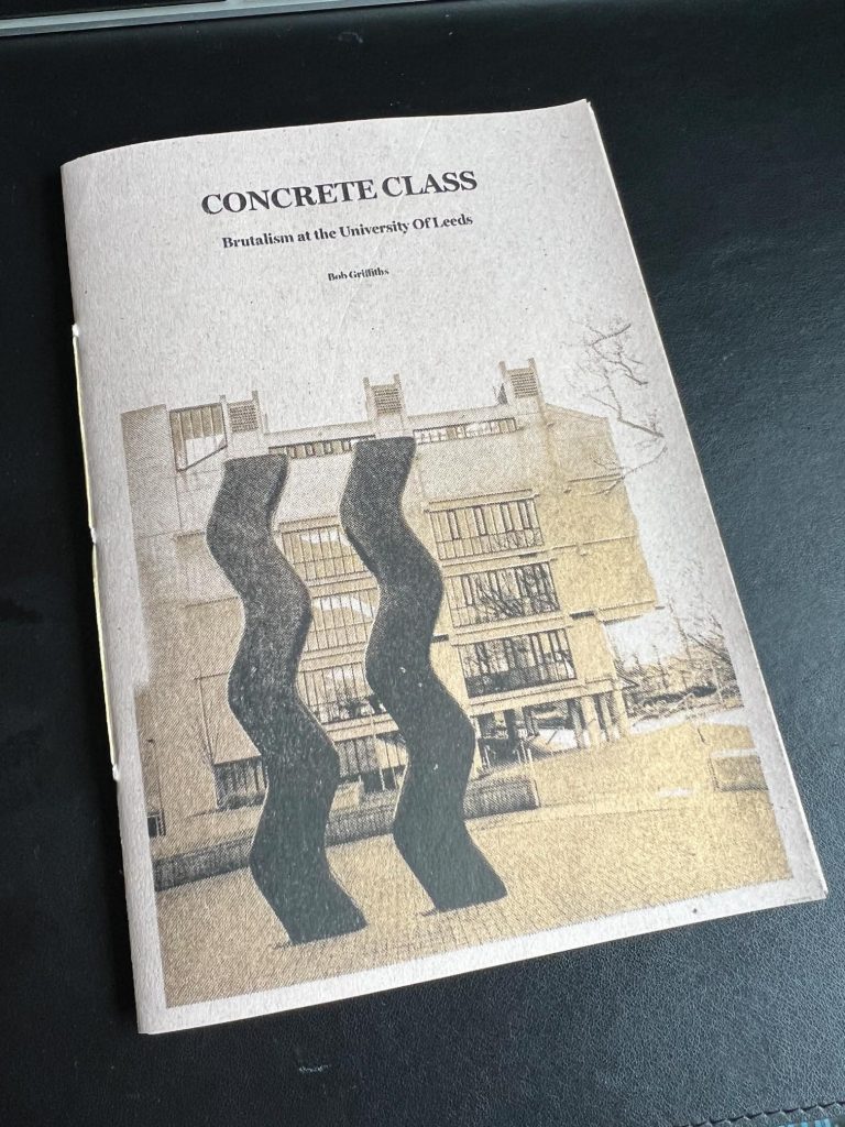
Overall I’m happy with the result, it is a record of some work that I’ve made about the buildings at Leeds Uni. The images have come out looking great, and whilst it’s not photograph perfect, the Riso process has the characteristics of some strange effects but this is what Riso is known for and all par for the course. The work was difficult sometimes with a real focus needed on treating each image exactly the same and thinking about the structure and layout. The end result is twenty copies of a zine that didn’t exist before and I might see if I can sell them on my ebay or etsy stores alongside my car park zine. I also have twenty A5 Riso Prints of a marvellous looking part of the campus buildings, looking up.
What did I learn?
From this exercise, I learnt many things. How to work with Jim and his machinery, he is a great guy to have available for support like he offered over the course of this project. I learnt that being prepared with the files in the right place enabled Jim to quickly go in and make some required changes to enable the images to result in a better quality product.
The effort and brain bending to ensure that the images to be double sided were not on the same sheets and in the correct order/orientation was taxing. The use of the maquettes to try out the idea was also a cracking process to follow as it meant that I spotted any errors earlier rather than later.
I learnt how to Duotone properly to enable the riso printing process to work more smoothly, and then I learned the basics of how to drive the Riso printer to achieve the results I desired. With some basic fault finding and some obvious questions I now have a better understanding of how the systems work to produce the results.
Another learning point was that materials and time cost money, the creation of an A5 print on each set rather than a wasted part of the page was good to learn and how the costs stack up to point to a figure for the manufacture, that must factor into the selling price of each zine/print.
Am I a swot?
Most certainly, yes. I’m a try-hard. This work wasn’t required to be done as part of any module or lesson but I found that tying up the riso printing and book binding workshops we’ve got this year with a result being produced enabled me to have a practical output learning experience.
I’m not doing any of this to please Alice, Jim, Dan , Euripides, Sam or Niki though, I’m doing it for me. I’ve signed up to this course to learn. Learn how to write in an academic style, how to think like an artist, how to use materials and methods to create products, to use social media and publishing to create an artist in me. I’m already an artist but not a confident one. These exercises push me out of my comfort zone so far that I’m always nervous embarking upon the journey, I might look like I’m confident and bold in my behaviour but I’m like the proverbial swan, kicking like hell under the surface to push myself onwards through this journey.
I’m already two years into the six year process and I feel I’ve already made some progress on seeing and believing in myself as an artist. I’m a creative, a photographer, a maker and someone who likes to help others achieve their goals too.
Another four years of this seems like a long way to go but I see this extended period, due to being part time, as a positive. It means I have six years worth of access to the darkrooms, the print support hub, the studios, the MS Office and Adobe subscriptions, library access on top of the workshops, learning, live briefs, volunteering opportunities, seminars, networking, inspiration, ideas and all manner of other valuable benefits that I might not have access to if I were just at work full time and trying to do some photography in the spare time.
[…] Alice gave everyone 5 sheets of A4 paper which were folded in half to create a ten page A5 booklet. As I’m a swot and wanted to make something for myself as part of this I’d already created a xine called Concrete Class, which contains images of Uni of Leeds Campus, Riso Printed on to thickish paper. The details of this exercise can be read in this post. […]
[…] Blade Runner movies and aesthetic. It was at this point I showed Sylvia my car park zine and the concrete class zines and she seemed pleased with the content of […]