Dissertation Tutorial
Into the uni for the day and spend some time in the darkrooms printing, I had to be ready for 12:00 with my dissertation project proposal for Gavin to peruse in room MK202.
Tomorrow morning at 10am is the Practice Proposal presentation for Euripides and Gavin in the basement.
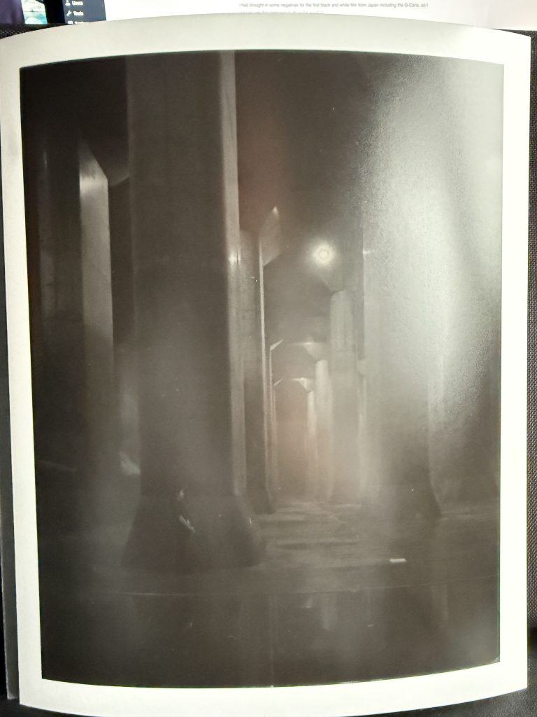
I had brought in some negatives for the first black and white film from Japan including the G-Cans, so I popped into the darkroom to do some printing.
I set up the room, turning on the RC paper dryer and the water for the wash dishes. I uncovered the Stop and Fix dishes and filled up a dish with some developer fluid ready for the session. the enlarger was set up and switched on, I checked the lens was a 50mm lens, checked the 50mm diffuser was inside and then put a 2.5 filter in the tray below the lamp. The easel was not set for my size paper (10×8) so I reset the frame mask to 9×7 and the spacers were set for 1/2in.
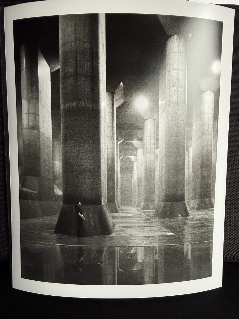
I chose a negative from the sheet that I had brought with me, which contained many shots from my trip to Japan in June this year. The first one I chose was a shot from the Tokyo Metropolitan Outer Area Underground Discharge Channels which features a set of huge concrete pillars underground that act as a pressure relief vessel in the cause of reducing flood damage to the city of Tokyo.
I put in a test strip first into the easel and then expose it to the negative in steps of 2 seconds, and as soon as I press the start of the exposure I realise that I had forgotten to change the aperture of the lens from the f/2.8 used for focussing, to the f/8 I would normally use it on. The exposure I preferred from this test strip was around 6 seconds and figured that I needed to alter the lens aperture three stops so that means multiplying the 6 by 3 so it meant that I would need about 18 seconds or 20 seconds in the new test print. I put in a test strip again and exposed at f/8 for steps of 5 seconds and the better exposures appeared around 20 to 25 seconds.
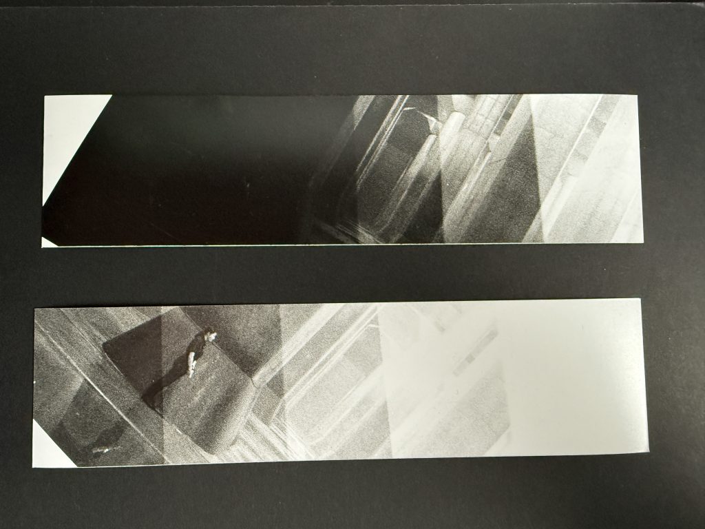
I banged in a full sheet of paper and set it off at 20 seconds, only to see that after a minute in the Dev that the blacks in the image were not black enough so I added another 5 seconds and set it running. This time it came out much better but I noticed that the tops of the pillars were blown out with no detail.
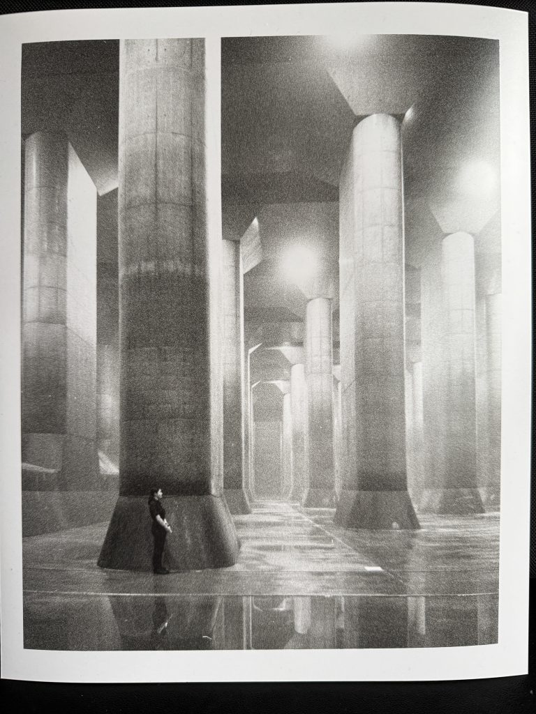
To bring some of the detail back into the top of the image I burned the image a little, I added another 25 seconds to the exposure and then covered the majority of the image over with a dark card and then uncover some of the top of the image slowly and not stopping at the same place before covering it up again to soften the line of the start of the burning.
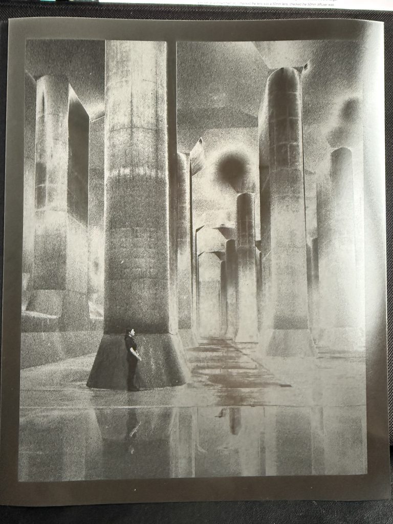
Once I was happy with this I made another copy using the same settings. Once this one had gone into the Fix, I thought back to a trip earlier this month to Tate Britain to the Lee Miller exhibition. In that exhibition were some works by Miller and Man Ray in which they experimented with solarisation, otherwise known as the Sabattier effect. the effects of the experimentation led to some strange results so I figured I’d give it a bit of a go. I hadn’t read anything about how to do Solarisation so tried a couple of things. The first was to flash my phone torch over the paper after a 25 sec exposure, I hadn’t put the paper in the easel correctly but I had ruined the paper anyway. The whole exposed piece of paper was black. Obviously. I then realised that of course it would be over exposed, thats what happens.
I thought about it and figured that the flash of light shouldn’t be whilst it is under the enlarger but part way through the developing in the dish. I exposed another sheet and then after 30 of the 60 seconds it would normally sit in there I flashed my phone torch over the top of the dish before swiping it away and turning it off again. Once it had finished developing, Stopping and Fixing it was obvious to see that there was a strange change to the print, after the wash 2 minutes was completed I looked at it and thought, “that will do for now” so then had to pack up everything before heading off to the tutorial with Gavin.
Diss Time
I headed up to MK202 for the feedback session and the printout of my proposal was removed from it’s plastic sleeve for some notes to be made on it.
Gavin talked about atmosphere and gave me a couple of texts to read and see if they fitted with the theme of the diss. I talked about how I was unsure as to whether to drop the grief around humans and go straight into the loss of buildings. He suggested that it would be good to start with human grief and then move it to the buildings etc.
Research entails how photography can be used to assist the mourning/grieving process. Is ther a difference between mourning and grieving?
Article by Jimenez has info in there around a study of a woman who lost her friend early due to cancer and that she was given a daily alarm to take photos and this forced her to think about her friend whilst she was taking photos. She recorded the text around the topic too at the time she took the photo. She also re visited the study and interviewed 9 months after the initial work, and found that this was an equally helpful part of the process of grieving for her friend.
Start off the dissertation with explanations of what grief is and then move on to the exploration of how loss of buildings is perceived in other artworks, Fighting Temeraire, Mark Power, Chris Killip etc.
Presentation Time
Wednesday morning it was time to go into the basement studio for the presentations to share my ideas with my peers and the tutors etc. Gavin, Euripides and Dan all sat in and watched the presentations some long, some short, some well planned, some less so, some full of content and others lacking.
It was decided to stand up in alphabetical order so we kicked off with Joe.
Joe
Talking about flags and what it means to people.
Look at modern Britain
Talking about immigration of kids using kids toys as the subject
Presentation of work: Project, spray and present outside
Euripides advised to look at Rene Matic
Gavin suggests care around language is vital.
Discussion around AI, and it’s possible use after Joe shared an AI image of a Bulldog with EU Deely boppers on..
Courtney
“Our Egocentric Society”
Environmental Waste and photographs of different waste streams
Used packaging is not useless, it’s awaiting an opportunity to be useful again
Used batteries and tyre marbles off racing car
Euripides mentions containers, that the battery contains energy, the tyre contains air
Tyre marbles look a little like asteroids when photographed close up on a black background
Gavin mentioned the Elizabeth Fishers’ Carrier Bag Theory Of Human Evolution.
Also about energy from sun and how energy is transformed
Bryanah
Music Photography
Bryanah likes music and photography at gigs.
Take photographs at gigs and then turn them into album covers etc
Needs to do more work on the bands and then working with them.
Needs to spend some time talking to the artists and perhaps taking photos after gigs etc.
Brian
Taking photos of surfers in a nice exotic place was first choice but can’t get funding.
On Gavin’s suggestion changed to examining microplastics and pollution in the oceans
Euripides says that they’re working with the science department to use microscopes
Gaining samples from different water sources to see if there are more pollutants
Brian needs to gather some samples from seaside, rivers, puddles, tap etc.
Clare
“Where she once stood”
Abandoned buildings and self portraits
The difference between looked after ruins and urbex locations
Having the face not in it allows the viewer to project.
The person looked like a video game character in a game environment but Gavin, Euripides and Dan suggested staying away from being tempted to follow up on video games as it was a bit done.
Evie-Mae
Wanted to come away from urban banality which is her usual practice
Utopia, photos of real places and then use some digital manipulation using AI
Black and white removes initial impact of AI contribution
B&W is the style used for documentary so would work well to lend some authnticity to the photos, even with a change or two.
Bob (Me)
Euripides likes the deadpan images up front, square on to the building. He liked the square on photo with the reflection showing building up into the sky.
Gavin recommends the Elizabeth Price “here we are” video which shows churches in the north of England created for Irish, Polish and other nationality migrants etc. A safe space.
Euripides mentioned Andreas Gursky who takes photos of mass events, or collections of many things, not immediately obvious until you look further into the photo and prints them out at a large scale. I likened the sound of Gursky to Jeffrey Millstein. Euripides mentioned this as some of my photos from the drone, top down, like the solar panels reminded him of this artist.

Gavin also mentioned about Tel Aviv, in Israel being designed as a Utopia of sorts when it was first built with all of thew sweeping angles and curves. Looking further into this I can see that White City is a Bauhaus inspired set of buildings that have been designated as a UNESCO world heritage site. My guess that he mentioned this as a way of looking into how the buildings and voices of people from the area are documented to help their legacy last into the future.
A quick mention of Forensic Architecture also from Gavin as a group that document changes to architecture in war zones, police actions and all manner of other circumstances. They often use their evidence for fact finding and ensuring that the truth is told.
Below is the presentation that I showed to my peers and teaching staff.
Vicky
Models of people in the real world borrowers with shoes and chewing gum discarded on street etc.
She referred to Slinkachu who does this regularly.
Street photography with small figures like from train sets
Small men on strawberries was a funny little aside, similar to as seen on supermarket ads on TV.
Euripides mentioned Jon Timberlake who puts small figures in apocalyptic situations
Vicky wants it be fun, absurd and Euripides was happy that fun was mentioned.
Jude
Pictures of street lights and natural lights
Taking pictures of brutalist images and for his game designer friend
Some photos of cars at different angles as per William Egglston
Likes photographing cars also.
I shared that the book A Time A Place is a book showing cars in the same image as a building that was built at the same time as the car.
Louise Storey
“Echoes of identity”
Project about what?
Identity and who you are.
Some street photography and ask people for their image as some of the photos were taken from a distance with a lack of focus on the people.
Dani
Street photography through minimalism
Inspired by Jeff Wall’s works
Euripides suggested that she could capture images over a series of close in moving outwards to a wider angle. (An eye, the face, a portrait, an upper body portrait a wider angle etc..)
Michelle Williams
“Echoes Of The Past”
Outdoor portraits inspired by Cinema and Old Masters
Pictures based on old masters work of classic paintings
Use of Lighting to be more cinematic.
the Others
The remainder who had attended but did not feel comfortable would have to present to Euripides and Gavin after lunch so it was lunch time, and I was late leaving Uni to get back to my workplace.
Assignment Grading Notes from Gavin:
After the session the presentation Id uploaded and presented in the basement was marked as a pass by Gavin and he also left me these notes.
Very clear presentation and clear plan/ vision for the project. As ever. top presentation skills and slides
Images you have are strong set of images, the zooming in and out. Being drawn in from the formal qualities, allowing far away shots to be an intriguing questioning of what is this? from a distance.
Have a look Andreas Gursky (Hayward Gallery)
Curated collection of images allow for conversations on subject areas, a template or methodology for working with other buildings,
If you are working with people at some point: Photovoice
Conclusion
With my dissertation and project at their very early stages, I can see how they will link together around the theme of documenting history and the legacy of a building.
The presentations were interesting to see, as I don’t spend a lot of time with my other coursemates. It is good to see what avenues they’re exploring and the differences in the students from those who have worked hard on their presentations to those who bodged a picture or two, uncredited into a power point slide and then presented it.
Some of the people in this year group also have anxiety around presenting to the group of peers and whilst I understand that it is a very stress inducing activity I feel that they could be using these opportunities to normalise, or make it less stressful in the future for themselves by getting these out of the way in front of like-minded friends and colleagues, before they head out into the real world.
I am aware that there is a lot of text on my slides, more than I would normally include on a powerpoint presentation but with this being submitted as an assignment I felt I needed to include the meaning and context of the works being shown and explored.
There was talk of the interviews of the people who used to work in Shirehall being captured on video or audio to accompany the photography also. This could then be used to capture the history and provide the context around the works.
Gavin also mentioned that I could use this project to create a template on which to base other explorations of building loss in the future. Possibly use it to standardise the evidence and testimony of people involved in the buildings and the environment in question.
Be First to Comment